
Looking for stunning photography websites to spark your creativity?
A great photography website does more than look pretty.
It needs to tell a story, showcase work beautifully, and make it easy for potential clients to book a session – or just to get inspired.
Over the years, web design trends for photographers have shifted toward immersive, fast-loading, and mobile-friendly experiences. Hey, we use our mobile devices more than ever, and the trend keeps going up.
That’s why high-impact photography sites focus on bold visuals, clean typography, and seamless navigation.
These sites will also:
- Engage visitors instantly, drawing them in from the moment it loads.
- Encourage longer visits by offering a seamless, visually appealing experience.
- Showcase work in a way that inspires exploration and deeper engagement.
- Guide visitors to take action.
Simple, uncluttered designs with plenty of space make the photos stand out beautifully. While full-screen images, smooth scrolling, and interactive galleries create a captivating experience.
Many top-tier photographers also incorporate social proof, such as client testimonials and featured publications, to build credibility.
In this article, we’ll explore some of the best photography website examples that you shouldn’t miss.
Content:
- How We Chose The Best Photography Websites?
- Best Photography Websites For Inspiration
- What Makes A Great Photography Website?
How We Chose The Best Photography Websites?
1. Stunning Visual Presentation
A great photography website must highlight visuals in the best possible way. Period.
We looked for sites that use high-quality images, clean (grid) layouts, and seamless galleries that let the photography shine without distractions.
2. User-Friendly Navigation
A well-organized website helps visitors browse portfolios, learn about the photographer, and quickly find key details.
We prioritized websites with intuitive menus, fast-loading pages, and smooth scrolling to enhance UX.
3. Mobile Optimization
With most users browsing on their phones, a great photography site MUST be fully responsive.
We focused on sites that offer flawless experiences across all devices, so images and content look superb on mobile and desktop screens.
4. Strong Branding And Storytelling
A website should reflect a photographer’s unique style and personality.
We chose sites that effectively use branding elements, engaging storytelling, and a compelling “About” section to connect with visitors on a personal level.
5. Clear Calls To Action
A high-performing photography website guides visitors toward a goal – whether it’s booking a session, making a purchase, or subscribing to a newsletter.
We selected sites that have clear CTAs, making it easy for visitors to take the next step. And this is especially important in wedding photography websites.
Best Photography Websites For Inspiration
1. Peter McKinnon
- Built with
- Squarespace
- Checked
- August 2026
- Palette sampled from the page
- #000000#614132#C5CDCE#3D0F10#A7B5B6
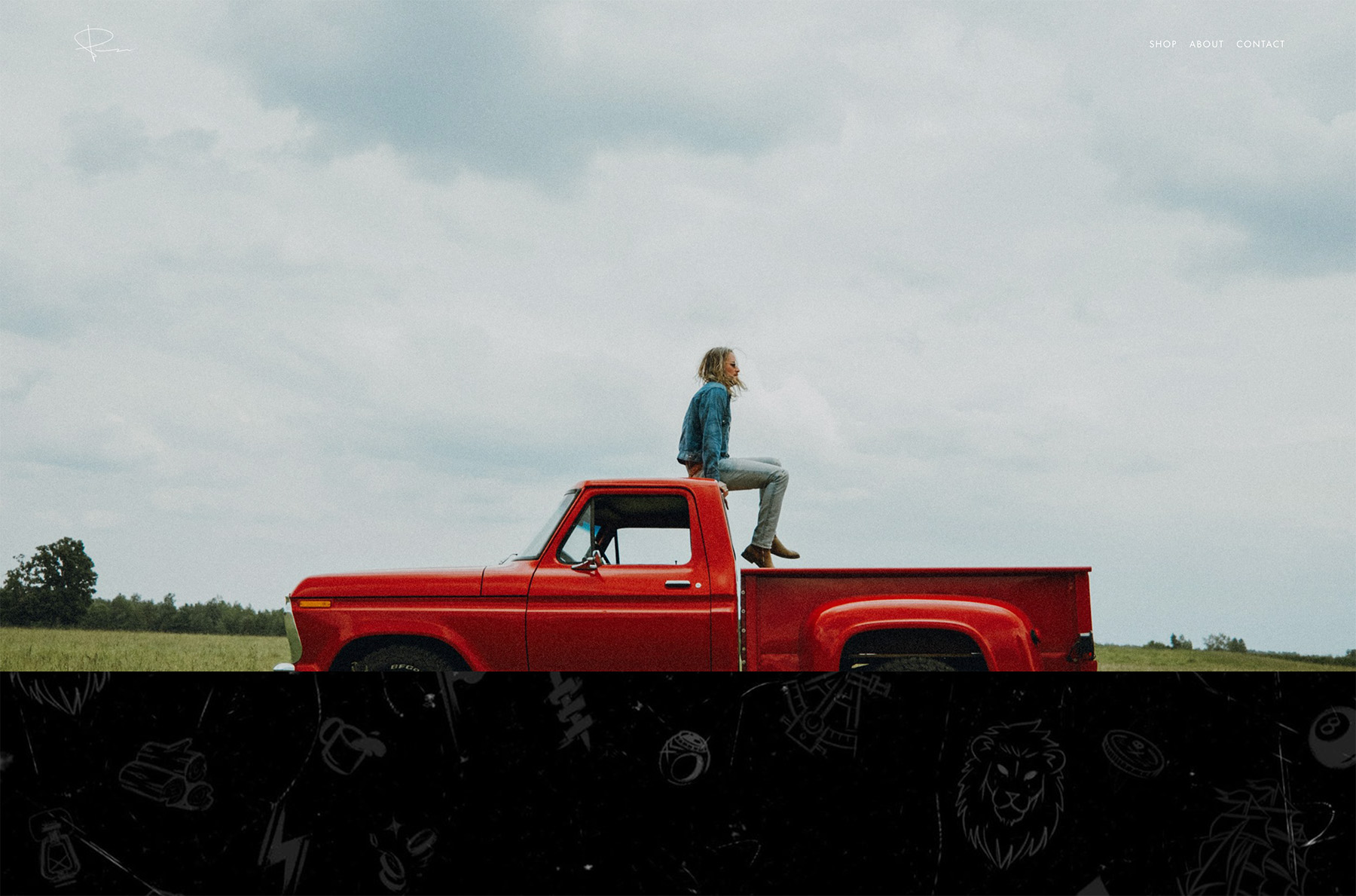
Peter McKinnon’s site feels like a personal brand powerhouse right from the get-go. The visuals grab you immediately, thanks to the full-width parallax approach.
He’s all about epic imagery and a cinematic vibe.
While the website is big and bold, it’s also super clean and to the point.
We like how the layout doesn’t distract from his main focus: the photos and his personality.
Scrolling through this website feels like a journey through his creative process, which sets it apart from other photographers’ websites.
Why did we choose this photography website?
We chose Peter’s site because it’s visually striking and super clean – it’s all about the energy that matches his persona: adventurous, fun, and a bit edgy.
2. Botega53

- Built with
- Custom build
- Checked
- August 2026
- Palette sampled from the page
- #030303#E6E5E5#2E3029#A29887#CBCAC6
Bottega53’s wedding photography website invites you to explore a world of amazing images with a quick preloader.
Once the website loads, you get hit with a larger, three-column grid that, if you don’t start scrolling, it scrolls slowly by itself. So all you can do is sit back, relax and enjoy.
Individual pages are spiced up with an elegant horizontal slider with large imagery for a better viewing experience.
Each photo feels luxurious but warm and inviting, making you want to keep scrolling and investigating.
What we also really like is the straightforward navigation, which opens the menu as a full-screen black overlay.
It’s basically a masterclass in modern, high-end wedding photography branding.
Why did we choose this photography website?
We chose Bottega53’s website for its luxurious yet inviting feel, with large imagery and a smooth-scrolling grid that instantly grab your attention.
Plus, the straightforward navigation and tasteful design details make the entire experience elegant and engaging.
3. Alberto Oviedo
- Built with
- Custom build
- Checked
- August 2026
- Palette sampled from the page
- #FFFFFF#B70214#020203#FE3A3C#866453
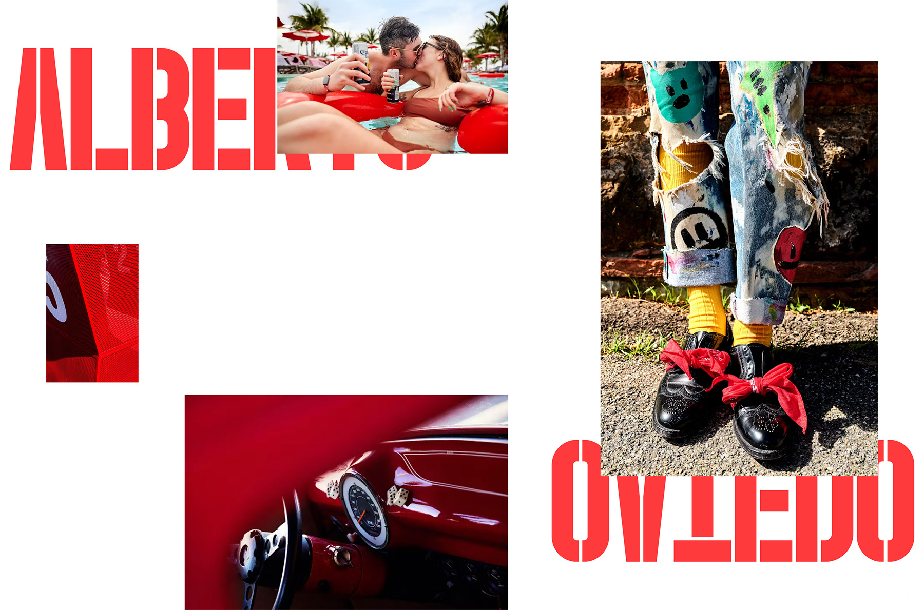
Alberto Oviedo’s photography website feels sophisticated with a unique design that makes scrolling extra fun.
The layout might lean heavily on minimalism, but the animated detailing keeps you glued to the screen.
We really like how the website transitions between sections – it’s fulent and distraction-free.
Even the font choices add to that modern, polished vibe.
The overall experience is simple and intuitive, so you focus on the artistry rather than the interface.
It’s a great example of how less can be more when it comes to displaying striking photography.
Why did we choose this photography website?
We chose Alberto Oviedo’s site for its sleek, minimalist touch and subtle animations that capture your attention without feeling cluttered.
It’s a perfect example of how minimalism always wins – especially when you sprinkle in some tasteful special effects.
4. Easton Chang
- Built with
- SmugMug
- Checked
- August 2026
- Palette sampled from the page
- #201B1A#3B2E2B#564B46#708495#B1C8D7
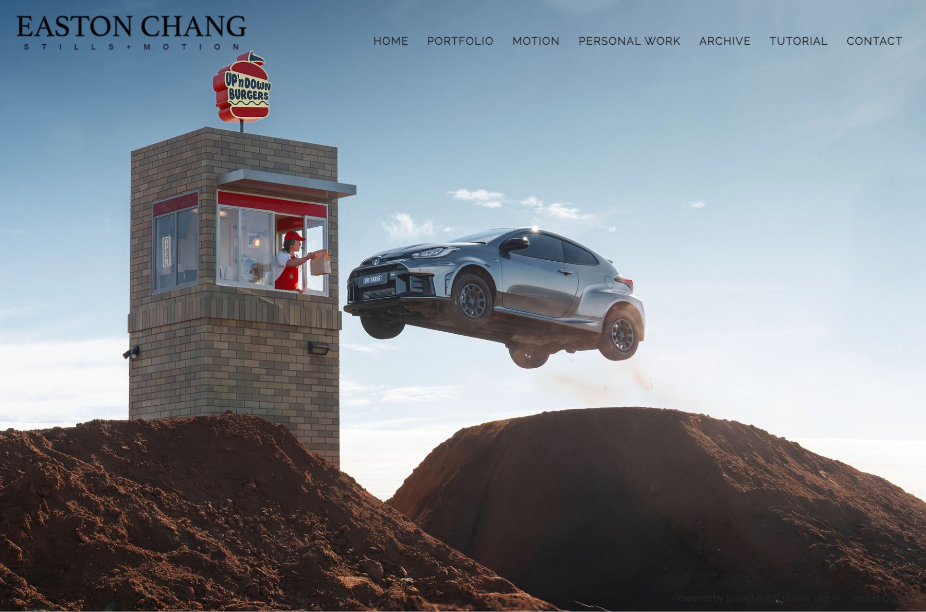
Easton Chang is an Australian automotive photographer, and his site does the bravest thing a portfolio can do: it shows you one picture.
The homepage is a single full-bleed frame with no scroll at all. There is no hero copy, no tagline, no scrolling carousel competing for attention — just the work, filling the screen.
The only chrome is an engraved-looking serif wordmark in the top-left and a row of widely letter-spaced uppercase links across the top: Home, Portfolio, Motion, Personal Work, Archive, Tutorial and Contact.
Splitting “Motion” out from “Portfolio” is a smart touch for a photographer who shoots both stills and film, and “Personal Work” and “Tutorial” quietly signal that there is a person behind the camera rather than just a studio.
Why did we choose this photography website?
We chose Easton Chang’s site because it proves restraint sells. When your images are strong enough, one uninterrupted frame beats a grid of twenty thumbnails.
It is also a useful reminder that a portfolio homepage does not need to explain itself. The navigation carries the structure, so the picture is free to do the selling.
5. Alex Tran

- Built with
- Squarespace
- Checked
- August 2026
- Palette sampled from the page
- #FFFFFF#F69C4B#D9D9D8#343627#09131D
Alex Tran’s website embraces a clean, discreet vibe right from the start.
You’re welcomed by a bold title and a quick intro above the fold, giving it a straightforward yet stylish feel. Usually, photographers add images above the fold, but Alex took a different approach, and it works!
Below that, a beautiful three-column grid view showcases each photo with generous spacing, making every thumbnail pop.
It feels like walking through a well-lit art gallery with nothing to distract you from the imagery.
Surprisingly, there’s no footer, which might sound odd, but it actually enhances the design’s simplicity.
You end up focusing more on the photos rather than the site elements. Whenever in doubt, go with a minimalist web design.
Why did we choose this photography website?
We chose Alex Tran’s website because its bold, minimalist design – complete with a spacious grid and no footer – keeps the focus firmly on the photos.
6. Flavio & Frank

- Built with
- WordPress
- Checked
- August 2026
- Palette sampled from the page
- #252525#6B6154#7F7A70#4C493F#B5B3AD
Flavio & Frank’s website pops right away because of its dark color scheme.
The home page has a striking horizontal slider that grabs your attention and sets a dramatic tone.
Instead of the usual top navigation, they placed the menu at the bottom, which feels fresh and a bit unexpected.
The custom cursor adds an extra layer of interactivity, making the browsing experience feel more personal.
Each product page mimics the homepage layout, giving you the same neat slider effect throughout the site.
And in the top-right corner, handy buttons let you jump between works without returning to the main menu.
Why did we choose this photography website?
We chose Flavio & Frank’s website for its dark design, unique bottom navigation, and eye-catching horizontal slider that immediately hooks you.
The custom cursor and quick-jump buttons add a fun, interactive twist that sets it apart from typical photography sites.
7. Will Bremridge
- Built with
- Squarespace
- Checked
- August 2026
- Palette sampled from the page
- #EBE8E1#818EA8#9B2325#76BBCB#DFB283
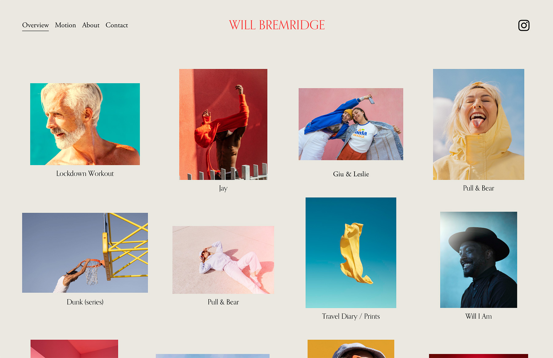
Will Bremridge’s website shows how simplicity can still feel dynamic. The homepage greets you with a grid layout where some thumbnails are animated, giving it a dynamic vibe from.
The background design in the header and footer is consistent throughout (including the base), giving the whole site a seamless look.
Project pages follow the same grid style but feature much larger thumbnails, which grab your attention right away.
One interesting choice is the lack of a lightbox feature, so you can’t click to view the images in more detail. While this might be a missed opportunity to showcase the full-size photos, it also keeps the site experience ultra-clean and uncluttered.
Overall, Will B’s site is a terrific example of how you can stick to the basics while still achieving an outcome that will turn heads.
Why did we choose this photography website?
We chose Will Bremridge’s site for its dynamic approach to minimalism, with animated thumbnails in a clean grid layout that amazes without feeling stuffed.
The consistent background design ties everything together, letting the photography shine more.
8. O’Shane Howard

- Built with
- Webflow
- Checked
- August 2026
- Palette sampled from the page
- #2E1E02#8B5503#6C3002#C38703#FDF213
Oshane Howard’s website rocks a vivid yellow aesthetic that instantly sparks curiosity.
It features a responsive grid layout that reacts to your cursor, highlighting thumbnails on hover in a playful way.
Scrolling feels immersive, drawing you further into the portfolio without any clunky navigation.
Internal pages switch to a black background, but the signature yellow detailing remains, creating a striking contrast.
This design choice keeps the brand identity cohesive while allowing each project to excel individually.
Overall, it’s a fantastic example of how color and interactivity can create a fun, memorable photography site.
Why did we choose this photography website?
We chose Oshane Howard’s site for its yellow color scheme and playful grid layout, which immediately grabs your interest.
Also, the contrasting internal pages are a pleasant surprise that makes browsing through projects even more adventurous.
9. Pontus Rudolfson

- Built with
- Custom build
- Checked
- August 2026
- Palette sampled from the page
- #FFFBF5#644C40#C0B6AF#EB3B0A#25212F
Pontus Rudolfson’s website is no ordinary photography website.
It has a unique, centered title and clear CTA buttons that lead you to the About and Contacts pages.
Above and below that title, you’ll find a tidy grid layout of projects, making it easy to jump into his work.
The three-column grid has a smooth, animated effect that adds a subtle sense of motion while you scroll.
Once you click through to a project, you’re greeted by the images, with quick project info placed above the fold.
This setup lets you focus on the visuals, with the photographs doing all the talking.
It’s a balance of minimalism and interactivity that ensures the user experience is easy and engaging.
Why did we choose this photography website?
We chose Pontus Rudolfson’s site for its unique homepage structure – featuring a centered title with clear CTAs and an animated three-column grid above and below.
10. Cristina Gómez’s

- Built with
- Custom build
- Checked
- August 2026
- Palette sampled from the page
- #EBEBEB#848484#171616#555453#9C9897
Cristina Gómez’s website entertains you with a stylish, dark preloader that sets the mood from the start.
Once inside, you’ll see a large above-the-fold section with her photo centered and her name displayed at the bottom, giving it a personal touch.
The floating, transparent header is a cool detail that lets you see more of the imagery as you scroll.
Large sections dedicated to text, images, and behind-the-scenes video clips add a layered storytelling vibe, letting you in on her process.
Parallax scrolling weaves everything together nicely, creating a sense of depth and movement.
Cristina’s site is an experience that combines wonderfully clean design with a warm, personal feel.
Why did we choose this photography website?
We chose Cristina Gómez’s website because it instantly draws you in with its attention-triggering first impression, personal touches, and layered storytelling.
The floating header, parallax scrolling, and behind-the-scenes videos create an intimate, unforgettable experience.
11. Dennis Berti
- Built with
- Adobe Portfolio
- Checked
- August 2026
- Palette sampled from the page
- #E0E0E0#000000#FFFFFF#383838#626262
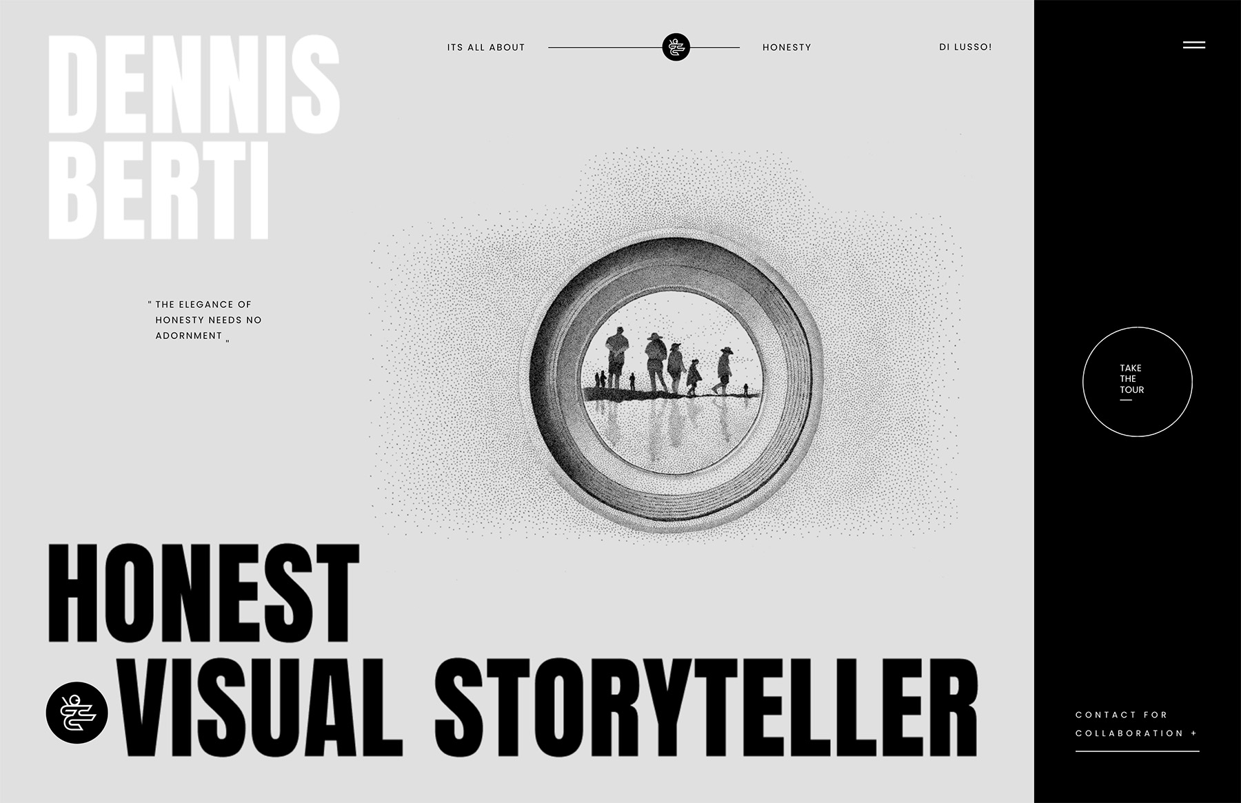
Dennis Berti’s website’s entire home page is above the fold, allowing visitors to engage with it without scrolling.
Animated elements add a dynamic touch, enhancing the visual appeal of black-and-grey while maintaining efficiency.
The full-screen menu overlay provides consistent navigation, so you can get to the desired section much more easily.
A minimalist vertical slider with a counter allows visitors to browse his portfolio, ensuring each image receives rich attention.
Additionally, the About page features special effects that make it informative and visually captivating.
This combination of clean design and interactive features creates a memorable user experience, making Dennis Berti’s website a superb example of photography website design.
Why did we choose this photography website?
We chose Dennis Berti’s website for its unfussy black-and-grey design and animated elements that engage visitors without requiring scrolling.
The seamless full-screen navigation, intuitive vertical slider, and well-crafted About page provide an enjoyable browsing experience.
12. Nordica Photography
- Built with
- WordPress
- Checked
- August 2026
- Palette sampled from the page
- #2F2F2F#474747#848484#6E6E6E#E7E7E7
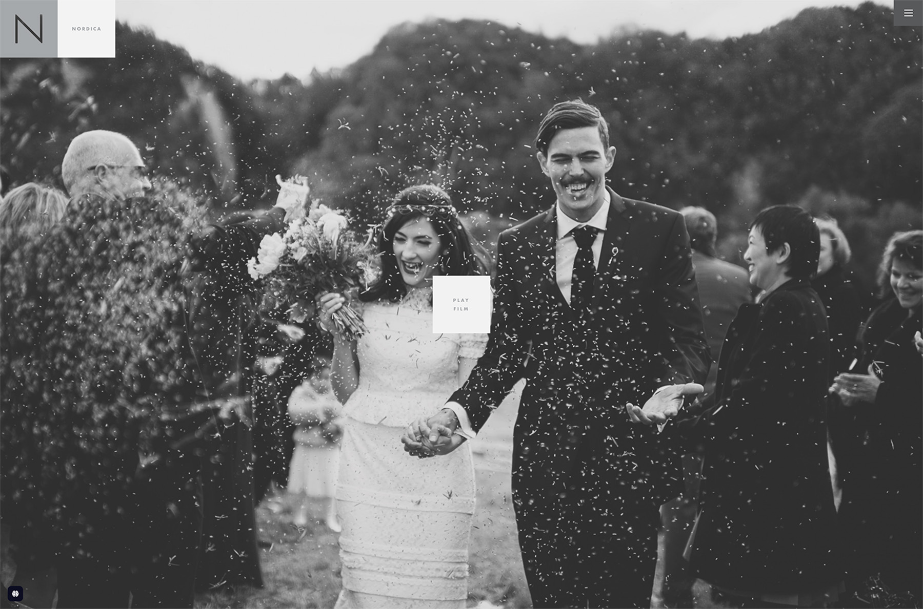
Nordica Photography’s website impresses with its full-screen above-the-fold section that immediately immerses visitors in stunning, high-res images.
The minimal sticky header, featuring a hamburger menu icon on the right, ensures navigation is always accessible. And when activated, the navigation slides in from the right, maintaining the site’s clean and uncluttered look.
Large images are prominently displayed throughout, showcasing the work in all its glory.
Each project page is exceptionally detailed, providing visitors with in-depth insights and context behind the photographs, which enriches the overall storytelling.
The light, simple footer offers additional links and social media icons in a subtle way, ensuring easy access without overwhelming the main content.
This balance of minimalism and functionality makes the website a must see.
Why did we choose this photography website?
We chose Nordica Photography’s website for its full-screen imagery and seamless navigation.
Also, we like the detailed project pages and unfussy design, which effectively showcase the work while maintaining a clean and professional visual appeal.
13. Erik Almås
- Built with
- Custom build
- Checked
- August 2026
- Palette sampled from the page
- #271B28#DAC5B6#976D5D#B4A091#443939
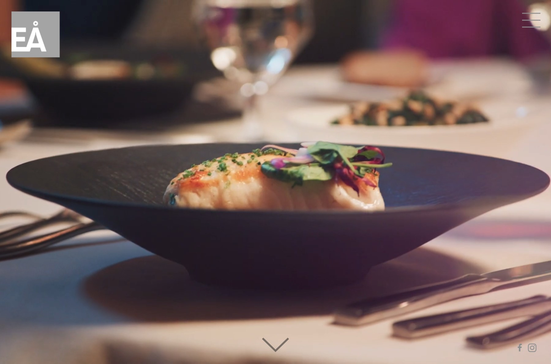
Erik Almås is a Norwegian-born commercial photographer based in San Francisco, and his site opens on full-screen motion rather than a still.
The interface is stripped back to almost nothing: a small monogram tucked in the top-left corner and a hamburger in the top-right. A single chevron at the bottom is the only prompt to keep going.
Scroll past the hero and the page opens into a three-column grid of category tiles — Campaigns, Travel, Lifestyle, Flight, Portraits, Landscapes and Yoga — each captioned in small, widely spaced uppercase type beneath the image.
Organising by subject rather than by client is the clever part. A prospective art director can go straight to the genre they are hiring for instead of digging through a list of project names they may not recognise.
Why did we choose this photography website?
We chose Erik Almås’s site for the contrast between the cinematic opening and the calm, orderly grid underneath. It gives you the emotional hit first, then hands over control.
The captions deserve credit too — they are small and quiet, so they label the work without ever competing with it.
14. Dean Bradshaw
- Built with
- Semplice
- Checked
- August 2026
- Palette sampled from the page
- #F5F5F5#0A0E11#4D686C#9CA79A#CFDED3
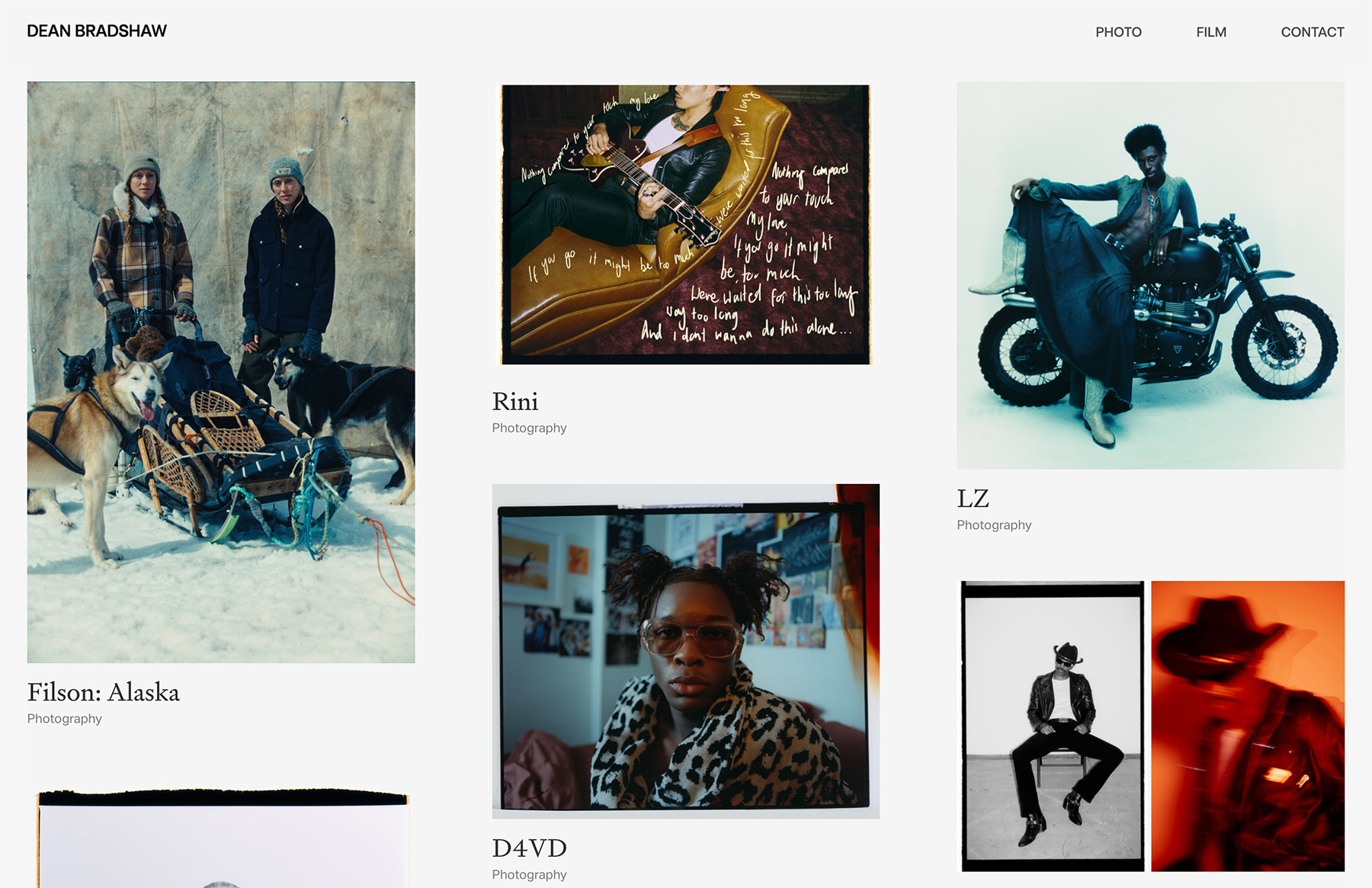
Dean Bradshaw’s website intrigues visitors with its dynamic grid layout on the homepage, mixing static and animated thumbnails.
The consistent background color across the entire site (except the contact page) in the header and footer provides a unified, professional look.
Moreover, a convenient back-to-top button makes navigation easy, allowing users to effortlessly explore the portfolio.
On project pages, photography takes center stage by eliminating text, allowing the images to communicate their stories and emotions.
The contact page features a concise bio alongside references from notable companies with whom Dean has collaborated, which adds credibility and trust.
By prioritizing visuals and functionality, Dean Bradshaw’s website effectively shows how to present a professional photography portfolio online.
Why did we choose this photography website?
We chose Dean Bradshaw’s website for its unified design, effortless navigation, and focus on letting the photography speak for itself.
15. Jessica Chou
- Built with
- Squarespace
- Checked
- August 2026
- Palette sampled from the page
- #FFFFFF#F2D9C2#170E0D#511410#801C16
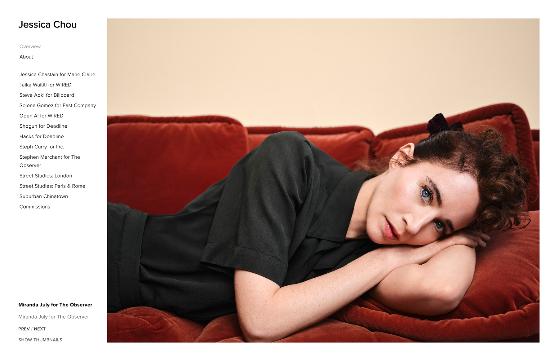
Jessica Chou’s website has a handy left sidebar navigation, offering an accessible way to explore different sections without messing with the main view.
The homepage has a stunning image slideshow that seamlessly transitions between her best photographs, creating an immediate visual impact.
Switching the slideshow view to a grid layout provides users a versatile browsing experience catering to different viewing preferences.
The site’s minimalist design ensures that each photograph is prominently showcased, free of unnecessary distractions, and effectively highlights Jessica’s artistic vision.
This clean aesthetic enhances the website’s visual appeal and improves its UX.
This beautiful website is made using Squarespace’s drag-and-drop website builder.
Why did we choose this photography website?
We chose Jessica Chou’s website for its unique left sidebar navigation and versatile portfolio options, allowing users to switch between an image slideshow and an organized grid layout.
16. Christina Hohner

- Built with
- WordPress
- Checked
- August 2026
- Palette sampled from the page
- #FFFFFF#C3C5C0#61564B#78736C#29221D
Christina Hohner’s website dazzles with its vibrant, contemporary design, instantly energizing and delighting visitors.
The hero section features a randomized image collage, with one image animated, effortlessly capturing attention and setting a dynamic tone right from the start.
Large background image sections throughout the site create an immersive experience, allowing each photograph to breathe and resonate with viewers.
The lightbox gallery enhances user interaction by enabling seamless, in-page image viewing without leaving the page.
With a rich collection of wedding photos, the site beautifully showcases Christina’s expertise and emotional storytelling through her lens.
Additionally, the integrated Instagram feed keeps the content fresh and connected, offering a real-time glimpse into her latest work and social presence.
Why did we choose this photography website?
We chose Christina Hohner’s website for its vibrant contemporary design, animated hero collage, immersive imagery, interactive lightbox gallery, and integrated Instagram feed.
17. Liller Photo
- Built with
- Showit
- Checked
- August 2026
- Palette sampled from the page
- #FFFFFF#313130#4D4C4C#121415#A09D9A
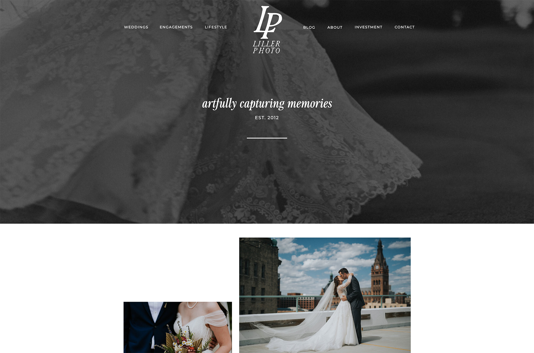
Liller Photo’s website mesmerizes visitors with its distinctive scrolling effect that elegantly fades out the hero section, ensuring a fluid transition into the main content.
The floating, transparent navigation keeps all necessary links always within reach, without the need to scroll back to the top.
A dynamic testimonials slider provides authentic client feedback, enhancing credibility and engagement.
The page also features a large image slider that showcases Liller’s stunning work by category, allowing each photograph to come front and center.
What’s also very handy is the detailed contact form, making it easy for potential clients to get in touch.
Additionally, an active blog keeps the site fresh with regular updates and insights, fostering a deeper connection with visitors.
Why did we choose this photography website?
We chose Liller Photo’s website for its dynamic testimonials, prominent image sliders, detailed contact form, and active blog. (Hint: if you start a blog, keep it active, or it’s better not to start it first.)
18. Elena Iv-Skaya
- Built with
- Custom build
- Checked
- August 2026
- Palette sampled from the page
- #FDFAF5#E29A6B#BCC7BA#E2DFCD#BE1023
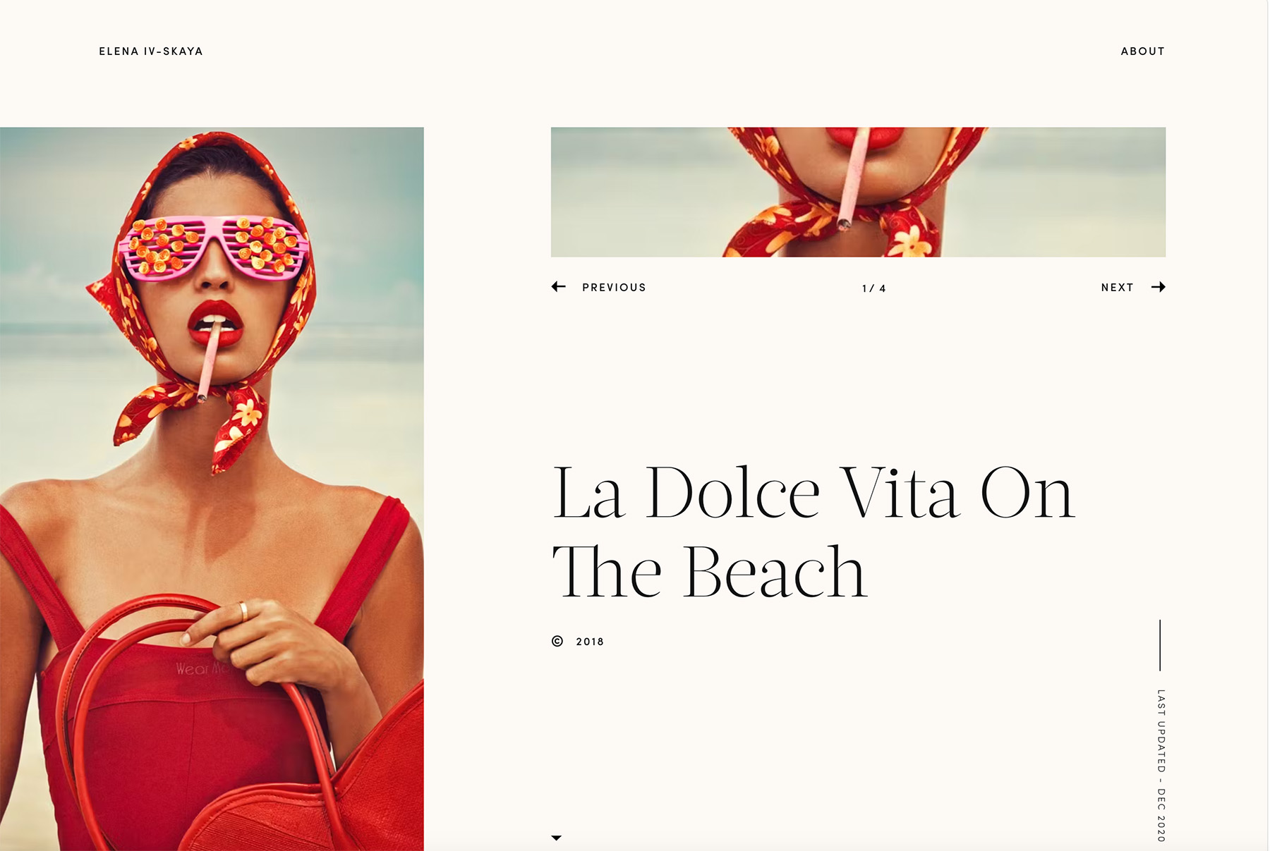
Ivskaya’s website captivates with a one-of-a-kind full-screen slider that instantly submerges visitors in stunning visuals.
The homepage features a unique single-column layout that dynamically randomizes, offering a fresh and engaging experience.
Seamless, elegant transitions between pages enhance overall navigation, making the site’s journey flow better.
The About page breaks the mold with its bold, dark design, creating a striking contrast that highlights Ivskaya’s personal story and artistic vision.
This bold choice not only draws attention but also adds depth and sophistication to the site’s aesthetic.
Why did we choose this photography website?
We chose Ivskaya’s website for its unique full-screen slider and dynamic single-column layout, which deliver a fresh visual experience.
19. Foudamour

- Built with
- Webflow
- Checked
- August 2026
- Palette sampled from the page
- #B2C1BA#B6836B#E6E5E8#383125#B89F8D
Fou Damour’s website distinguishes itself with its sleek, minimalist design and intuitive navigation.
The simple sticky hamburger menu in the upper-left corner remains accessible as you explore, ensuring effortless navigation throughout the site.
One standout feature is the innovative slider-style image presentation above the fold; you should check it out.
As you scroll past the initial section, the background seamlessly changes, adding depth and visual interest to the browsing experience.
Accordion-style FAQs keep the information organized and easy to navigate without cluttering the page.
Overall, Fou Damour’s website exemplifies how modern design techniques can enhance the presentation of a professional photography portfolio.
Why did we choose this photography website?
We chose Fou Damour’s website for its cool slider-style image presentation, seamless background transitions, and the sticky hamburger menu and organized accordion FAQs.
20. Jonathan Glynn Smith
- Built with
- Custom build
- Checked
- August 2026
- Palette sampled from the page
- #F5F5F5#8A887C#A1A198#D0CABE#524A40
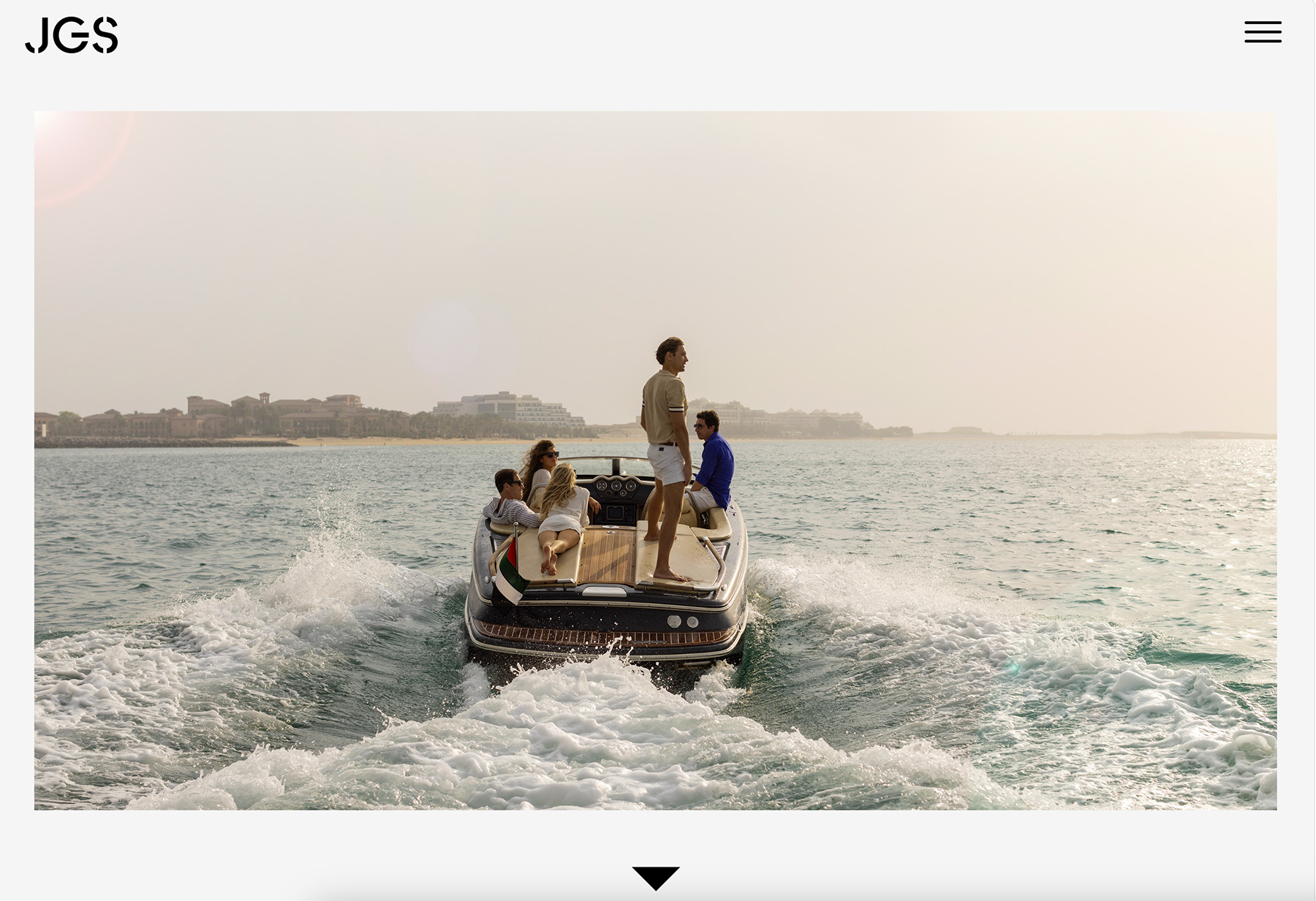
Jonathan Glynn Smith’s website sparks interest with a full-screen image and a video slideshow “preloader” that prepares you for even more content.
Upon entering, a slideshow above the fold showcases the photographer’s best work, creating an immediate and lasting impression.
The unique full-screen menu overlay offers handy navigation that blends with the site’s modern aesthetic.
As users scroll through the extensive homepage, they encounter a rich tapestry of high-quality images that invite exploration and appreciation.
The contact page continues the visual storytelling with a full-screen background image. It provides essential contact details, including a telephone number, an email address, and social media icons for Instagram and Twitter.
Why did we choose this photography website?
We chose Jonathan Glynn Smith’s website for its rich collection of high-quality images distributed on a long home page and its visually stunning yet basic contact page.
What’s even more exceptional is that you can create a similar website using a DIY website template for photographers.
21. Meiwen

- Built with
- Squarespace
- Checked
- August 2026
- Palette sampled from the page
- #F8F5EE#ABADA5#837659#D4D2C6#A29573
Mei Wensee’s website features a transparent header that smoothly fades out as you scroll and reappears when you return to the top. This makes the scrolling experience cleaner, but the practicality of the header/navigation remains.
Below the header, text introduces her before unveiling a collection of images; some feature subtle animations that add a dynamic flair without distracting from the photography.
The abundant white space throughout the site creates a clean and airy atmosphere, allowing each photograph to breathe more.
A substantial white footer provides essential information in a minimalist style, maintaining the site’s uncluttered aesthetic.
Additionally, the content gracefully loads as you scroll, ensuring a continuous, engaging navigation experience.
Why did we choose this photography website?
We chose Mei Wensee’s website for its seamless navigation, transparent, auto-hiding header, subtle animations and flush content loading.
22. Cassandra Ladru

- Built with
- Showit
- Checked
- August 2026
- Palette sampled from the page
- #212121#EFEFEF#353535#CACACA#AEAEAE
Cassandra Ladru’s website has a full-screen horizontal slider that automatically transitions between slides.
The transparent, minimalist header seamlessly integrates into the design, keeping the focus on the stunning visuals.
The overlaid hamburger menu maintains a clean appearance while providing easy access to different sections.
Each project page is meticulously crafted, featuring expansive lightbox galleries that allow visitors to immerse themselves in detailed, high-resolution images.
The abundance of photographs within each gallery showcases Cassandra’s talent and dedication, providing a comprehensive view of her work.
Cassandra’s website is a prime example of how caring design can create a memorable and impactful online photography portfolio.
Why we chose this photography website?
We chose Cassandra Ladru’s website for its full-screen slider and minimalist design, which beautifully showcase her photography.
The immersive galleries and uniform navigation create an emotional bond, making it a standout portfolio.
Live demos
The principles above are easier to see in a finished site than to read about. These five are ours, and each one applies them differently depending on who the photographer is selling to.
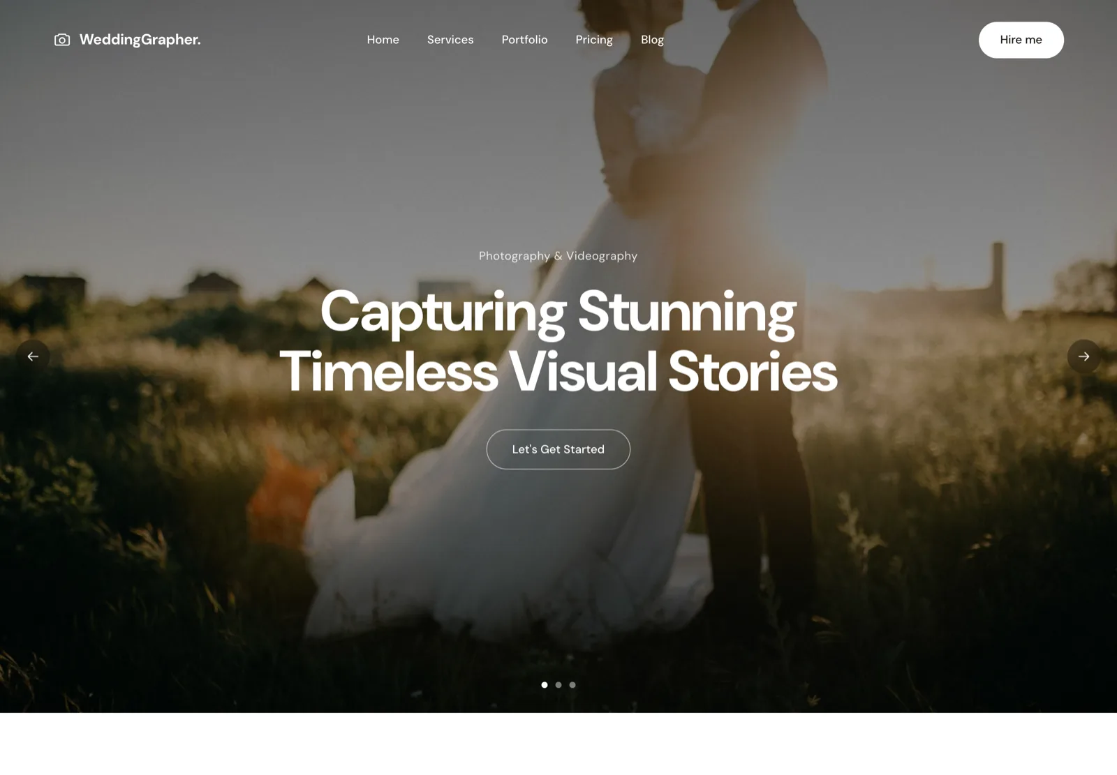 WeddingWeddingGrapher.Hero slideshow, packages, enquiry form.Open live demo →
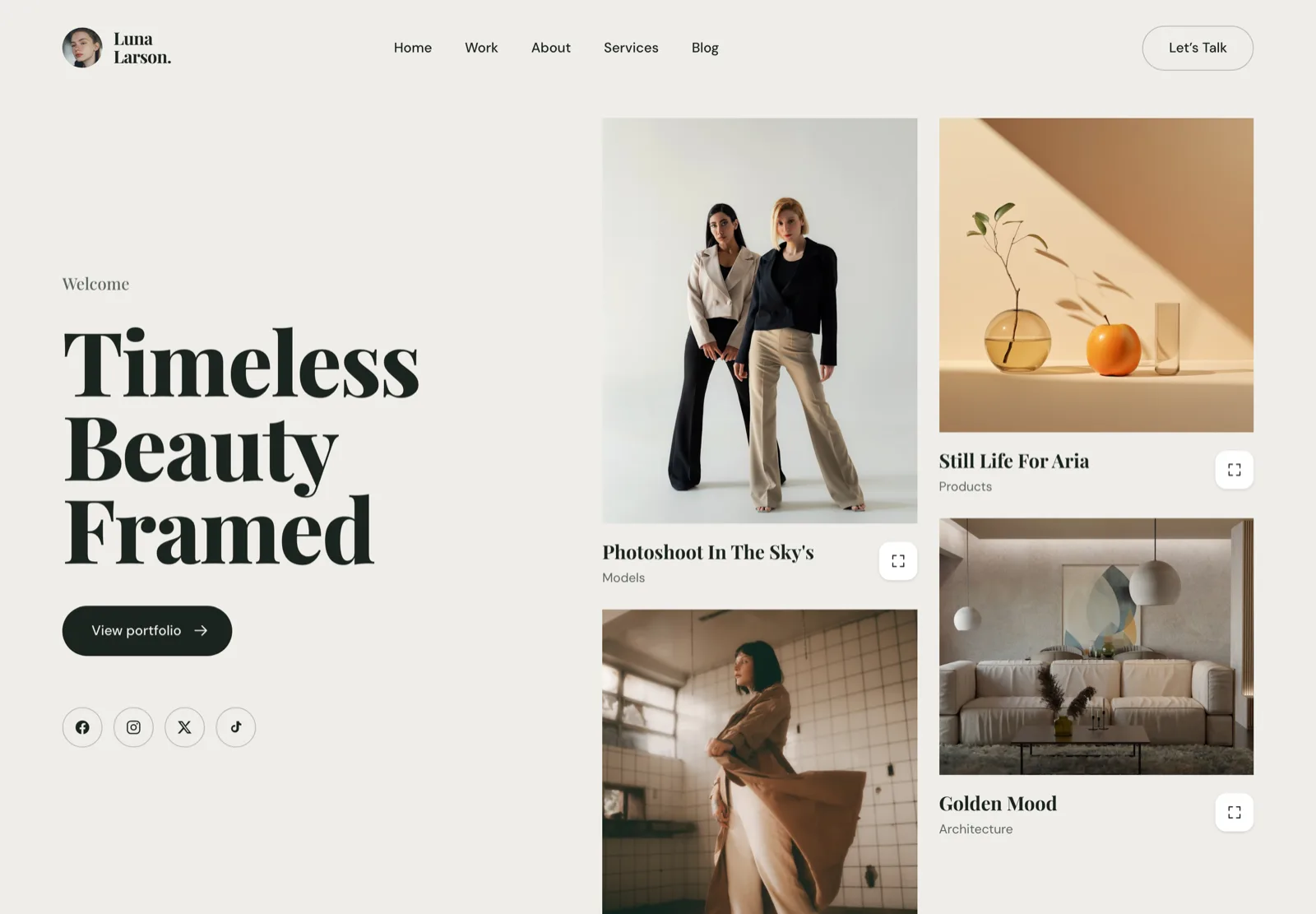 Fashion & editorialLuna Larson.Editorial type and a portfolio-first grid.Open live demo →
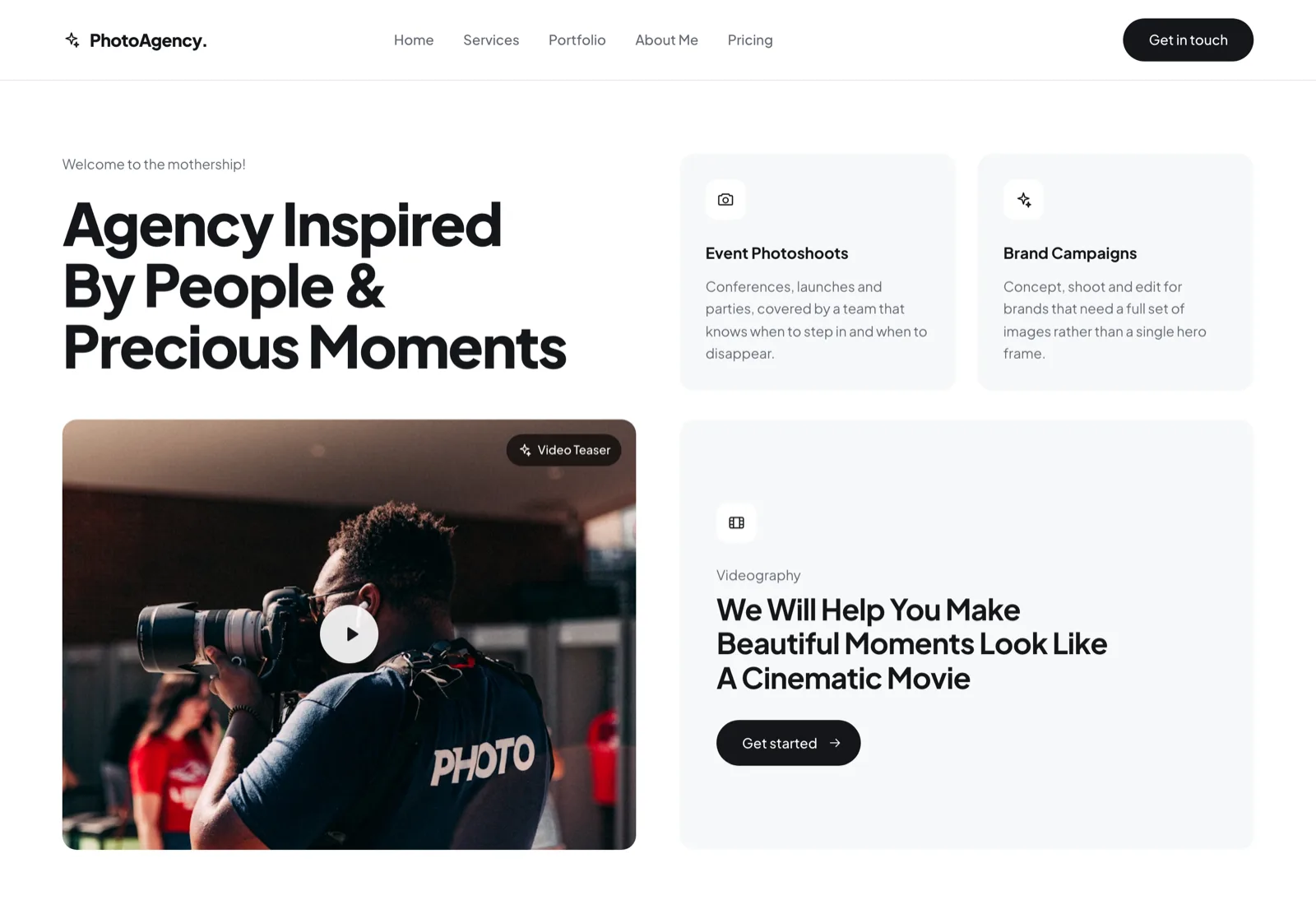 Studio & agencyPhotoAgency.Bento layout, client logos, service tiers.Open live demo →
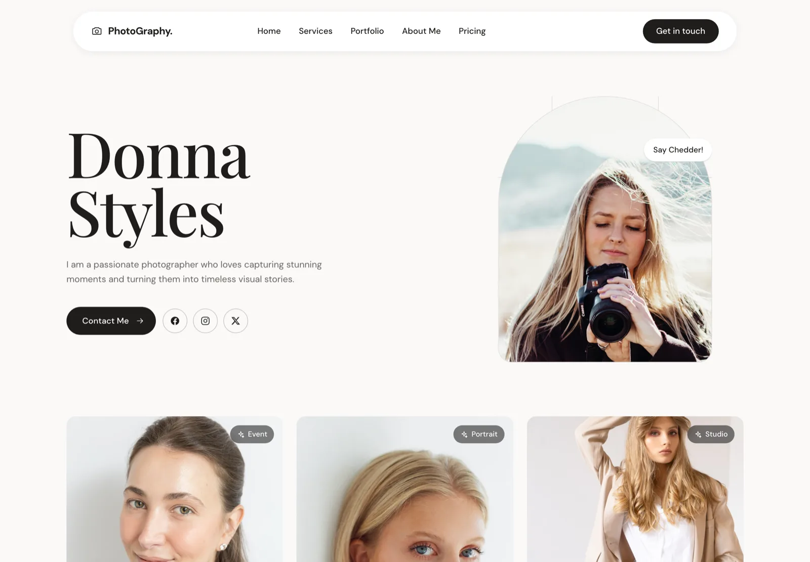 Portrait & eventDonna StylesPortrait-led, personal, direct contact.Open live demo →
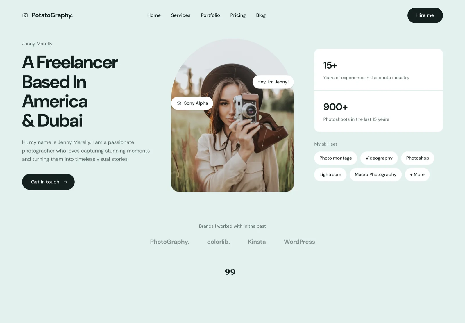 Solo freelancerPotatoGraphy.One scroll, one story, one call to action.Open live demo →
Want one of these with your own photographs in it? See website design for photographers, or browse all five demos.
What Makes A Great Photography Website?
A great photography website isn’t just about aesthetics.
It’s about delivering a smooth, engaging experience that converts visitors into clients.
1. High-Quality Imagery:
- Displays crisp, high-quality photos that look professional and clear, without blurry or pixelated details.
- Uses full-screen backgrounds, grids, and galleries for a polished look.
2. Simple, Intuitive Design:
- Clean, minimal layouts that let the photography take center stage.
- Logical, simple navigation with well-structured categories and an easy-to-find menu.
3. Fast Load Times:
- Optimized images that load quickly without sacrificing quality.
- Lazy loading to improve performance while keeping the experience flawless.
4. Mobile-Friendly Experience:
- Fully responsive layouts that adjust seamlessly to any screen size are a must.
- Mobile pages must also be fast-loading on mobile because mobile users are more impatient than desktop users.
- Optimized performance for quick access on slower networks.
5. Strong Personal Branding:
- A compelling “About” page that tells the photographer’s story.
- Consistent color schemes, typography, and branding elements that reflect their unique style.
6. Clear Contact & Booking System:
- Easy-to-find contact forms and booking buttons.
- Integrated calendars or scheduling tools to streamline client bookings are a big plus.
Every website on this list was designed by somebody. If you would rather have that done than do it yourself, we offer website design for photographers — five ready-made designs from $2,100, or a fully custom build from $3,500.
How heavy are these websites, actually?
Out of curiosity we measured how heavy sixteen of these homepages actually are. The spread is enormous — and on several of them the photographs are not what makes the page slow.
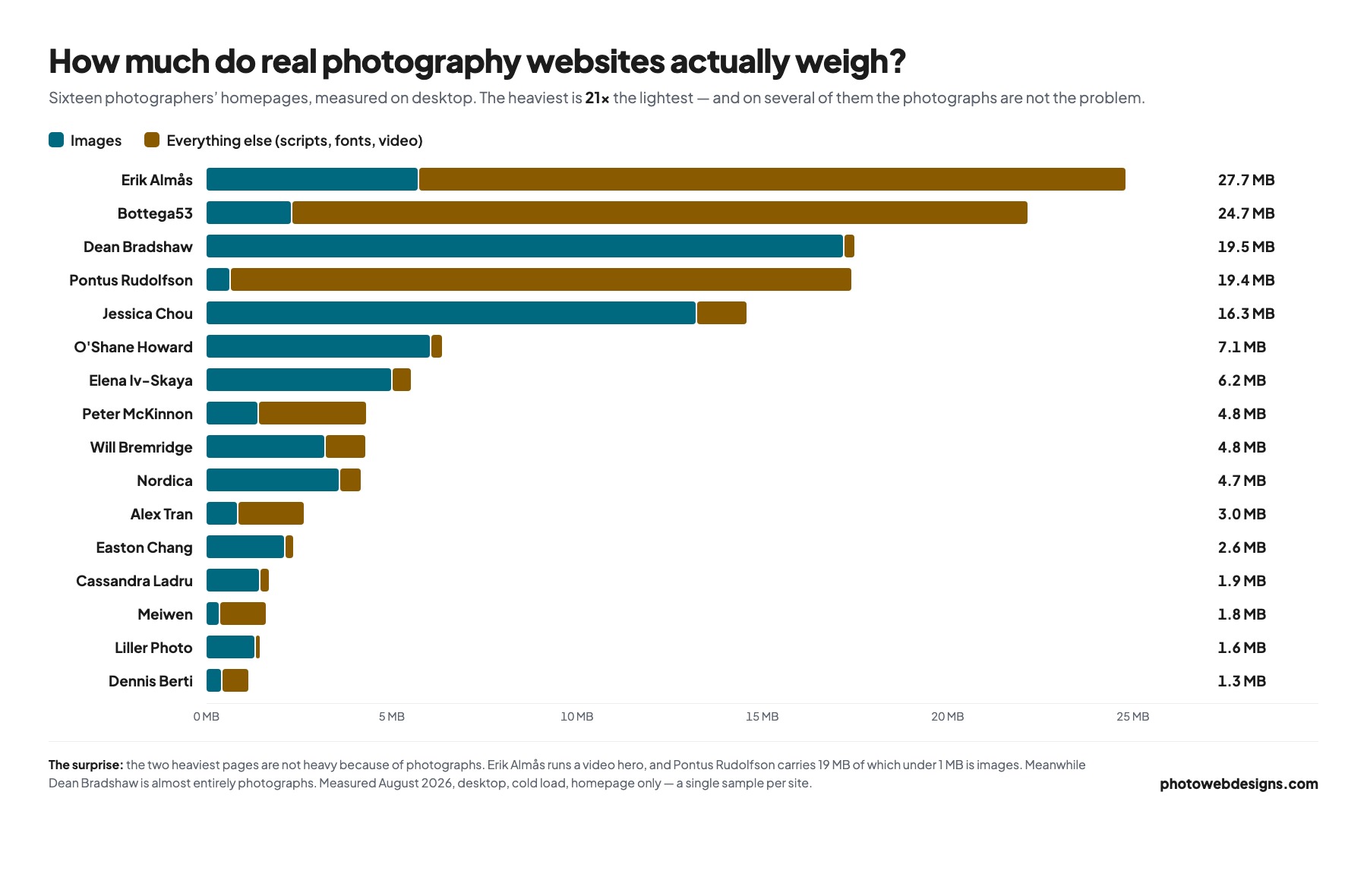
If your own site sits at the heavy end of that chart, our guide to speeding up a photography website covers what to do about it.
Frequently asked questions
What makes a photography website good?
Speed, edit and clarity — in that order. The photographs have to appear before the visitor gives up, the selection has to be ruthless enough that every frame earns its place, and it has to be obvious within seconds what you shoot and how to book you. Beautiful sites that fail any one of those three do not convert.
How many images should a photography portfolio have?
Fewer than you want to include. Twenty to forty across the whole portfolio is normal for a working professional, split into two or three galleries by genre. Your portfolio is judged on its weakest image, not its best, so cutting is the highest-leverage editing you can do.
Do photographers still need a website if they have Instagram?
Yes. Instagram is rented ground — you do not control the ranking, the crop, the audience or whether the account survives a policy change. A website is the only place clients can find your prices, your process and your contact details without an algorithm in the way, and it is the only asset that shows up in Google.
What is the best platform for a photography website?
For most photographers it is Squarespace or Wix; for anyone selling prints or proofing to clients it is Zenfolio or Pixpa; for full control it is WordPress. We break down the trade-offs in the best photography website builders.
How fast should a photography website load?
Aim for a Largest Contentful Paint under 2.5 seconds on a phone. That is achievable with full-bleed photographs, but only if the images are properly sized and served as WebP or AVIF. Our guide to speeding up a photography website covers exactly what to change.
Working in a specific genre? We looked at fashion separately — see the best fashion photographer websites, where the design problem is different: art directors, not couples.
We also measured what these homepages actually do above the fold — see what a photography website homepage needs, where 38% turned out to have no h1 at all.