
Almost every list of photography website trends says the same eight things, and almost none of them checks whether photographers are actually doing any of it.
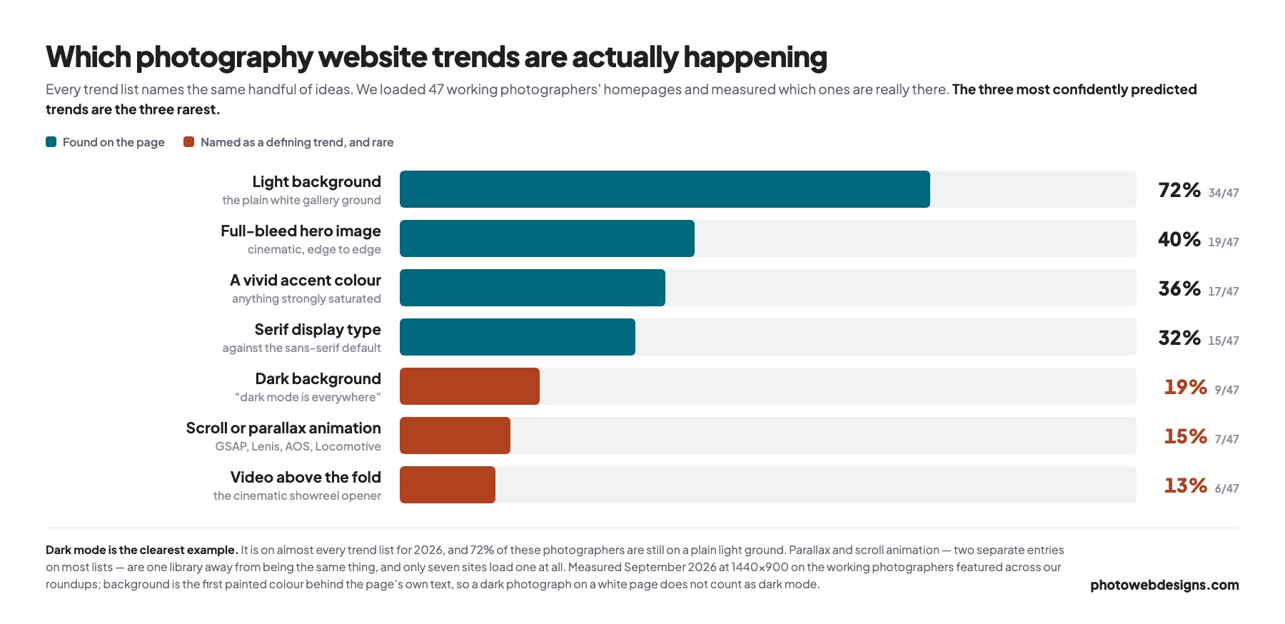
So we checked. We loaded the homepages of 47 working photographers — the ones featured across our best photography websites roundups — at desktop size, and measured what was really on the page.
Some of the trends are real, and the wider numbers are in our 2026 photography website statistics. Three of the most confidently predicted ones turn out to be the rarest things in the sample, and the genuine trend is one that no list names, because it does not look like a design decision at all.
Which Trends Are Actually Happening
The eight sections below take each trend in turn, with what we measured, and whether it is worth your time.
1. Dark Mode & High-Contrast Aesthetic
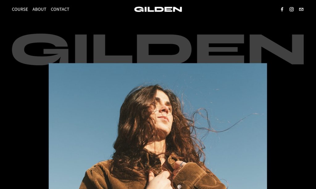
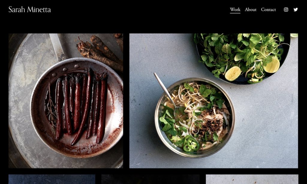
Measured: 9 of 47, or 19%. Dark mode is on every trend list for 2026 and it is the minority choice by a wide margin — 72% of these photographers are on a plain light ground, and the rest sit somewhere between.
That is not an argument against it. A dark ground genuinely does make images sit forward, and it suits moody, dramatic and black-and-white work particularly well. It is an argument against choosing it because you were told it was the direction of travel. It is not.
One caution the trend lists skip: dark backgrounds make body text harder to read at small sizes, so if your site carries real copy — and for search it should — test it at a phone size before committing.
2. Minimalist Layouts With A Lot Of White Space

This one is real, and then some. The median homepage in our sample carries 182 words in total — the entire page, not the visible part. The median number of images visible before scrolling is four, and the median navigation is three links.
Minimalism is not an emerging trend among photographers. It is the established default, and the interesting question is no longer whether to adopt it but whether it has gone too far. In an earlier study of the same sample we found 38% of these homepages have no h1 at all, which is minimalism applied to the one element search engines rely on.
Keep the restraint in the layout. Do not extend it to the words, because 182 of them is not enough for Google to work out what you shoot or where.
3. Cinematic Full-Screen Images & Videos
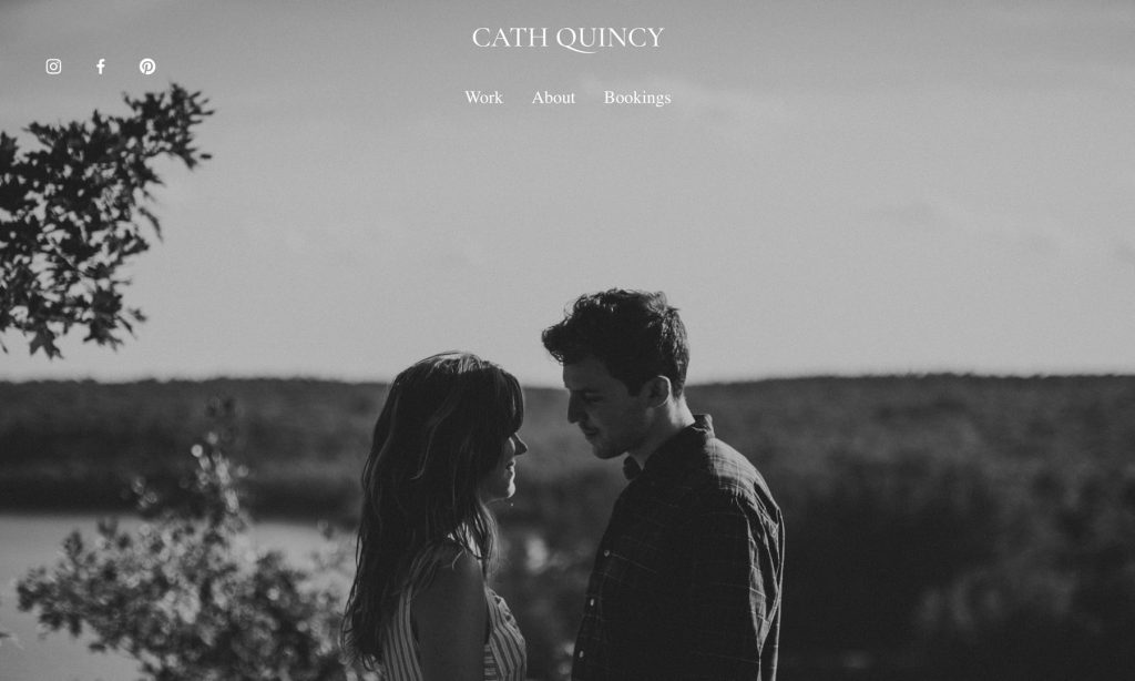
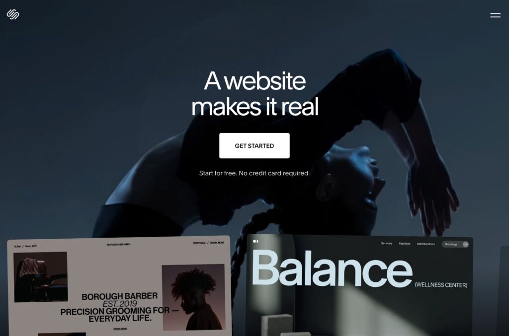
Measured: full-bleed hero on 19 of 47 (40%); video above the fold on 6 of 47 (13%). The cinematic opener is the single most recommended idea in this category and fewer than half of these photographers use it.
The full-screen hero also has a cost that the trend lists rarely mention: it is almost always the largest element on the page, so it is what Google measures as your Largest Contentful Paint. A slow one drags your whole performance score down. And it shows exactly one photograph, which is a strange opening move for a portfolio.
Use it when one frame genuinely is the argument — a recognisable campaign, or an image that sets the emotional register on its own. Otherwise a grid of four to eight shows range in the same space and each file loads faster.
4. Interactive Scrolling & Parallax Effects

Measured: 7 of 47, or 15% — counting any site loading a scroll-animation library such as GSAP, Lenis, AOS or Locomotive Scroll. It is the rarest thing on this list apart from video.
Parallax is the trend with the longest gap between how often it is recommended and how often it is used, and there is a reason for that. It adds JavaScript to the critical path, it frequently misbehaves on phones, and it competes with the photographs for the visitor’s attention. Photographers who try it often quietly remove it.
If you want it, keep it to one moment on the page rather than a whole-site behaviour, and check it on a mid-range Android before you ship it.
5. Asymmetrical Layouts & Bold Typography
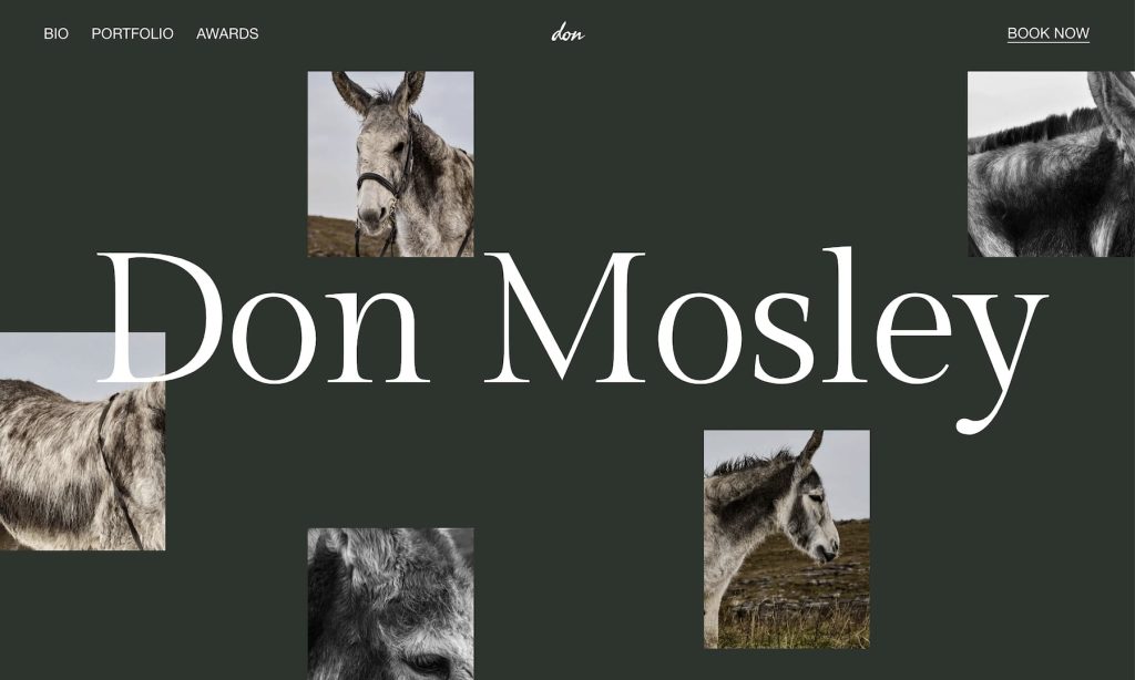
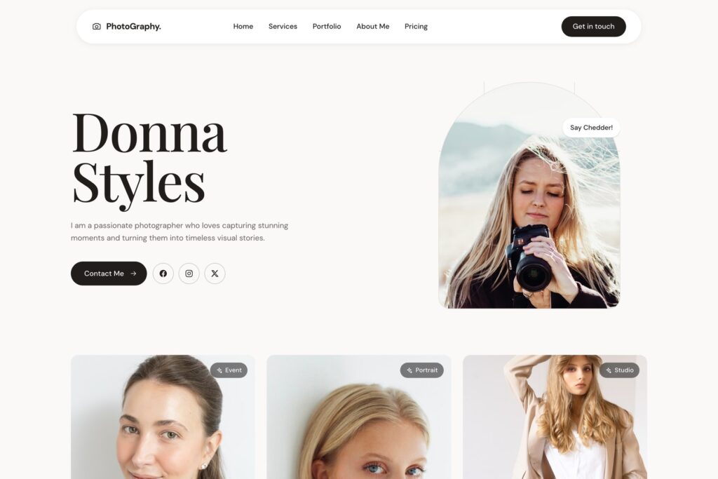
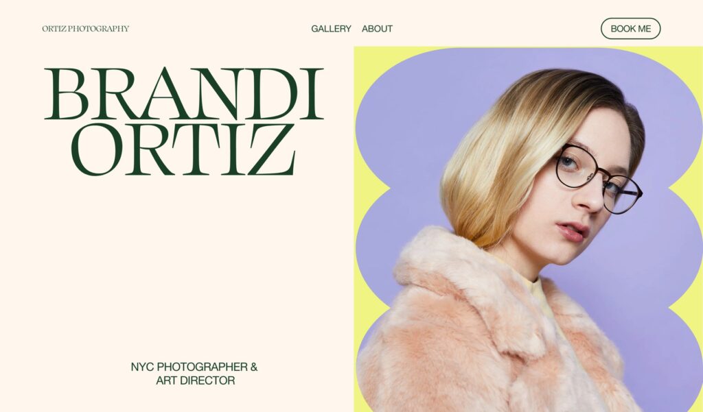
Measured: of the 28 sites with a heading visible before scrolling, the median headline is 42 px and 12 set it at 48 px or larger. So genuinely large display type is a real but minority choice, on roughly four sites in ten of those that show a headline at all.
The more striking number is the other one: 19 of the 47 show no heading in the fold whatsoever. Bold typography cannot be your trend if you are not using typography.
A serif display face turned up on 15 of 47 (32%), which is the quiet counter-trend to a decade of sans-serif portfolios, and probably the more useful idea here if you want to look different from the template next door.
6. Immersive Storytelling With Scroll-Based Animations

Measured: the same 15% as trend four, because in practice they are the same thing — both are a scroll-animation library, and most lists count them twice to reach a round number.
Where it does earn its place is a project page rather than a homepage: a single wedding or a single commission, told in sequence, with the images revealed as you move through it. That is storytelling with a beginning and an end. A homepage rarely has either.
7. Thin Line Elements & Delicate Borders
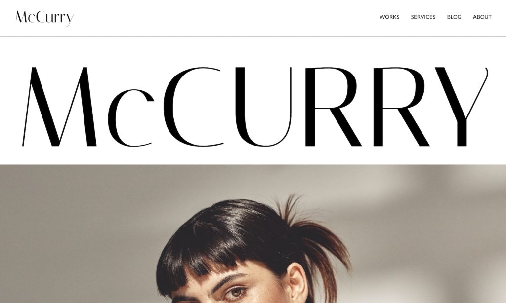
This is the one trend on the list we could not put an honest number on. Hairline rules and delicate borders are real design decisions, but they are indistinguishable in the markup from a hundred other one-pixel edges, so any figure we gave you would be measuring the wrong thing.
What we can say is that it belongs with trend two rather than standing on its own. Thin rules are a minimalist device: they separate without adding weight, and they only read as deliberate on a page that is already quiet. On a busy layout they disappear.
8. Strong Color Detailing & Vibrant Accents
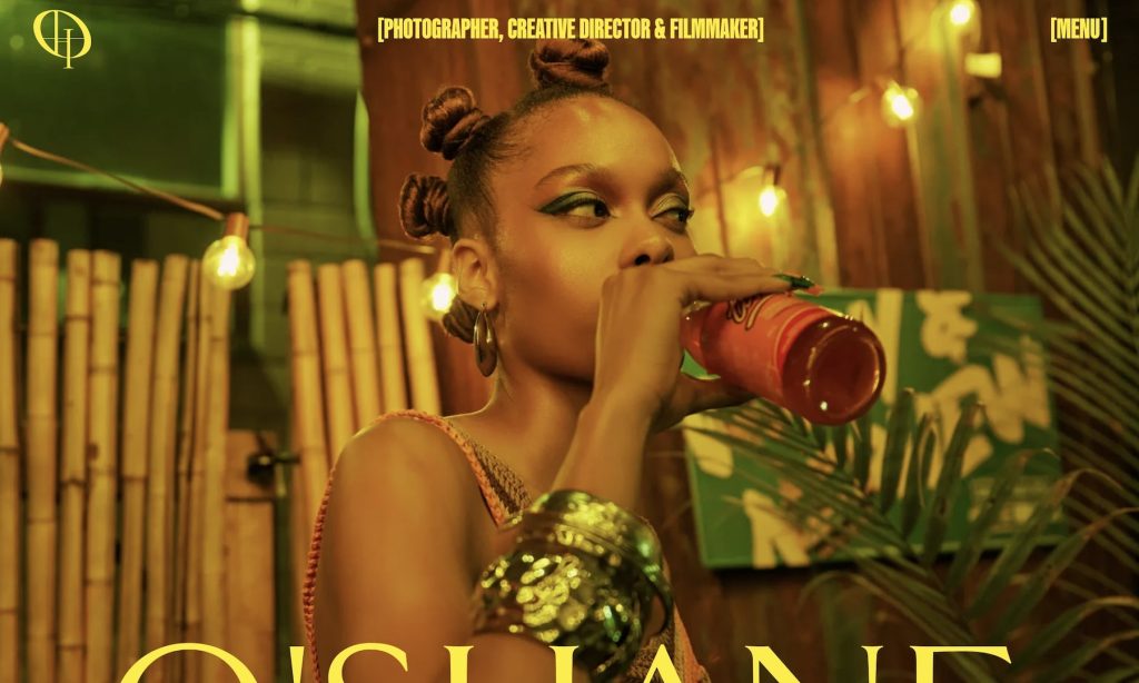
Measured: 17 of 47, or 36%, use a strongly saturated colour anywhere in the fold. Just over a third — which makes this the most widely adopted of the trends that are actually about decoration rather than layout.
It works because it is cheap and reversible. One accent on the buttons and links gives a white-ground portfolio a personality without touching the photographs, and you can change it in an afternoon. The failure mode is using a colour that fights your work: if you shoot warm, a cold accent will make every image look wrong and you will blame the images.
The Trend Nobody Lists
Put the measurements together and the same picture keeps appearing. The median homepage in this sample has 182 words, four images above the fold, three navigation links, and a 38% chance of having no h1. Photographers have spent a decade removing things from their websites, and they have been rewarded for it aesthetically.
The cost lands somewhere else. A page with 182 words gives a search engine almost nothing to understand, which is why so many beautiful photography sites are invisible for the searches that would actually bring them work — the city, the speciality, the price bracket.
If you want one trend to act on from this page, it is not on any of the lists: keep the design as spare as you like and put the words back. An h1 that names what you shoot and where, a paragraph that reads like a person wrote it, and captions that say who and where. None of it disturbs the photographs, and it is the difference between a portfolio people admire and one people find.
Practical Tips For Implementing These Website Trends For Photographers
Before implementing any of the mentioned trends, remember that not all suit every photographer.
Select elements that complement your brand and help you elevate your work.
Here are our tips:
- Start small: You don’t have to overhaul your entire website with these new trends at once. Begin by incorporating one or two that align with your brand and go from there.
- Optimize for speed: Features like parallax effects and full-screen videos look stunning but can slow down your website. Use image compression and caching to keep performance smooth. And for videos, use a YouTube link instead of uploading them directly to your website.
- Maintain balance: While bold typography and vibrant accents are eye-catching, too much can overwhelm your visitors. Use them strategically to create impact without distraction.
- Test on multiple devices: Ensure your (new) design elements look great and function without a hitch across all screen sizes, especially mobile.
- Keep navigation simple: Interactive scrolling and animations are engaging but should never complicate navigation. Visitors should always find what they need quickly and effortlessly.
- Stay consistent with branding: Whether you’re using dark mode, bold fonts, or asymmetrical/uneven layouts, ensure they align with your style.
- Stay true to your identity: With so many design trends emerging, it’s easy to get carried away and lose sight of your brand’s identity. While experimenting with new techniques, don’t deviate from your unique branding and artistic vision.
Want these trends applied to your own site? That is what we do — see website design for photographers.
Most of these trends are heavier than what they replace, which makes performance the constraint — see how to speed up a slow photography website.
Every trend above is applied in at least one of our five live demo sites, if you would rather see them working than read about them.
Several of these trends show up first in fashion — see the best fashion photographer websites for where they are already standard.