

Every guide to website speed tells you to compress your images. That advice is written for websites where images are decoration. On a photography website they are the product, and you cannot solve the problem by making them worse.
This is the version for photographers: what actually makes a portfolio slow, what to export from Lightroom, and how to tell whether any of it worked.
Why photography websites are slow in a particular way
A normal business website might carry 400 KB of images across a whole page. A photography homepage routinely carries fifteen to forty megabytes, because the photographer uploaded the same files they would send to a client.
Three things go wrong, and they are specific to this kind of site:
- The hero image is the slowest thing on the page and the first thing anyone sees. On most portfolios the full-bleed opening photograph is the Largest Contentful Paint element. Whatever that file weighs is, more or less, how long your site takes to feel like it has loaded.
- Galleries multiply the problem. Forty images at 3 MB each is 120 MB. Even lazy-loaded, a visitor who scrolls will pull all of it, and on a phone on mobile data they will simply leave first.
- Photographers upload print-quality files. A 4000 px JPEG exported for an album is roughly sixteen times the data of the 1000 px version the browser will actually display. The extra pixels are not visible. They are just slow.
None of that is fixed by turning quality down until the photographs look bad. It is fixed by sending the right size file in the right format, and not sending it before it is needed.
To put a number on it, we measured the homepages of sixteen photographers from our own best photography websites list. The heaviest came in at 27.7 MB and the lightest at 1.3 MB — a twenty-one-fold spread across sites that are all, by our own reckoning, good.
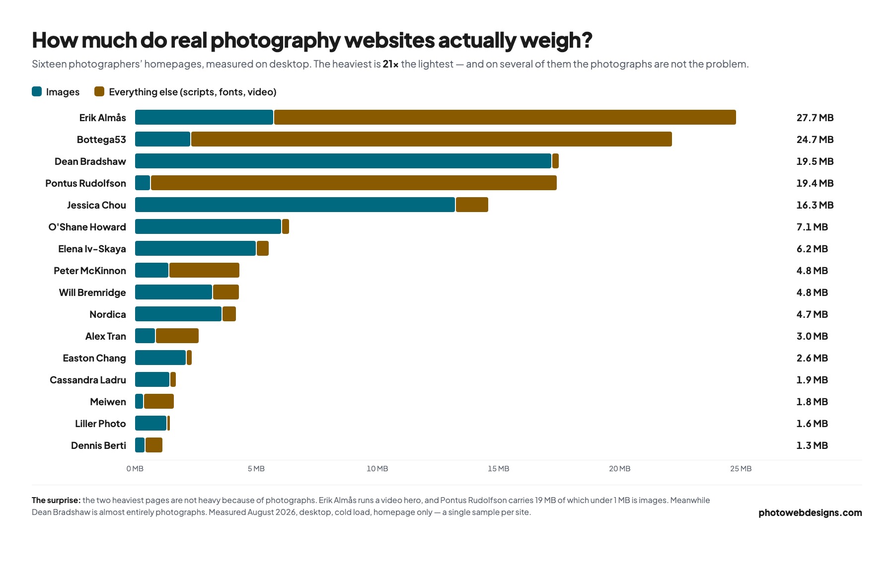
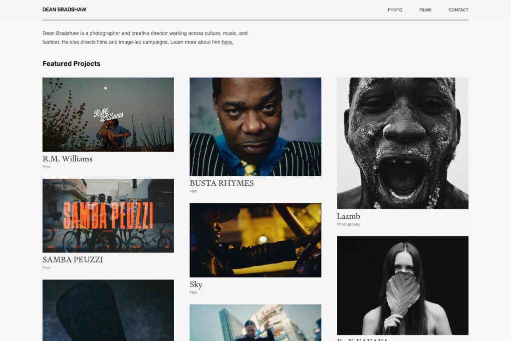
The useful surprise is in the split. On Dean Bradshaw’s site almost all the weight is photographs, so compressing images would fix it. But Pontus Rudolfson carries 19 MB of which under 1 MB is images, and Erik Almås opens on video — on those two, re-exporting every JPEG would barely move the number. Measure before you optimise, or you will spend an afternoon fixing the wrong thing. Speed is only one of the six things we found holding photography sites back — see the full list, measured.
Start in Lightroom, not on the website
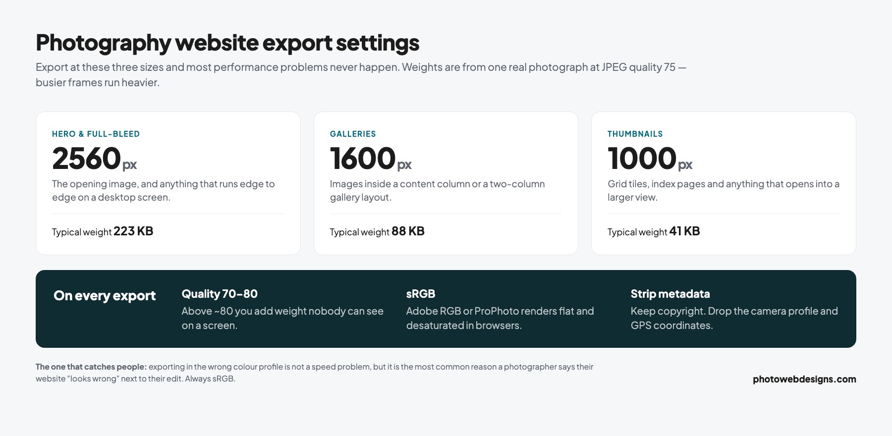
This is the step every generic guide skips, and it is the one that does the most work. If you export correctly, most of the rest becomes optional.
Export settings that work for the web
- Long edge 2560 px for full-bleed hero images and anything that goes edge to edge on a large screen.
- Long edge 1600 px for images inside a content column or a two-column gallery.
- Long edge 1000 px for thumbnails and grid tiles.
- Quality 70–80, not 100. Above about 80 you are adding file size that nobody can see on a screen.
- sRGB, always. Export in Adobe RGB or ProPhoto and your careful colour will render flat and desaturated in most browsers.
- Strip metadata except copyright. Lightroom will happily embed the entire camera profile and your GPS coordinates in every file.
A 2560 px JPEG at quality 75 usually lands between 400 KB and 900 KB depending on how much detail is in the frame. A busy forest scene will be near the top of that range; a portrait against a plain wall near the bottom. If your exports are coming out at 4 MB, something is set wrong.
The sRGB point catches more photographers than any of the others. It is not a speed issue, but it is the single most common reason a photographer says their website “looks wrong” compared to their edit.
That quality advice is the one photographers distrust most, so here is the evidence rather than the assertion. The same frame exported four ways, cropped to a detail and magnified so the compression is actually visible:
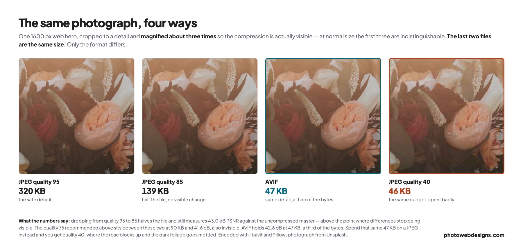
The third panel is the one worth sitting with. AVIF at 47 KB holds the same detail as a 320 KB JPEG. The fourth panel is the same 47 KB spent on a JPEG instead — the rose blocks up, the dark foliage goes mottled. It is not that small files ruin photographs. It is that the wrong format makes small files ruin photographs.
Use a modern format — but keep a fallback
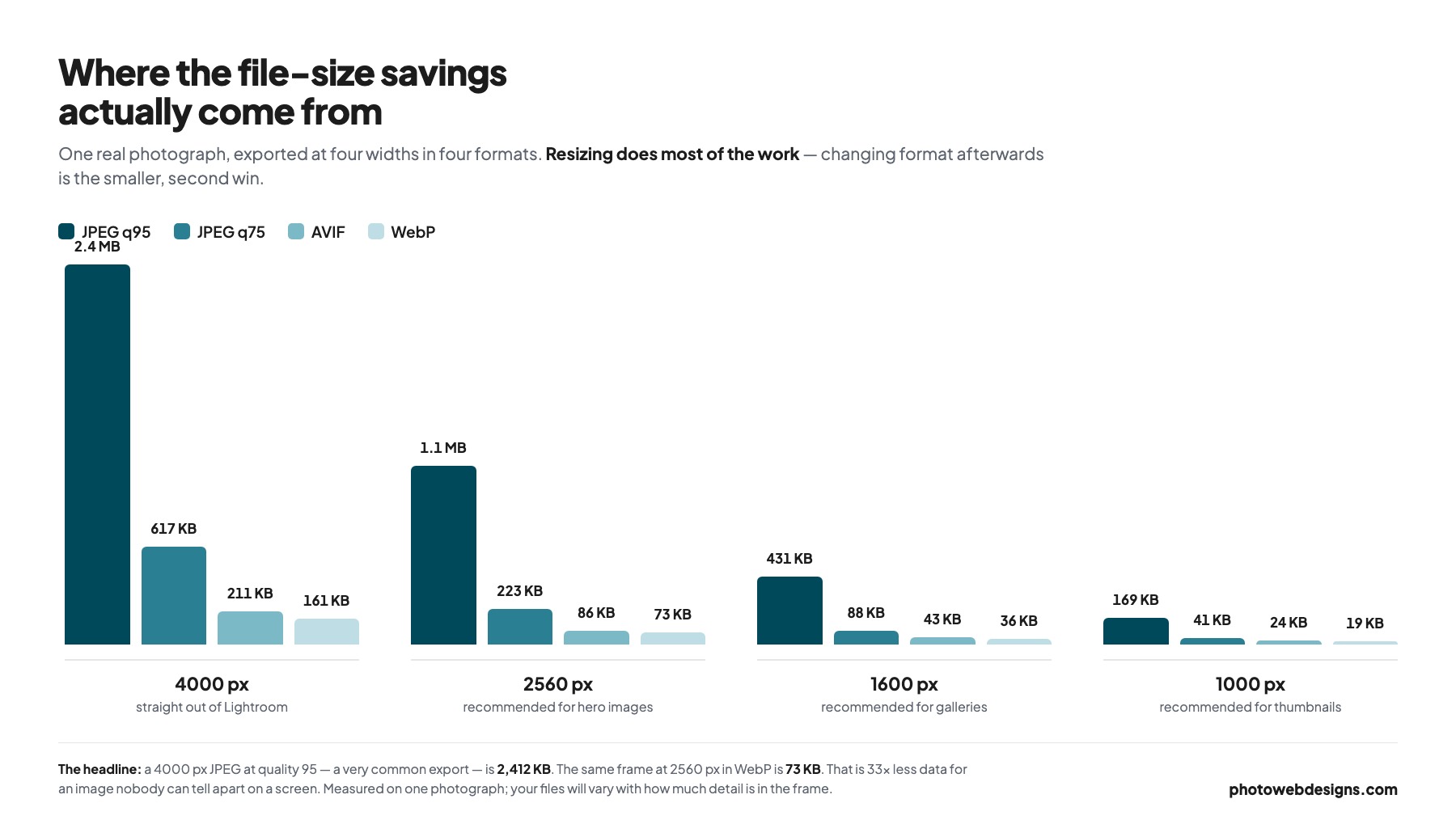
The chart above is one photograph, but the pattern holds: at 2560 px the same frame came out at 223 KB as a JPEG, 73 KB as WebP and 86 KB as AVIF — roughly a third of the JPEG either way. Which of the two wins swaps around depending on encoder settings and subject matter, so do not agonise over it. Both are supported by every current browser and both are a large saving.
For a forty-image gallery that is the difference between a page that loads and a page that does not.
The practical approach is to serve AVIF or WebP with a JPEG fallback, so older browsers still get an image rather than a blank space. Most decent WordPress image plugins will do this conversion automatically on upload, and every serious website builder does it behind the scenes. If yours does not, that is worth knowing before you commit to it.
One caveat worth stating plainly: do not convert your archive. These formats are for delivery to browsers. Your masters stay as they are.
Load images only when they are needed
Lazy loading tells the browser not to download an image until the visitor is close to scrolling it into view. On a long gallery this is the difference between downloading forty images and downloading four.
There is one rule that gets broken constantly: never lazy-load the hero image. It is the first thing on screen, so deferring it delays exactly the thing you most need to appear quickly. Lazy-load everything below the fold and load the top image eagerly.
Always set width and height
If an image has no dimensions in the markup, the browser does not know how much room to reserve. It lays out the text, then the photograph arrives and shoves everything down the page. That is Cumulative Layout Shift, and it is the reason a visitor taps a link and hits the wrong one.
Setting width and height on every image costs nothing and removes the problem entirely. Google measures it, but the real argument is that layout jumping makes a site feel amateur.
Serve the right size to the right screen
Most visits to a photography website happen on a phone. Sending a 2560 px file to a 390 px-wide screen wastes roughly 95% of the data you just paid to deliver.
Responsive images solve this: you provide several sizes and the browser picks the smallest one that still looks sharp. Every modern platform supports it, and WordPress does it automatically for images uploaded through the media library — which is a good reason not to hard-code image URLs into a page.
A CDN then puts those files on a server geographically near the visitor. If you shoot destination weddings and half your enquiries come from another continent, this matters more than any other item on this list.
Measure it properly
Here is a real one — and it is this site. We ran our own 22 best photography websites page, which carries twenty-two screenshots, through PageSpeed Insights on mobile. Performance scored 60, with a Largest Contentful Paint of 7.7 seconds against a 2.5-second target. Nobody is exempt from this, including us.
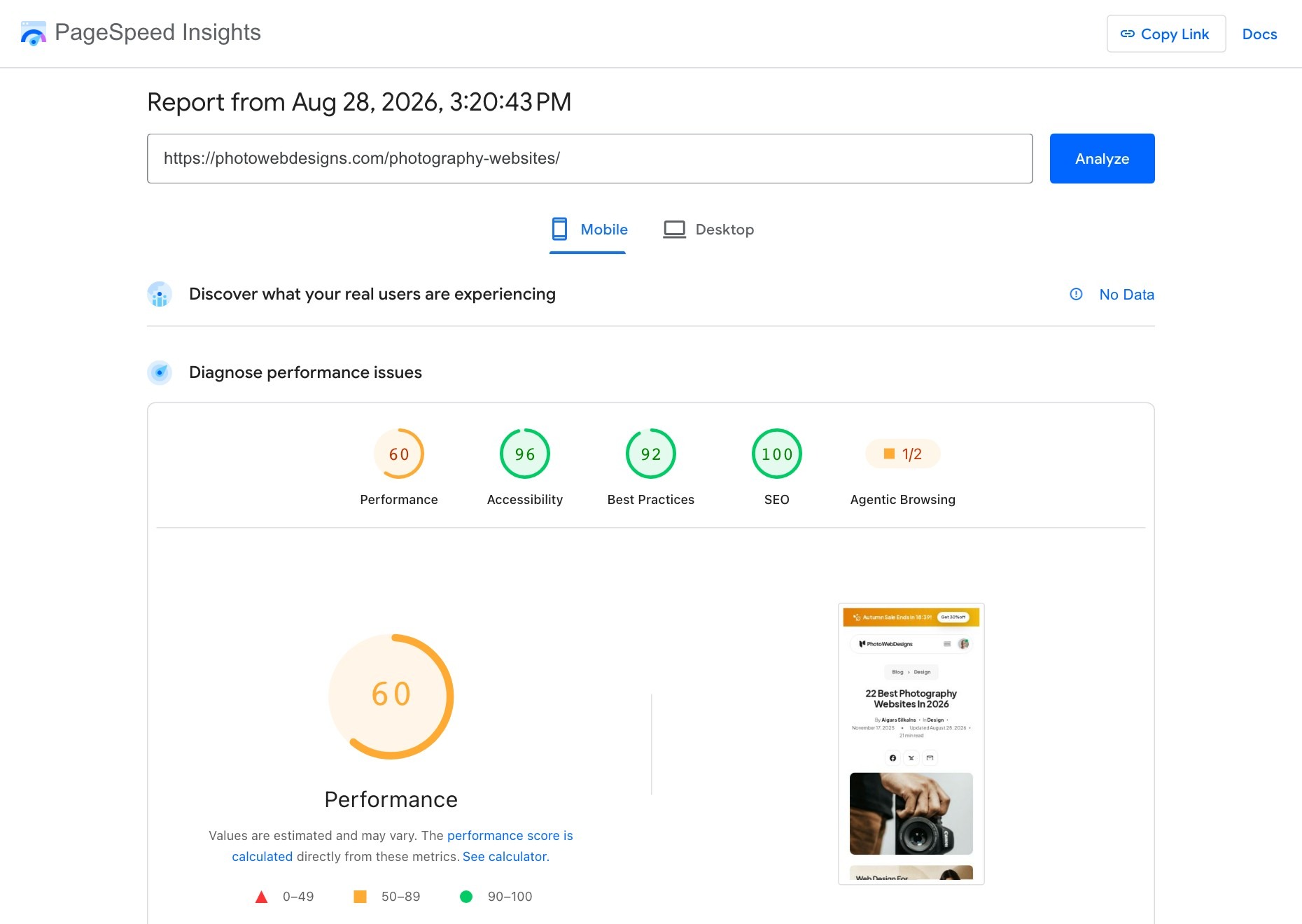
Note the “No Data” against real-user experience. That simply means the page does not get enough traffic for Google to have field measurements, so you are looking at lab results only. That is normal for most photographers’ sites, and lab results are still perfectly good for finding what to fix.
Two mistakes make speed testing useless. The first is testing your homepage only — it is usually the most optimised page you own. Test a full gallery page instead, because that is where the weight actually is. The second is testing on your own laptop on your own broadband, which tells you nothing about a phone on a train.
Run PageSpeed Insights against your heaviest gallery, on the mobile tab, and look at three numbers:
- LCP — how long until the main image appears. Google’s threshold for “good” is 2.5 seconds. On photography sites this is almost always the hero.
- CLS — how much the page jumps about while loading. Good is under 0.1, and missing image dimensions is the usual culprit.
- INP — how quickly the page responds when someone taps. Good is under 200 ms. Heavy sliders and lightbox scripts are what hurt here.
Chase LCP first. It is the one a visitor actually experiences as “this site is slow”, and on a portfolio it is nearly always a single oversized photograph.
A realistic order of work
- Re-export your hero images at 2560 px, quality 75, sRGB. Replace them.
- Re-export gallery images at 1600 px and thumbnails at 1000 px.
- Turn on WebP or AVIF conversion, with a JPEG fallback.
- Check that lazy loading is on everywhere except the hero.
- Make sure every image has width and height set.
- Test your heaviest gallery on mobile, and only then start on caching and CDNs.
Steps one and two typically do more than everything after them combined. They are also the only steps that require no plugin, no subscription and no developer — just an afternoon and a correct export preset.
Common questions
Will compressing images ruin how my work looks?
At quality 70–80 in sRGB at a sensible pixel size, no. What ruins how work looks is exporting in the wrong colour profile, or letting a plugin re-compress files that were already compressed. Compress once, properly, at export.
How many images should a gallery hold?
Twenty-five to forty is the range most photographers land on, and it is as much an editing question as a technical one. If a gallery needs a hundred images to make its case, the problem is not the loading time.
Does site speed actually affect my Google ranking?
It is a ranking signal, but a modest one — relevance matters far more. The bigger effect is on the visitors you already have: a couple comparing four photographers late at night will not wait for the slowest one to load.
Is my host to blame?
Sometimes, but far less often than people assume. Hosting decides how fast the first byte arrives, usually a few hundred milliseconds. Your images decide the other several seconds. Fix the images first, then judge the host — there is more on that in our guide to web hosting for photographers.
If you would rather this were simply handled, image optimisation, responsive sizing and caching are all part of every site we build — see website design for photographers.
All five of our demo sites are built this way, if you want a reference for what the numbers look like when it is done right.
A full-bleed hero is usually the Largest Contentful Paint element. We measured how many photographers actually use one in what a photography homepage needs — it is fewer than half.