

Look at fifteen real estate photography websites in a row and you notice something that no amount of design advice prepares you for: they are not all doing the same job. Some are shopfronts with a price list and an order button. Others are portfolios with ten words on the homepage and no way to buy anything at all.
That is not a quality gap. It is two different businesses that happen to share a camera.
The Split, Measured
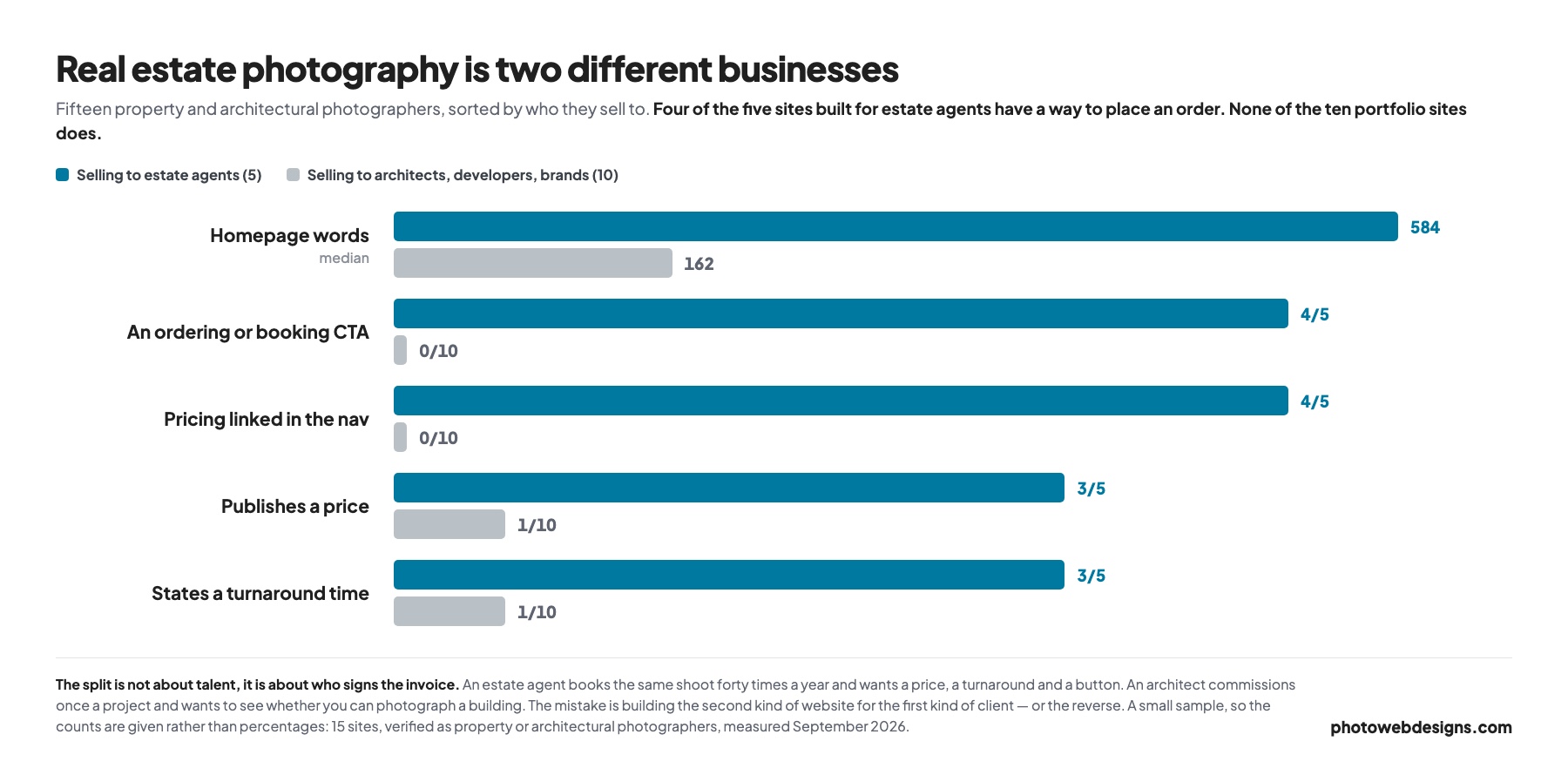
We opened fifteen property and architectural photographers’ sites and sorted them by who they are selling to. The separation is cleaner than we expected: four of the five agent-facing sites have a way to place an order, and none of the ten portfolio sites does. Pricing in the navigation splits exactly the same way.
The word counts are the other tell. The agent-facing sites run to a median of 584 words on the homepage. The portfolio sites run to 162 — and the shortest four in the sample carry 10, 24, 46 and 56 words respectively. One of them is a single photograph and a four-item menu.
If You Shoot For Estate Agents
An estate agent is a repeat buyer. They will book the same shoot forty times this year, they are choosing between you and two competitors on price and turnaround, and they are doing it between viewings on a phone. They are not browsing your portfolio for pleasure.
The sites built for that reader look like service businesses. Relavix puts services, pricing, an FAQ and a book-online button in the header, with Google reviews on the homepage. Elevated Photos leads with a “Packages and Booking” button and a Locations menu. Duplex Imaging repeats a “Start order” button four times before you have scrolled. Clyde Digital splits the navigation by product — residential, commercial, drone — and puts Book Online next to it.
What these have in common is that they answer the three questions an agent actually has, in the order they have them: what does it cost, when do I get the photos, and how do I book it? Three of the five state a turnaround time. That is the single most persuasive thing on the page for someone with a listing going live on Thursday.
What to copy
A price or a starting price, a stated turnaround, an ordering flow that does not require an email thread, and the service area you cover. That last one is worth emphasising, because it was the biggest gap we found: only one site in fifteen clearly states where it works, which for a business that is inherently local is a strange thing to leave out.
If You Shoot For Architects And Developers
An architect commissions photography once a project, maybe twice a year. The decision is slow, it is made on the work, and it is often made by someone who will be judged on the pictures for a decade. They are not comparing your hourly rate to anyone.
The sites built for that reader look like the work. Matthew Digati shows one interior, a four-item menu and almost no text. Gary Kasl opens on a coastal building and a line about a sharper direction. ProfotoDesign leads with “the visual authorship of architecture”. Mark Herboth gives you a single black-and-white frame and three links.
None of them publishes a price, and they are right not to. A photographic commission for a completed building is scoped on the building, the number of spaces, whether a stylist is involved and how the images will be licensed. A number on the homepage would be meaningless and would anchor the conversation in the wrong place.
What to copy
Fewer, better images, organised by project rather than by category. A named client list if you have one. And enough text to be findable — which is where this camp gets into trouble.
10 Real Estate Photography Website Examples
Four built to take orders, six built to win commissions. Each one opened and measured — the word count is the whole homepage, and the palette is sampled from the screenshot.
One pattern worth noting before you scroll: six of these ten run on Squarespace, including nine of the ten most image-led. If you are choosing a platform for this kind of site, that is where the field has landed.
1. Relavix

- Built with
- WordPress
- Homepage words
- 1,120
- Palette sampled from the page
- #FFFFFF#CCDDE0#7E7871
The most complete example of the agent-facing type in the sample. Phone number and email sit in the header bar, the navigation carries both Pricing and an FAQ, and a Book Online button closes it. Google reviews are embedded on the homepage rather than paraphrased as testimonials, which is a harder-to-fake form of proof.
It is also the only site here that reads as a company rather than a person, and for an agent placing a repeat order that is reassuring rather than cold.
Why it works: Everything an agent needs to decide and book, above one scroll.
2. Elevated Photos

- Built with
- Squarespace
- Homepage words
- 4,654
- Palette sampled from the page
- #1F201F#6C6E5E#4A4038#D8D8CA#9FA07B
The Locations menu is the detail worth stealing. Real estate photography is a local service sold on how quickly you can get to a property, and a page per area is both useful to the reader and the most direct way to rank for “real estate photographer” plus a town name.
At 4,654 words it is by far the wordiest homepage we measured, which sounds like a fault and is not: almost all of it is service description and area coverage that a search engine can actually read.
Why it works: Treats a local service like a local service, with a page per patch.
3. Duplex Imaging
- Built with
- Custom build
- Homepage words
- 584
- Palette sampled from the page
- #595652#9E9790#312E26#443B33
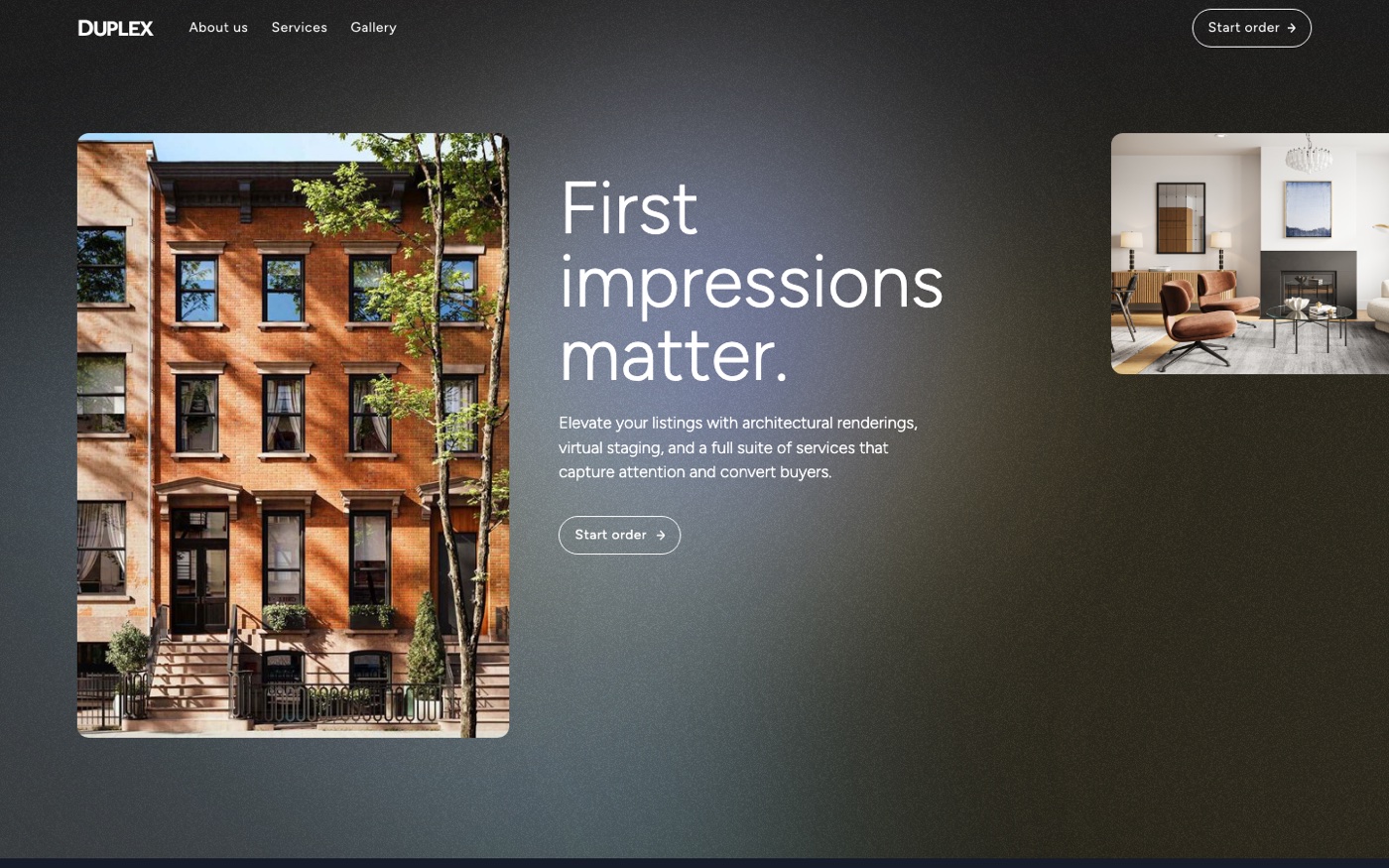
“First impressions matter” over a brownstone, and a Start order button repeated four times before the first scroll. The service list goes beyond photography into renderings and virtual staging, which is where the margin is in this market.
It states a turnaround, which only three of the fifteen sites did, and it is the thing an agent with a listing going live on Thursday is actually looking for.
Why it works: One instruction, repeated: start the order.
4. Clyde Digital

- Built with
- WordPress
- Homepage words
- 337
- Palette sampled from the page
- #444545#030303#66696C#1F2021
The navigation is split by what the client is selling rather than by what the photographer does — residential, commercial, drone — which is the right way round. An agent with a retail unit finds their own category immediately.
Book Online sits in the menu rather than buried on a contact page, and the whole thing runs to 337 words. Short, but every one of them is doing a job.
Why it works: Navigation organised by the client’s problem, not the photographer’s kit.
5. Harry Lim
- Built with
- Squarespace
- Homepage words
- 495
- Palette sampled from the page
- #397287#3A3F53#919D9C#D5CBBE#FFFFFF
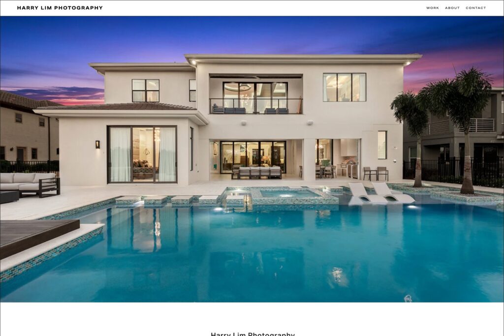
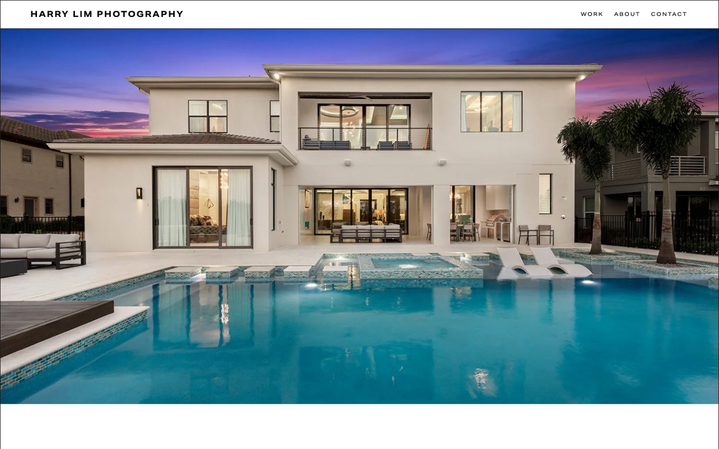
A luxury property at dusk, full width, and a navigation item that says exactly who the site is for: For Architects & Builders. That single link does more audience-setting than a paragraph of positioning copy would.
It sits between the two camps — the imagery is real-estate work but the framing is commissioned rather than transactional, and there is no price anywhere.
Why it works: A nav item that names the client it wants.
6. Nicholas Doyle
- Built with
- Squarespace
- Homepage words
- 306
- Palette sampled from the page
- #61555F#9F7C6D#0C0B0C#292024
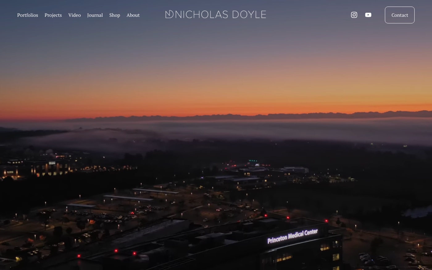
The navigation splits by discipline — architecture, lighting design, landscape architecture — which tells you the buyer is a practice with a specialism, not an agent with a listing. A cinematic aerial at dusk carries the homepage.
There is a Journal and a Shop, which is unusual in this camp and gives the site something to rank for beyond the portfolio itself.
Why it works: Categorised by the client’s discipline, not by room type.
7. ProfotoDesign
- Built with
- Wix
- Homepage words
- 1,285
- Palette sampled from the page
- #78828A#606C71#29383F#81949F#BABCBE
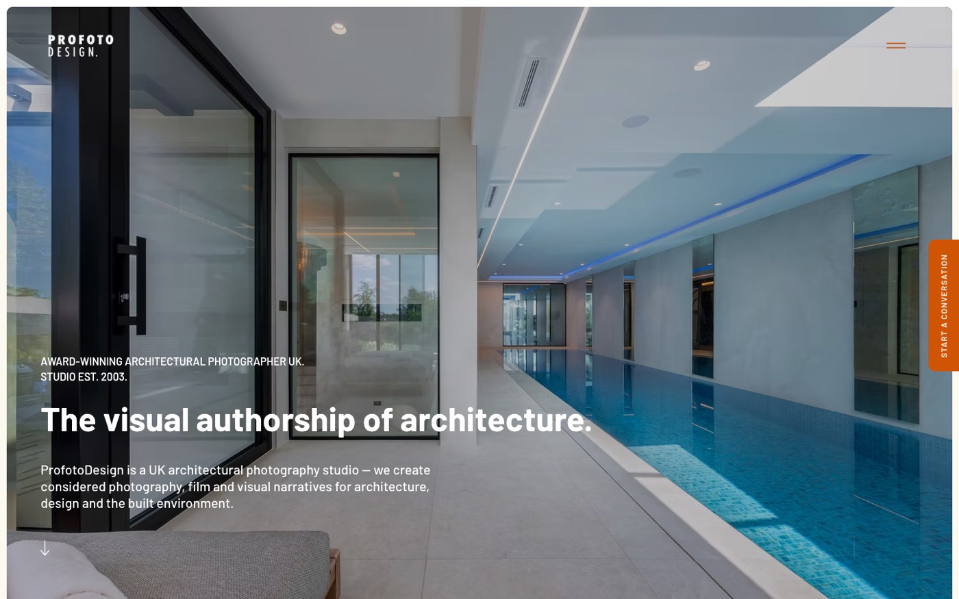
“The visual authorship of architecture” is a positioning line rather than a description, and it works because the site backs it with 1,285 words about the practice — the most substantial writing of any portfolio site we measured.
It also states a turnaround, which almost no portfolio site does, and offers a timelapse and aerial service alongside stills.
Why it works: A portfolio site that still gives a search engine something to read.
8. Travis Mark
- Built with
- Squarespace
- Homepage words
- 241
- Palette sampled from the page
- #A4ADB0#C7CFD4#FFFFFF#576769#EEEFEF
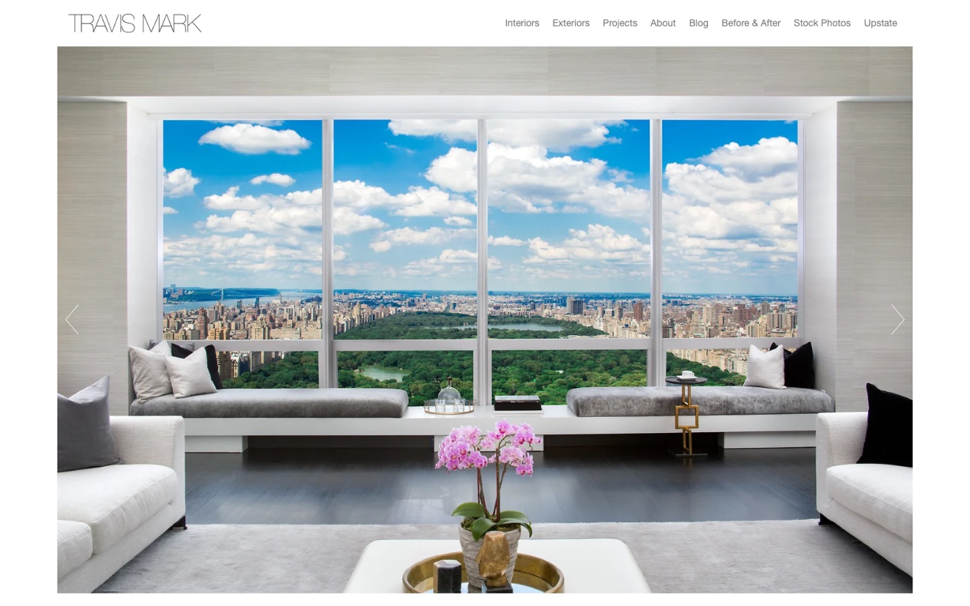
A Manhattan interior framed through a window, and two navigation items the rest of the sample does not have: Before & After and Stock Photos. The first is the single most persuasive page an interiors photographer can build, because it shows the work rather than describing it.
Stock Photos is a second revenue line running off the same archive, which is a sensible thing for a photographer with a decade of interiors to do.
Why it works: A before-and-after page, which is the whole argument in one click.
9. Gary Kasl
- Built with
- Squarespace
- Homepage words
- 56
- Palette sampled from the page
- #3B434C#191714#515D66#2C2822
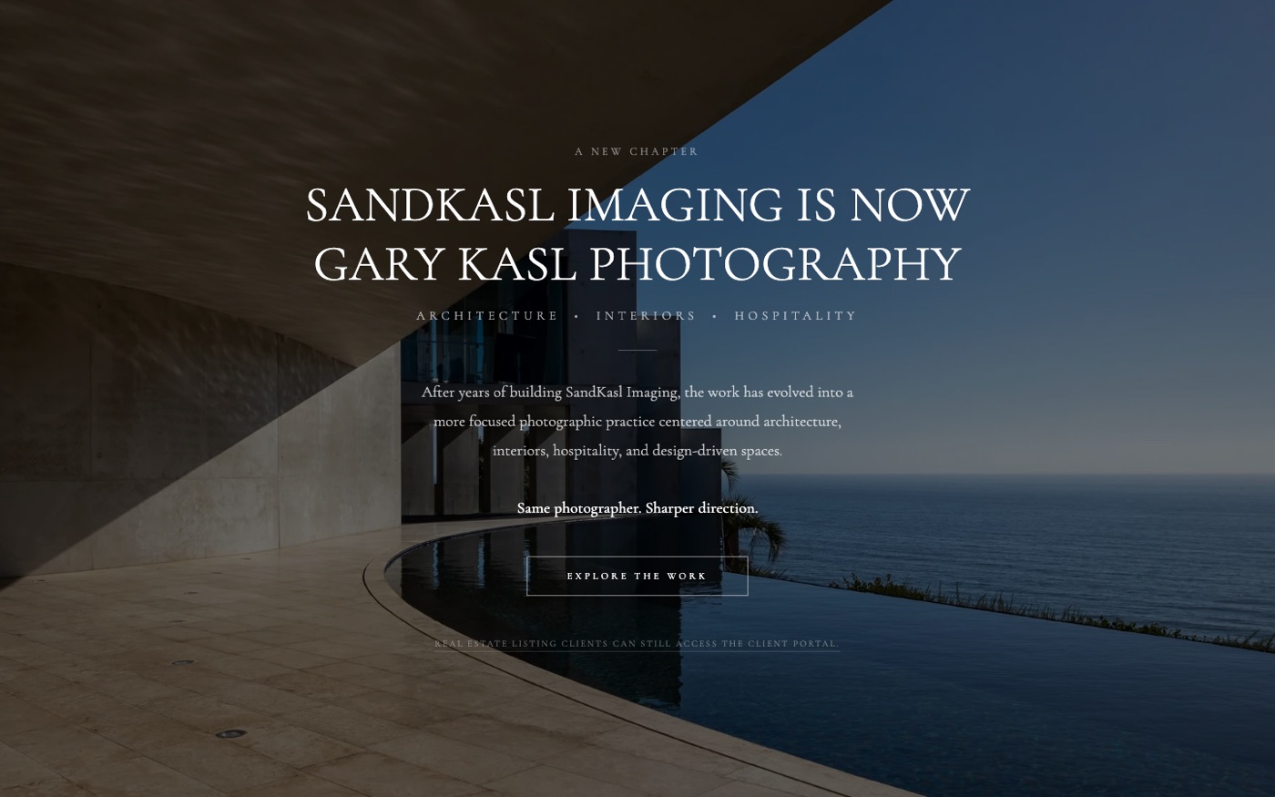
A rebrand caught mid-flight: the homepage explains that SandKasl Imaging is now Gary Kasl Photography, in 56 words over a coastal building. It is handled well — the old name is stated plainly so returning clients are not confused.
It is also the clearest illustration of the portfolio camp’s trade-off. Fifty-six words is elegant and gives Google essentially nothing.
Why it works: How to handle a rename without losing the people who knew the old one.
10. Matthew Digati
- Built with
- Squarespace
- Homepage words
- 10
- Palette sampled from the page
- #B2AAA4#C5C2BF#9A9187#7C6453
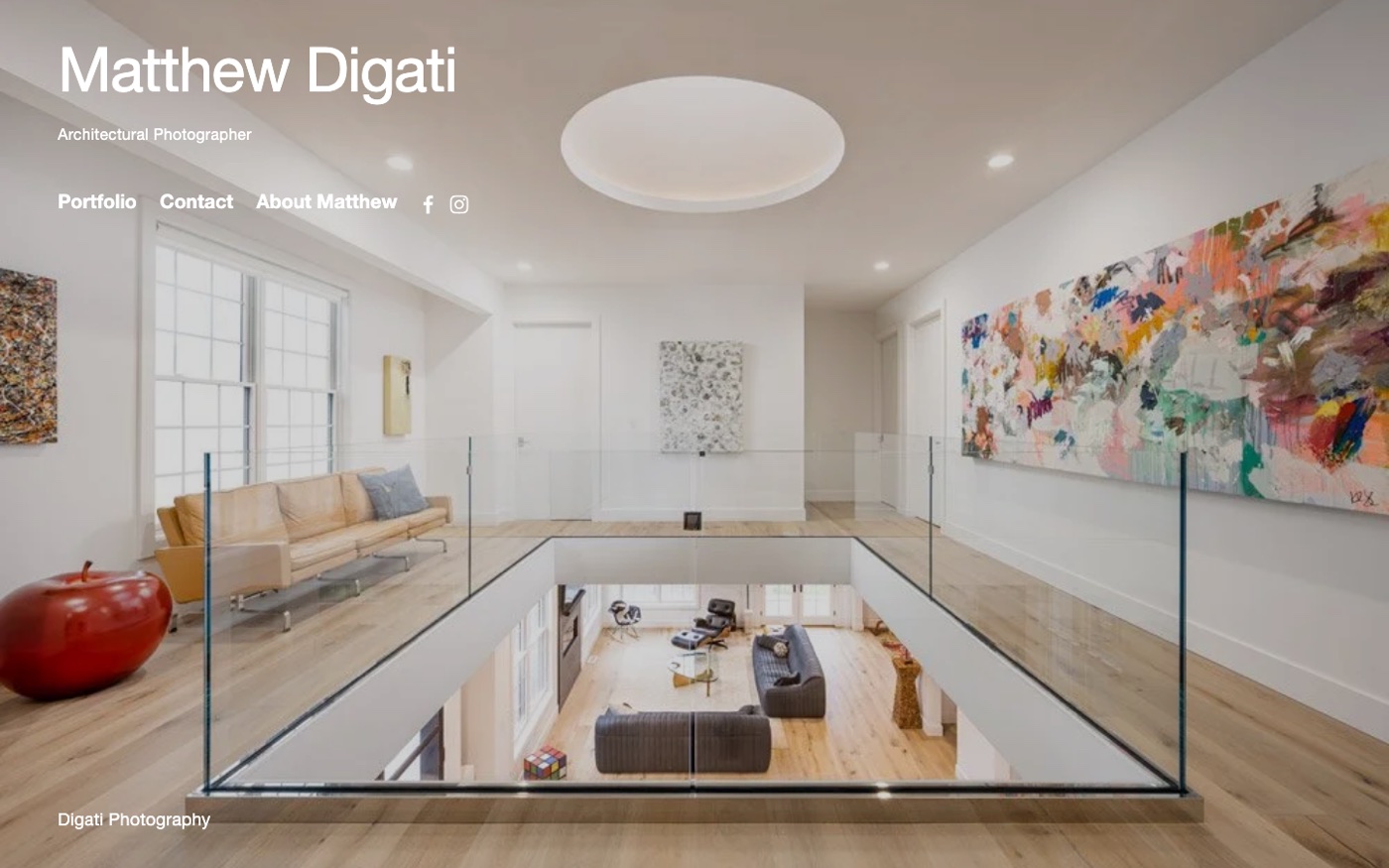
The most extreme site in the sample: one interior, three links, a name, the words “Architectural Photographer”, and nothing else. Ten words on the entire homepage.
As a piece of design it is confident and completely coherent. As a way of being found by anyone who does not already have your number, it is a decision rather than an oversight — and worth making deliberately.
Why it works: The portfolio position taken to its logical end. Beautiful, and invisible to search.
The Portfolio Camp Has A Search Problem
A homepage with 10 or 24 words on it cannot rank for anything. We have measured this across photography generally and it is the single most common reason good photographers are invisible: there is nothing on the page for a search engine to read.
For an architectural photographer that may genuinely not matter. If your work arrives through architects who already know you, and through the practices you have shot for, search is a rounding error and a beautiful silent homepage costs you nothing.
It starts costing you the moment you want a client you do not already know. “Architectural photographer” plus a city is a search people make, and you cannot appear for it with a page that never says either word. The fix is not to become the other camp. It is a real h1, a paragraph that says what you photograph and where, and project pages that name the building and the practice. None of that disturbs the images.
Which One Are You?
The useful question is not which website looks better. It is which invoice you want more of.
If most of your revenue comes from agents, and the work is repeatable, priced per property and booked in a hurry, build the shopfront. Price, turnaround, ordering, service area. Your portfolio needs to be good enough, not remarkable.
If most of your revenue comes from architects, developers or brands, and each job is scoped individually, build the portfolio. Then add the minimum text that lets a stranger find it.
If you genuinely do both — and several of the fifteen do — the honest answer is two routes through one site, not an average of the two. A homepage that tries to be a rate card and a gallery at the same time reads as neither. Split them at the navigation and let each audience land somewhere built for them.
If you would rather not work out which of those two sites you need, that is the sort of thing we do. The structural version of this exercise for weddings is in what a wedding photography website actually needs, and the pricing question specifically is in should photographers put prices on their website.
Frequently Asked Questions
What should a real estate photography website include?
It depends who you sell to. For estate agents: a price or starting price, a stated turnaround, an ordering or booking flow, and your service area. For architects and developers: project-organised galleries, a client list and enough text to be findable. Four of the five agent-facing sites we measured had an ordering flow; none of the ten portfolio sites did.
Should real estate photographers show prices?
Agent-facing photographers usually should, and mostly do — three of the five we measured publish a price. Photographers working for architects generally should not, because each commission is scoped on the building and the licensing rather than sold as a fixed package.
How much text should a real estate photography homepage have?
The agent-facing sites we measured carry a median of 584 words; the portfolio sites 162. If you want to be found in search rather than through referrals, aim nearer the higher figure — several portfolio sites in our sample carried under 50 words, which gives a search engine nothing to work with.
Do real estate photographers need a booking system?
If you shoot for agents, it removes the slowest part of the job: the email thread about availability. Four of the five agent-facing sites we looked at had one. If you shoot commissioned architectural work, it is unnecessary and slightly odd, because the scoping conversation is the sale.
Should I list my service area?
Yes, and almost nobody does — only one of the fifteen sites we measured clearly stated where it works. For a local service business that is a straightforward miss, both for the visitor deciding whether to enquire and for ranking on searches that include a place name.