

Almost every guide to photography homepages gives the same advice: a large hero image, a clear call to action, some testimonials. It is reasonable advice. It is also nobody’s actual homepage. The wider dataset behind this is in our 2026 photography website statistics.
So rather than repeat it, we measured. We loaded 47 working photographers’ homepages in a real browser at 1440×900 — wedding, editorial, fashion, commercial and landscape — and recorded what is genuinely visible before you scroll. The results contradict the standard advice in three places, and expose one problem that affects more than a third of them.
What 47 Photography Homepages Actually Do
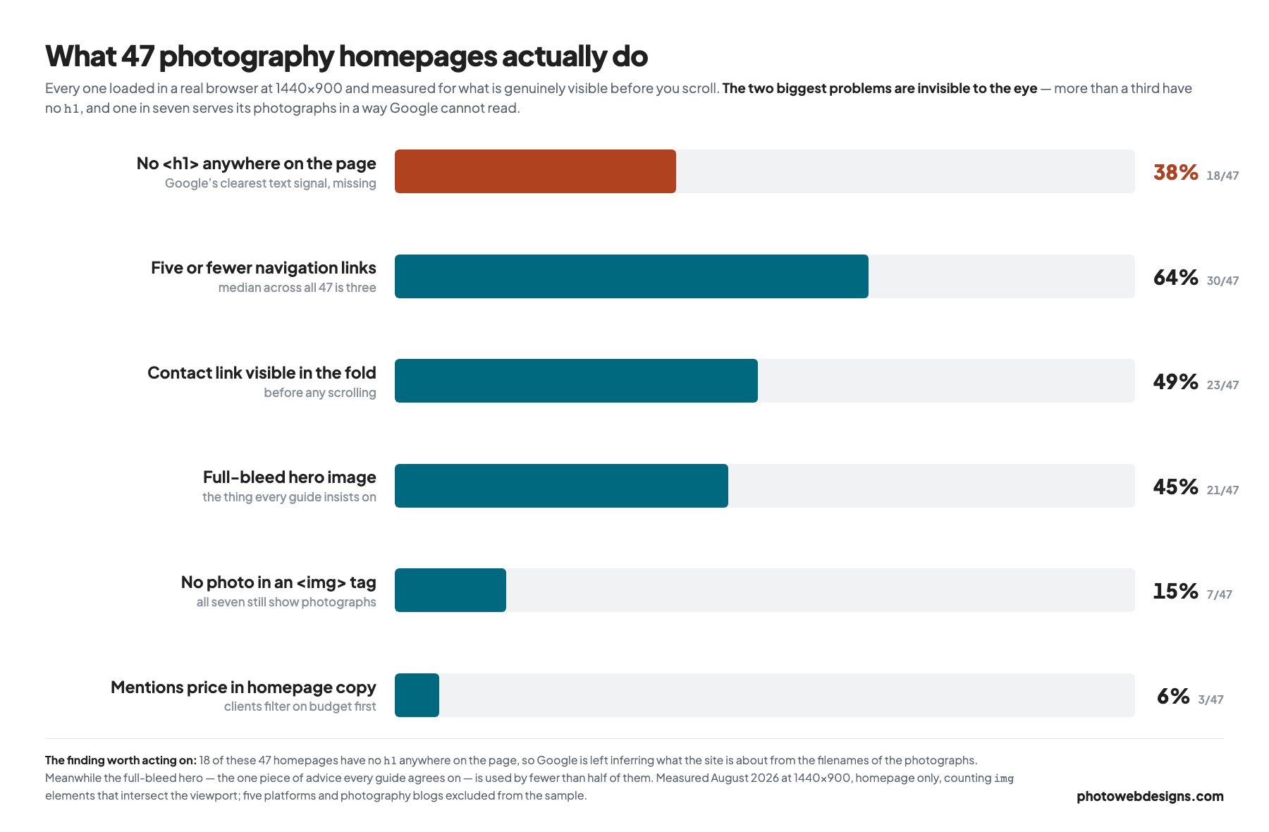
| Above the fold | Count | Share | What it means |
|---|---|---|---|
| Full-bleed hero image | 21 / 47 | 45% | Fewer than half. The universal advice is wrong. |
| Contact or booking link in the fold | 23 / 47 | 49% | Half make you scroll before you can enquire. |
| An <h1> anywhere on the page | 29 / 47 | 62% | 38% have none at all. |
| No photograph in an <img> tag | 7 / 47 | 15% | All seven still show photographs — as CSS backgrounds or video. |
| Five or fewer navigation links | 30 / 47 | 64% | Median across all 47 is three. |
| Price mentioned in homepage copy | 3 / 47 | 6% | Almost nobody. Whether that is wise is another matter. |
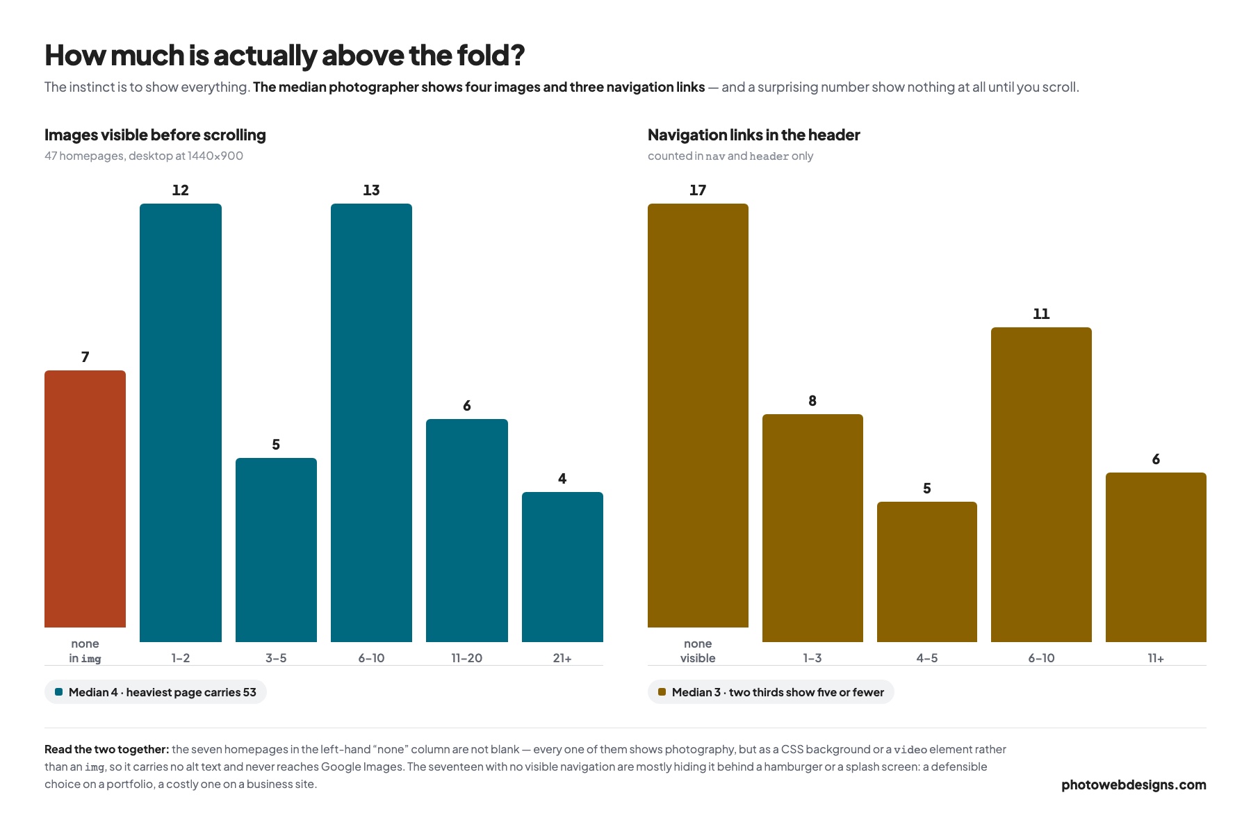
Measured August 2026 at 1440×900 in a real browser, counting img elements that intersect the viewport — CSS background images and video elements are counted separately and dealt with below. Sample is the working photographers featured across our roundups; five platforms and photography blogs were excluded. Median images above the fold: 4. Median navigation links: 3.
The Big Hero Image Is Not A Rule
Fewer than half the homepages we measured — 21 of 47 — open with a full-bleed hero. The rest use a grid, a two-column split, a single centred frame with white space around it, or — in seven cases — imagery that is not in an img tag at all.
That matters because the full-bleed hero has a real cost. It is the largest element on the page, so it is almost always what Google measures as your Largest Contentful Paint, and a slow one drags the whole score down. It also shows exactly one photograph, which is a strange choice for a portfolio.
A grid of four to eight frames does more in the same space: it shows range, it gives the visitor something to choose between, and each individual image is small enough to load quickly. The median across our sample was four images above the fold — not one enormous one, and not the twenty that the instinct suggests.
Use the full-bleed hero when a single frame genuinely is the argument — a campaign for a recognisable brand, or a wedding image that sets the emotional register. Otherwise the grid is doing more work.
Thirty-Eight Percent Have No H1
This is the finding worth acting on today. Of the 47 homepages, 18 have no <h1> element anywhere on the page.
It happens because of how these sites get built. A photographer drops in a logo image, a gallery block and a footer, and never types a heading — so the page has a title tag and essentially no other text signal. Google is left to infer what the site is about from the file names of your photographs, which is not a strategy. The same problem shows up across every measurement we have run: why photography websites do not rank collects all of it in one place.
The fix takes two minutes and does not have to spoil the design. An h1 can be visually small, set below the logo, and still do its job: Wedding photographer in Somerset. Editorial and beauty photographer, London. It names what you do and where you do it, which is exactly the query someone types.
Check yours in ten seconds. Open your homepage, right-click and choose View Page Source, then search for <h1. If it is not there, or if it contains only your business name, that is the highest-value edit available to you today.
Your business name in the h1 is close to useless unless people already search for you. It should describe the work: genre first, location second.
Half Of Them Hide The Contact Link
Only 23 of 47 have a contact, booking or enquiry link visible before you scroll. On the rest you have to scroll, open a menu, or find the footer.
That is a strange thing to make people work for. Commissioning a photographer usually starts as a short email, and the site’s only real job is to not get in the way of it. “Contact” was also the single most common navigation label across the whole sample, appearing on 12 sites — ahead of “About” on 9 and “Portfolio” on 5. The photographers who do this well treat it as a primary link, not a footer afterthought.
The Navigation Is Shorter Than You Think
The median homepage in our sample has three navigation links. Two thirds have five or fewer.
The exceptions are instructive rather than sloppy. The sites with long navigations are almost all splitting by client type rather than by subject — advertising separated from editorial, beauty from jewellery, model portfolios from commercial work. That is a deliberate choice by photographers who take commissions from different buyers with different budgets, and it lets each one reach their evidence in a single click.
If you shoot one thing for one kind of client, three links is genuinely enough: work, about, contact. Add categories only when you can name the different person each one is for.
Almost Nobody Mentions Price
Three homepages out of 47 mention price anywhere in their copy. That is a genuine finding about what photographers do, and we are not going to pretend it is a recommendation. We followed it up by opening the pricing pages too — across 51 photographers, only three publish a figure anywhere, and none publishes a price list.
Clients filter by budget before they filter by style. A photographer with no price anywhere is asking every enquirer to invest an email in finding out, and most will not — they will email the two photographers who published a starting figure instead. A “collections from” number costs you the enquiries you were never going to win and saves you the calls.
The reasonable compromise, and what the small number of sites doing this well actually do, is a single line on the homepage pointing to a pricing page rather than a full rate card in the fold. If you want the arithmetic behind what to charge for the site itself, we broke it down in how much a photography website costs.
A Homepage That Covers All Of It
Putting the findings together, a homepage that does the job has six things and does not need a seventh:
- Four to eight photographs above the fold, sized properly, showing range rather than one hero.
- An h1 naming the genre and the location. It can be small. It cannot be missing.
- A contact link in the primary navigation, visible without scrolling.
- Three to five navigation items, or more only if they map to different buyers.
- Two or three sentences of real text — what you shoot, who for, where. This is the only thing on the page Google can actually read.
- A pointer to prices, even if the number lives on another page.
What is not on that list: an autoplaying video background, a preloader animation, an Instagram embed, a testimonial slider, or a cookie banner covering the first screen. Each one costs load time and none of them changed whether a site read as professional in the sample we looked at.
Four Homepages, Four Strategies
The averages hide how differently these sites solve the same problem. Four from the sample, with the numbers we measured, and what each one is optimising for.
David Bastianoni — 29 images, 4 nav links
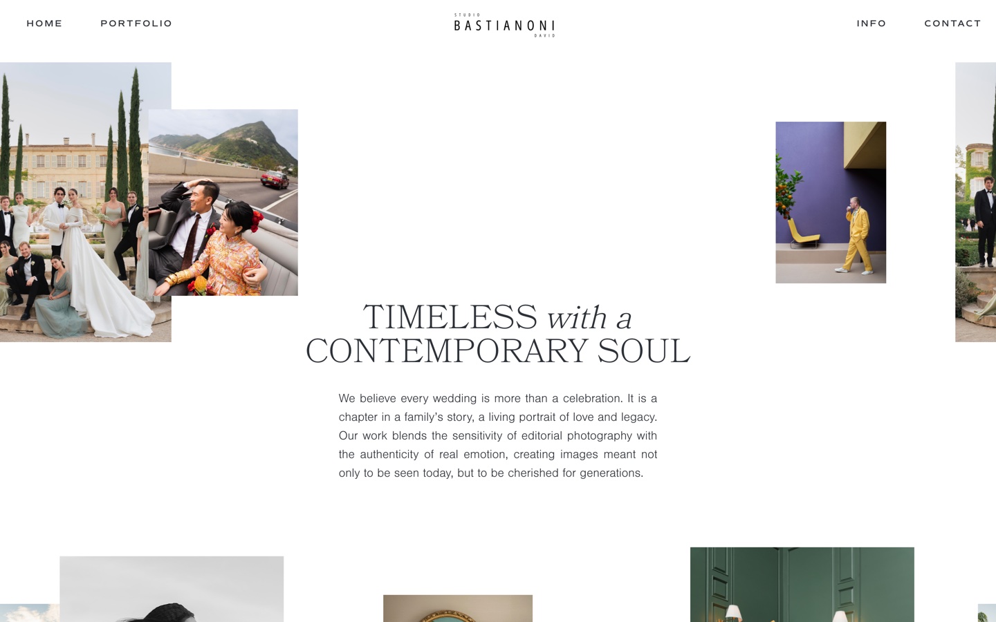
The densest homepage in the sample and one of only a handful with substantial copy above the fold. Twenty-nine images visible before you scroll, arranged small, with a contact link in the fold and a four-item navigation holding it together.
This is volume as the argument. An editorial wedding photographer working internationally needs to demonstrate that he shoots constantly and consistently, and twenty-nine frames does that in a way four cannot. It only works because the thumbnails are small and properly compressed — the same layout with full-size images would be unusable on a phone.
Renee Parkhurst — full-bleed hero, five sections
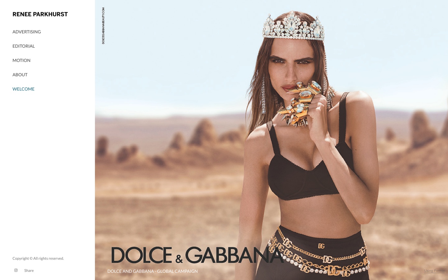
The opposite approach: one campaign image at full width, with the client’s own branding left visible in the frame. The navigation splits advertising from editorial from motion — five destinations, above the median, and correctly so, because those are three different buyers. (Our automated count reads eight here, because it also counts the wordmark, the share control and the Instagram icon; the aggregate figures above apply that same rule to all 47.)
This is the case where the hero earns its place. A recognisable global campaign says more about what she can handle than a grid of twenty unattributed frames would. If your best single image is a brand everyone knows, lead with it.
Alex Tran — 4 images, 6 nav links, real copy
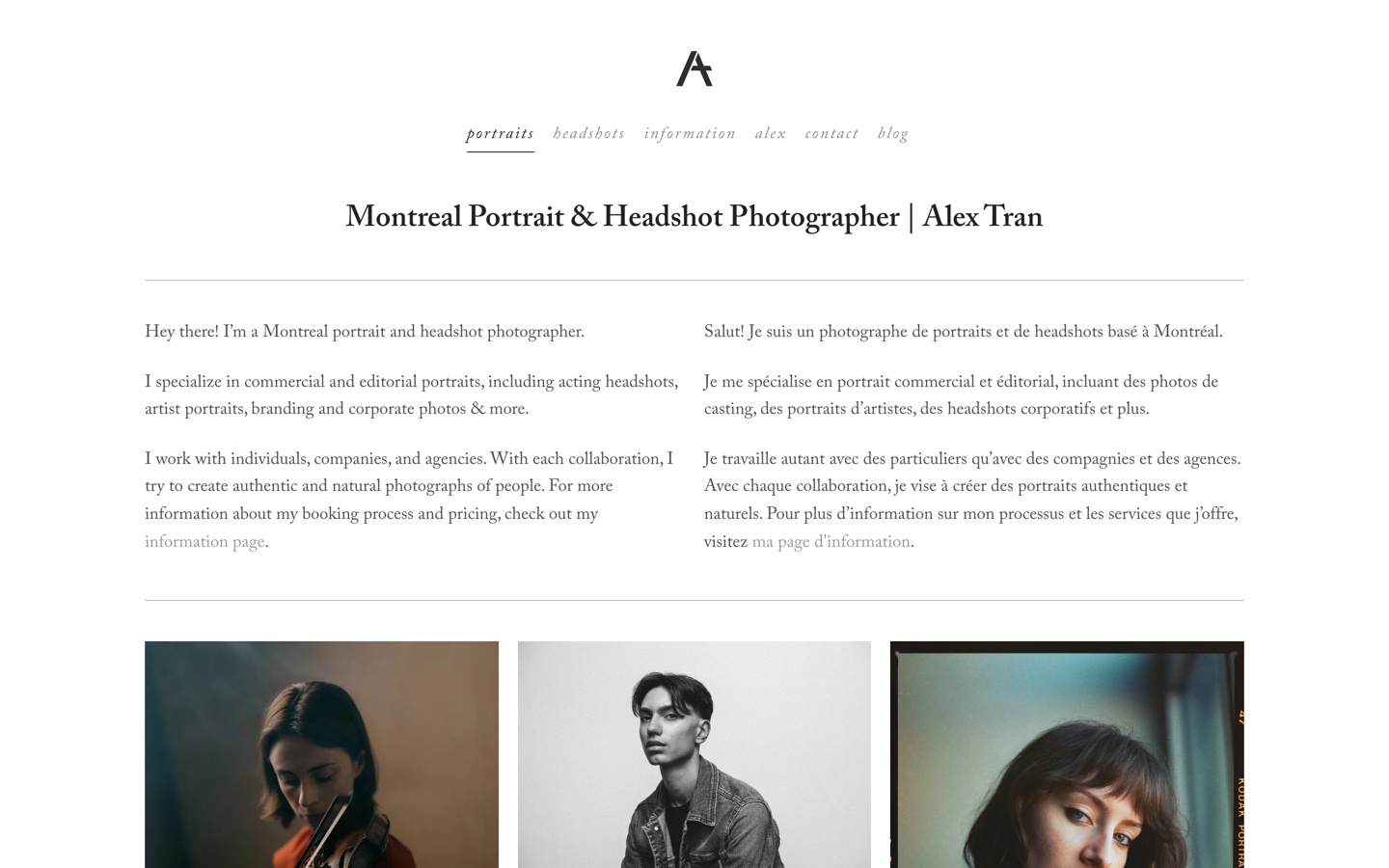
h1 that names the service and the city, then 142 words of bilingual copy before the first photograph.The most conventionally balanced homepage in the sample, and the closest to the six-point checklist above. Four images, 142 words of genuine text, a contact link in the fold and a six-item navigation that names the categories rather than the sections.
It is not the most striking site here. It is the one most likely to be found in a search, because it is the one that gives Google something to read. That trade — slightly less drama, considerably more discoverability — is the right one for most working photographers.
Bottega53 — six frames, none of them an image
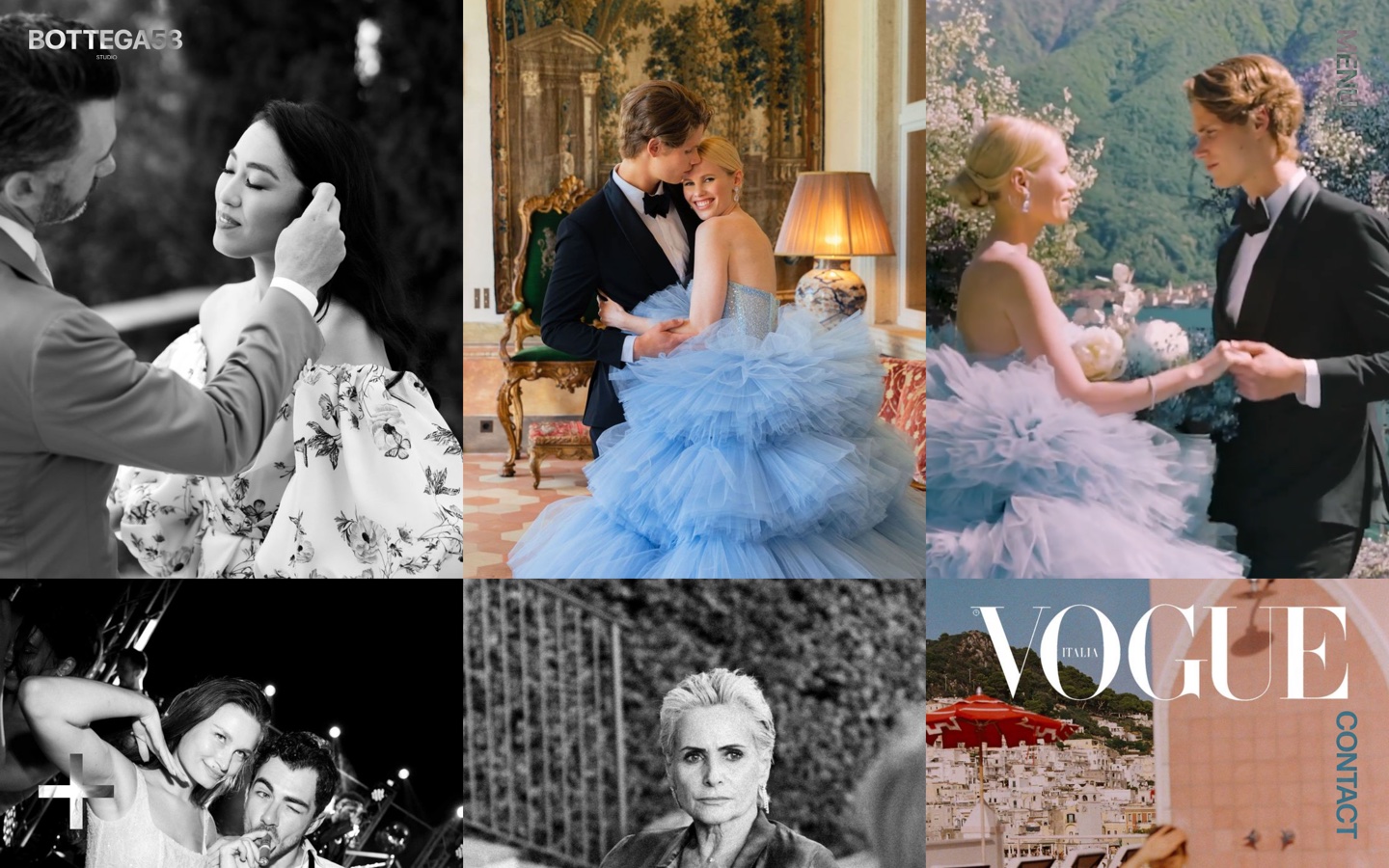
img element.This is the homepage our measurement recorded as having zero images above the fold, and the screenshot shows why that number needs explaining. Six frames fill the viewport. Not one of them is an img element — they are video elements, so the script counted none, and so does Google Images.
The design is excellent and the studio is established enough that it may not matter to them. But it is worth being precise about the cost: no alt text, nothing to appear in image search, and no h1 either, so the page offers a crawler a title tag and very little else. If your enquiries arrive by referral that is a survivable trade. If they arrive by search it is not.
This turned out not to be one site’s quirk. We went back and re-measured all seven homepages that recorded zero images, checking how each one actually puts photography on the screen:
| Homepage | <img> | CSS background | <video> / canvas | <h1> |
|---|---|---|---|---|
| Bottega53 | 0 | 0 | 6 | 0 |
| Jimmy Chin | 0 | 7 | 1 | 6 |
| Cassandra Ladru | 0 | 3 | 0 | 1 |
| Kayla Fisher | 0 | 3 | 0 | 18 |
| Cristina Gómez Ruiz | 0 | 0 | 1 | 1 |
| Steve McCurry | 1 | 0 | 1 | 1 |
| Guy Collier | 1 | 0 | 0 | 1 |
Re-measured August 2026 at 1440×900, counting only elements larger than 60×60px that intersect the viewport. Kayla Fisher’s eighteen h1 elements are a separate problem: when everything is a first-level heading, none of them is.
Not one of the seven is a blank page. Every one of them shows photography above the fold. What they share is that a crawler cannot see any of it — a CSS background image carries no alt attribute, and a video element is not indexed as a photograph. Five of the seven have no crawlable image on their most important page at all.
If you have built a site this way, the fix is small and worth doing: put the hero and the first row of the grid in real img tags with alt text, and keep the video treatment for the decorative layer behind them.
If you want to see the structure rather than read about it, all seven of our demo sites are live and built to the shape above — each one for a different kind of photographer.
Free to download
Two of our five designs are free, under an MIT licence, for personal or client work. Each one is a finished site — open index.html and edit it, or rebuild it from the Astro source. The photographs are Unsplash placeholders; swap them for your own before you launch.
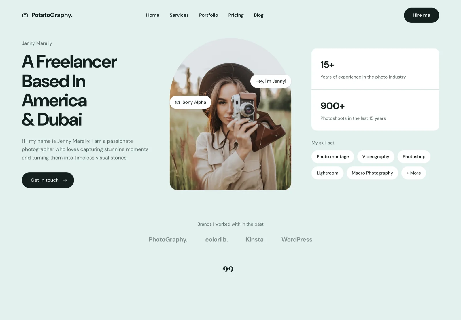
One page, one story, one call to action. The right shape when the whole site is the pitch — a hero, a skill set, a testimonial and a contact form, and nothing else to maintain.
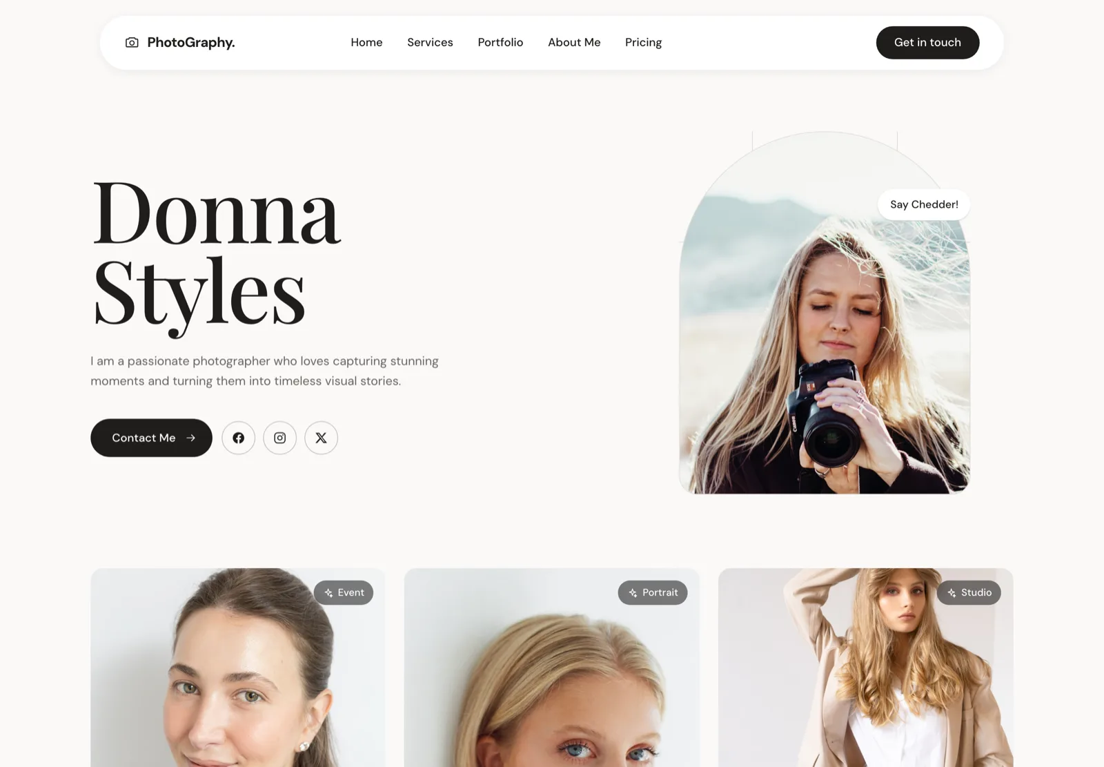
Built for the photographer whose booking depends on the client liking them. Portrait hero, an about-led structure, and contact details that follow you down the page.
The other three designs — wedding, fashion and agency — are available personalised to your brand and photographs, from $2,100. See website design for photographers, or open all five live demos.
Frequently asked questions
What should be on a photography homepage?
Four things, in this order: photographs, what you shoot and where, a way to make contact, and enough text for Google to understand the page. Everything else — testimonials, an about section, a blog feed, an Instagram embed — is optional and most of it is better on its own page.
Should a photography homepage have a big hero image?
Not necessarily, and the data says most working photographers do not use one. We measured 47 professional homepages and only 45% had a full-bleed hero. A grid of six well-chosen frames often does more work than one giant image, because it shows range in the same space.
How many images should be above the fold?
The median across the homepages we measured was four. The instinct is to show everything; the sites that read as most confident show a handful and let you scroll. What matters more is that they load fast — see our guide to speeding up a photography website.
Does a photography homepage need text for SEO?
Yes, and this is where photographers lose most often. Google cannot read a photograph. A homepage that is nothing but a gallery gives it a page title and almost nothing else to work with — which is why 38% of the sites we measured, all with no h1 at all, are effectively invisible for anything except their own name.
Should I put prices on my homepage?
Only 3 of the 47 homepages we measured mention price at all. That is what photographers do, not necessarily what works — couples and commercial clients both filter by budget, and a starting figure removes enquiries you were never going to win. A line on the homepage pointing to a pricing page is usually the right compromise.