


Want to explore the most inspiring and popular photography websites?
In today’s digital era, a photographer’s success goes beyond mastering the camera.
A powerful online presence is essential.
Photographers thrive in two spaces: social media and personal websites or online portfolios.
The best? They excel at both.
But for now, let’s zoom in on websites – the true home base of a photographer’s brand.
The best photography websites do more than just display images.
They captivate visitors, showcase unique artistic styles, and make booking services, buying prints, or enrolling in courses effortless.
What makes these sites so effective? It’s a seamless blend of aesthetics and functionality:
- Minimalist layouts with generous white space let images command attention.
- Blazing-fast load times keep visitors engaged and browsing.
- Intuitive navigation ensures a frictionless user experience.
- Inviting calls to action (CTAs) guide visitors toward their next steps – booking, purchasing, or learning.
- Authentic personal branding makes photographers unforgettable in a crowded market.
These elements shine in the standout websites we’ve selected.
Ready for some serious inspiration?
Let’s dive into the most impressive photography websites that set the gold standard!
Content:
- How We Chose The Most Popular Photography Websites?
- Popular Photography Websites
- How To Easily Build A Modern Photography Website
How We Chose The Most Popular Photography Websites?
Choosing the top photography websites was a combination of good looks, convenience, engagement and real-world impact.
We dived deep into a variety of crucial factors to identify the sites that truly excel:
- Design excellence: A visually attractive yet functional layout that highlights the photographer’s work.
- Performance & speed: Fast-loading pages to ensure a smooth browsing experience.
- User Experience (UX): Comfortable navigation and clear pathways to key actions.
- SEO & search visibility: Strong rankings on search engines, helping photographers reach a wider audience.
- Social media influence: Engagement levels, shares, and follower counts on platforms like Instagram.
- Website traffic & popularity: Verified analytics showing consistent visitors and solid audience retention. (Thanks, Similarweb!)
- Mobile responsiveness: Flawless display and usefulness across all devices.
- eCommerce & booking features: Easy-to-use online stores, print sales, and booking integrations.
By analyzing these metrics, we ensured that only the best and most effective photography websites made the cut.
Popular Photography Websites
1. Peter McKinnon
Instagram followers: 3.2 million
Peter McKinnon’s website makes a powerful first impression with a full-screen layout and immersive parallax scrolling.
A transparent header with a drop-down menu ensures easy navigation without distracting from the visuals.
The large, light footer features a newsletter signup and social media icons, creating a seamless way to stay connected.
Plus, an integrated online shop lets fans purchase exclusive photography-related products.
Why we chose it?
We chose Peter’s website because it blends breathtaking design with practical functionality.
2. Gray Malin

Instagram followers: 579K
Gray Malin’s site is an elegant mix of creativity and usability.
A floating header with a hamburger menu ensures streamlined navigation, while a top bar notification keeps visitors informed.
The homepage’s clean grid layout maximizes visual appeal, enhanced by tasteful white space.
A well-structured footer neatly houses additional links, social icons, and a subscription form.
Why we chose it?
We chose Gray’s website for its sophisticated balance of artistic expression and eCommerce efficiency.
3. Lindsay Adler

Instagram followers: 442K
Dark and mysterious yet effortlessly sleek, Lindsay Adler’s site captivates with its animated three-column image grid.
The sticky transparent header keeps navigation accessible at all times, while a black background across the entire design adds consistency. Very enjoyable!
Portfolio pages incorporate a lightbox function for distraction-free viewing, and a simple yet effective contact form ensures easy communication.
Why we chose it?
We chose Lindsay’s website because it perfectly embodies her signature dramatic style, reinforcing her brand identity through bold design choices.
4. Steve McCurry

Instagram followers: 3.6 million
Steve McCurry’s site draws visitors in with a striking video hero section, setting the tone for his storytelling expertise.
A minimalist light design ensures his iconic imagery remains the focal point, while a floating header enhances efficiency.
Additional news and shop pages offer more ways to engage with McCurry’s work. Also, the portfolio’s lightbox function keeps the experience immersive.
Why we chose it?
We chose Steve’s website for its cinematic appeal, perfectly complementing his legendary photography.
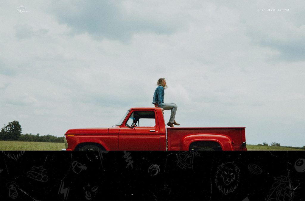
5. Jimmy Chin
Instagram followers: 3.5 million
Jimmy Chin’s website is a dynamic journey with an interactive full-screen homepage split into three hover-reactive sections.
Smooth transitions create a consisent browsing flow, while practical filters and a forward-and-backward gallery interface allow users to explore images distraction-free.
The multi-contact-form setup ensures inquiries reach the right recipient, which is very handy for someone as popular and busy as Jimmy is.
Why we chose it?
We chose Jimmy’s website for its adventurous energy and interactivity, mirroring Chin’s boundary-pushing photography style.
6. Ellen von Unwerth
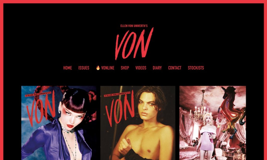
Instagram followers: 1 million
Ellen von Unwerth’s website makes a bold statement with its striking red and black theme.
The eye-catching red frame around the site adds a touch of drama, while the grid layout combines static and animated thumbnails to spice thing up even further.
The gallery’s simple sliders make navigating her evocative imagery effortless, and a no-frills contact page provides direct email links and social icons for quick connections.
Why we chose it?
We chose Ellen’s website for its daring visual choices, mirroring von Unwerth’s provocative and cinematic photography style.
7. Alex Strohl

Instagram followers: 1.9 million
Alex Strohl’s website is a visual treat, leveraging a floating header with a top bar notification for practical navigation.
The home page features a long, engaging grid layout with ample spacing to highlight his superb imagery.
Lightbox functionality ensures distraction-free viewing, while an integrated shop offers prints for sale.
Each project page is detailed, allowing visitors to dive deeper into his storytelling process.
Why we chose it?
We chose Alex’s website for its immersive design and well-structured project showcases.
8. Cristina Mittermeier
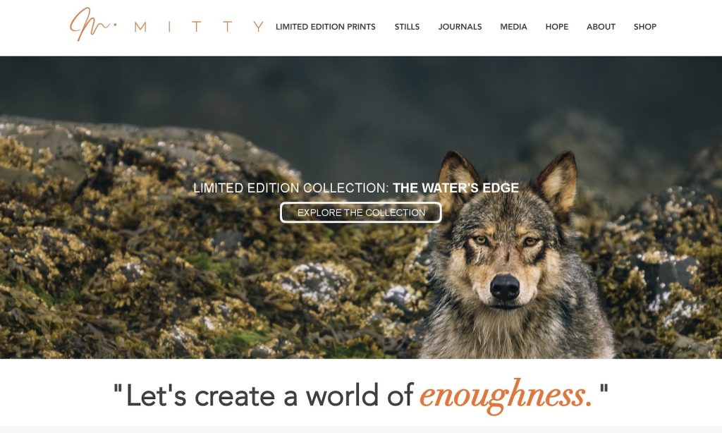
Instagram followers: 1.6 million
Cristina Mittermeier’s site exudes simplicity with a light design and a slider above the fold.
Consistent white backgrounds across the header, base, and footer create a seamless experience.
Moreover, the bold orange CTA buttons stand out, drawing visitors into the site’s key areas.
A comprehensive about section is broken into multiple pages, offering a deeper insight into Cristina’s journey and conservation work.
Why we chose it?
We chose Cristina’s website for its storytelling depth and clean, inviting aesthetic that perfectly aligns with her mission-driven photography.
9. Chris Burkard

Instagram followers: 3.9 million
Chris Burkard’s site captures adventure and energy with an attention-grabbing welcome animation and a full-screen background video.
Navigation is streamlined through a centered four-link menu, keeping the experience uncluttered.
The portfolio pages utilize lightbox functionality so you can enjoy each image without leaving the current page.
Finally, the minimalist design ensures that nothing distracts you from Burkard’s magnificent landscapes.
Why we chose it?
We chose Chris’s website for its bold visuals and straightforward navigation, reflecting his adventurous spirit and stunning photography.
10. PetaPixel
Website traffic: 3.3 million/month (according to Similarweb)
PetaPixel’s website adopts a sleek magazine-style layout, making it a go-to destination for photography news and insights.
A grid hero section keeps featured content easily accessible, while a floating header houses menu links, social icons, and a search bar.
The dark contrasting footer balances the bright content area, while a sidebar enhances navigation with trending articles and subscription options.
Why we chose it?
We chose PetaPixel for its expertly organized content and easy-to-navigate format.
11. Fstoppers

Website traffic: 1.6 million/month (according to Similarweb)
Fstoppers’ website is a prime example of a clean and user-friendly news platform.
The header subtly shrinks as you scroll, ensuring navigation is always accessible without being intrusive.
A clean white base enhances readability, ensuring a seamless user experience.
Furthermore, light gray accents in the header and footer add subtle contrast, keeping the design balanced.
Sections are neatly divided with subtle lines, making browsing photography-related articles and tutorials easy.
Why we chose it?
We chose Fstoppers for its clean layout and well-organized content.
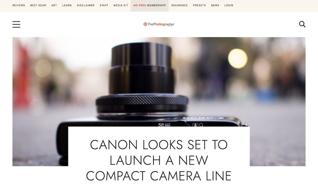
12. The Phoblographer
Website traffic: 660,00o/month (according to Similarweb)
The Phoblographer features a clean, structured blog layout with unchallenging navigation.
A slide-in hamburger menu contributes to smooth navigation, while large featured post images enhance engagement.
The minimalist header vanishes when scrolling down and reappears when needed (hint: scrolling back up), keeping distractions at a minimum.
Bright, open aesthetics keep the reading experience clean so the reader focuses on what matters.
Why we chose it?
We chose The Phoblographer for its content-first approach and clean, focused layout that keeps the reader engaged.
13. Pixieset

Website traffic: 13.1 million/month (according to Similarweb)
Pixieset’s website embraces a modern, full-width design with a popping hero section featuring a bold title, descriptive text, and a striking green CTA button.
Testimonials build trust, while a dark footer provides a strong visual foundation.
A sticky header keeps essential navigation at the top, and a well-structured pricing page offers transparency (and quick comparison).
The site also highlights real client examples, allowing visitors to explore professional work created using Pixieset’s tools.
Why we chose it?
We chose Pixieset for its sleek design and a strong focus on user trust.
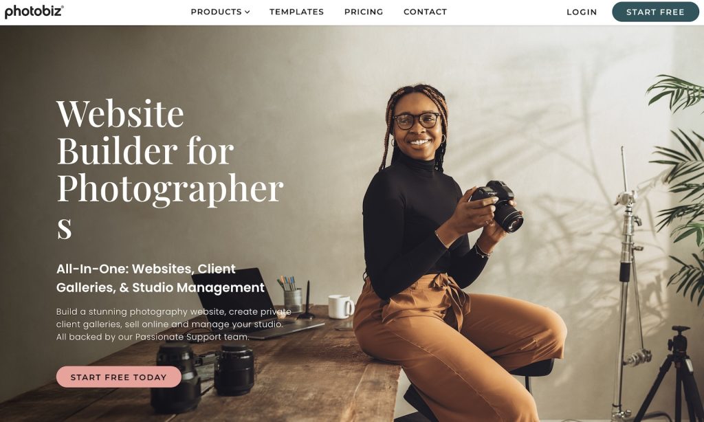
14. PhotoBiz
Website traffic: 90,000/month (according to Similarweb)
PhotoBiz is enriched with an inviting modern design with earthy tones that create a calming experience as users browse.
A floating header with a drop-down menu and call-to-action button ensures smooth and intuitive navigation.
What’s more, the footer is divided into four columns for quick access to useful links.
In addition, a live chat feature blends AI assistance with human support for quick answers.
The website’s thoughtful layout makes it a valuable tool for photographers looking to streamline their online presence.
Why we chose it?
We chose PhotoBiz for its warm, approachable design and interactive support features.
How To Easily Build A Modern Photography Website
Creating a stunning photography website doesn’t have to be complicated.
In fact, it’s very simple.
With the right tools, you can build a professional online presence without needing to code.
1. Use An Online Website Builder
The easiest way to start is with a website builder designed for creatives.
Platforms like Squarespace, Wix, and Webflow offer powerful tools to create a visually appealing and functional site.
They provide:
- Beautiful, customizable templates tailored for photographers.
- Drag-and-drop design interfaces so you’ll never need to touch a single line of code.
- Built-in SEO tools to help your site rank better on search engines.
- Mobile-friendly designs for seamless viewing on any device – mobile especially.
- Integrated eCommerce features to sell prints or services or courses effortlessly.
2. Essential Features For Your Photography Website
For your photography website to make an impact and turn visitors into loyal clients, it should include these essential elements:
- High-quality image galleries to showcase your best work.
- An About Me page to share your story and connect with visitors (make it personal!).
- Easy contact and booking forms so potential clients can reach you quickly.
- Fast-loading pages to keep visitors engaged. (You must optimize your images so they won’t weigh your site down and make it slow to load.)
- Social media integration to drive traffic and grow your audience.
3. Keep It Simple & Focused
A clutter-free, minimalist design keeps the focus on your images.
Stick to a clean layout with (plenty of) white space, quick navigation, and clear calls to action.
If your design feels overwhelming or cluttered, trust your instincts – simplify it.
4. Get Your Website Live
Once your site is ready, connect it to a custom domain for a professional touch. Before launching, test your site’s speed, usability, and mobile experience.
Pro tip: If it doesn’t perform as it should, you likely uploaded too large image files.
With these steps, you’ll have a modern photography website up and running in no time—ready to impress visitors and attract clients!


