
Fashion is the genre where a photographer’s website is most likely to be judged by an art director in under ten seconds, on a phone, between two other tabs. That makes it a useful place to look for design decisions that actually work, because the feedback loop is brutal and fast.
We looked at working fashion and editorial photographers rather than templates or agency showcases, opened every site, and kept the ones making a decision worth stealing — how they handle client names, where they put the categories, when a grid beats a single-image viewer. Each entry says what the site does and why it works, so you can take the structure without copying the design.
How We Chose These Fashion Photographer Websites
Every site here was opened and checked on the day of writing, not pulled from an older list. Five candidates were cut in the process, which is worth saying out loud because most roundups quietly keep them:
- Two had broken portfolios — one served thirty-one images that never loaded, the other was an empty page.
- One was running a website builder’s upgrade banner across the top of the page, which is not a design decision anyone should copy.
- Two were not fashion photographers at all once you got past the first screen — one shoots architecture, the other sport and advertising.
What survived had to load quickly, show the work above the fold, and make it obvious what kind of commission the photographer takes. Beyond that we looked for a decision — something specific about the layout, the navigation or the sequencing that another photographer could learn from.
One disclosure about the platforms. The mix here is fourteen on Format, three on Wix, two on Squarespace and one on Pixpa. Format is genuinely popular with working editorial photographers, but that count is also partly an artefact of where we started looking — several candidates came from Format’s own showcase, so we went back and sourced the Squarespace and Wix examples separately. Read it as “good sites exist on all of these”, not as a league table.
Best Fashion Photographer Websites
1. Renee Parkhurst
- Built with
- Format
- Layout
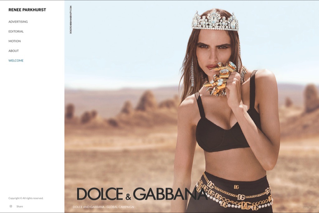
- Full-bleed campaign image, vertical side nav
- Palette sampled from the page
- #FFFFFF#CCA388#413331#BA8872#7D584A
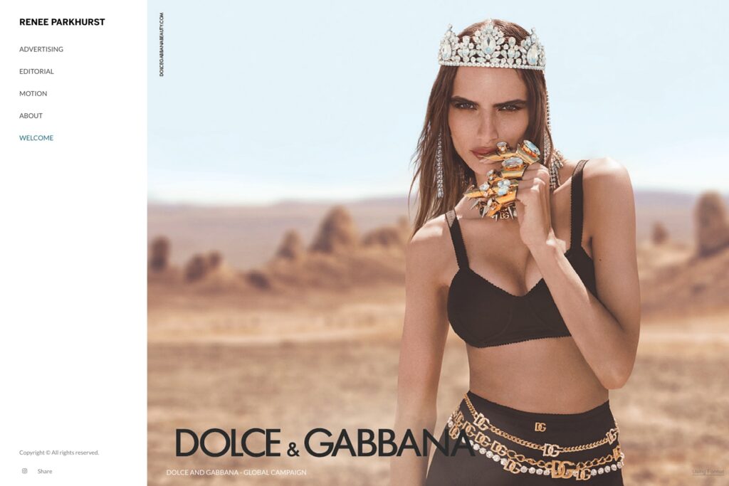
Parkhurst opens on a full-bleed Dolce & Gabbana campaign frame with the brand lockup left in place, which does something most portfolios avoid: it names the client before it names the photographer. For advertising work that is the right order — an art director scanning for someone who can handle a global campaign has their answer in the first second.
The navigation is a short vertical list — Advertising, Editorial, Motion, About — set quietly against the image rather than in a bar above it. Splitting advertising from editorial matters more than it looks: the two buyers want different evidence, and this lets each one land in the right gallery immediately.
Why we chose it: Because it leads with the client, not the CV.
2. David Ferrua
- Built with
- Format
- Layout
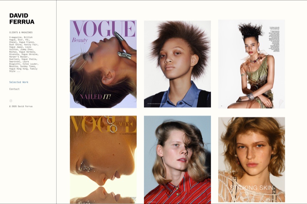
- Sidebar client list, three-column tear sheets
- Palette sampled from the page
- #FEFDF8#A46336#CCA085#D3CCD0#AAB9C7
Ferrua gives the entire left column to a client list — Vogue in about nine territories, Chanel, Estée Lauder, Harper’s Bazaar, Vanity Fair — printed small and set as running text rather than a logo wall. It is the least fashionable way to present that information and by far the most credible.
The work itself sits in a three-column grid of tear sheets, so covers and spreads read as published pages rather than loose images. For a photographer whose value is that magazines actually run the work, showing the printed context is the argument.
Why we chose it: The client list is the design, and it is set in a whisper.
3. Christine & Cory Kreiselmaier
- Built with
- Format
- Layout
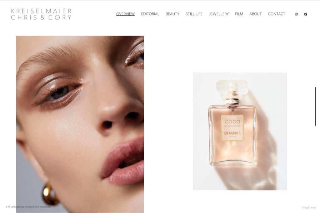
- Top nav, oversized beauty crop beside white space
- Palette sampled from the page
- #FFFFFF#DCB39E#C79783#784338#E5CDBD
A wide-tracked serif wordmark, a single beauty close-up at enormous scale, and a Chanel bottle sitting in white space beside it. The pairing tells you within one screen that this is a beauty and still-life studio, without a word of positioning copy.
The nav splits into Editorial, Beauty, Still Life, Jewellery and Film. That is unusually granular, and it is the correct call for a studio whose commissions come from different buyers — a jewellery client should never have to scroll past beauty work to find their evidence.
Why we chose it: Category navigation done properly, for a studio with several buyers.
4. Renata Kaveh
- Built with
- Format
- Layout
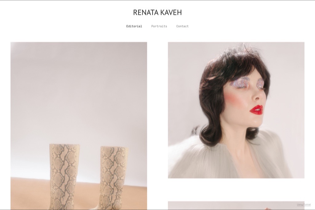
- Centred wordmark, asymmetric two-column grid
- Palette sampled from the page
- #FFFFFF#EBE3E2#E3C1AD#332622#BAA395
Three links: Editorial, Portraits, Contact. That is the whole site. The restraint is the statement, and it works because the images carry an obvious point of view — a pale, powdery palette and a slightly uncanny beauty direction that reads as one body of work rather than a collection of jobs.
The grid is deliberately asymmetric, pairing a wide still life against a taller portrait, so the eye moves diagonally instead of scanning rows. It costs nothing and makes a small portfolio feel edited rather than thin.
Why we chose it: Proof that three navigation links is enough when the edit is strong.
5. Polly Hanrahan
- Built with
- Format
- Layout
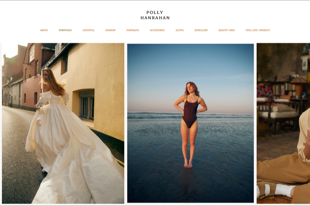
- Category row, edge-to-edge three-column grid
- Palette sampled from the page
- #FFFFFF#C6A87B#101516#3E2C1C#C2BCB3
Hanrahan runs the widest category set here — Lifestyle, Fashion, Portraits, Accessories, Active, Jewellery, Beauty and Still Life — in a single orange row under a centred serif logo. On most sites that would be clutter. Here it doubles as a rate card: it tells you exactly what she is commissioned for.
Below it the images run edge to edge with no gutters, three across, so the page reads as one continuous surface. The colour of the nav is the only accent on the page, which keeps a long category list from feeling heavy.
Why we chose it: A long category list used as a statement of range, not as clutter.
6. Constance Victoria Phillips
- Built with
- Format
- Layout
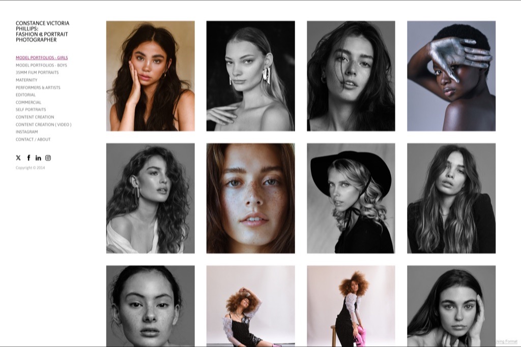
- Sidebar index, tight four-column grid
- Palette sampled from the page
- #FFFFFF#D9CDCC#E7E3E6#13100E#312B2A
The sidebar here is a working index: model portfolios split by gender, 35mm film portraits, maternity, performers and artists, editorial, commercial, self-portraits, plus separate entries for content creation in photo and video. It is closer to a service menu than a nav.
The grid is tight and small — four columns of headshots at modest size — which suits a book that exists to be scanned by agencies rather than admired one frame at a time. Different job, different layout.
Why we chose it: Built for agencies scanning a book, not for browsing.
7. Emilia Staugaard
- Built with
- Format
- Layout
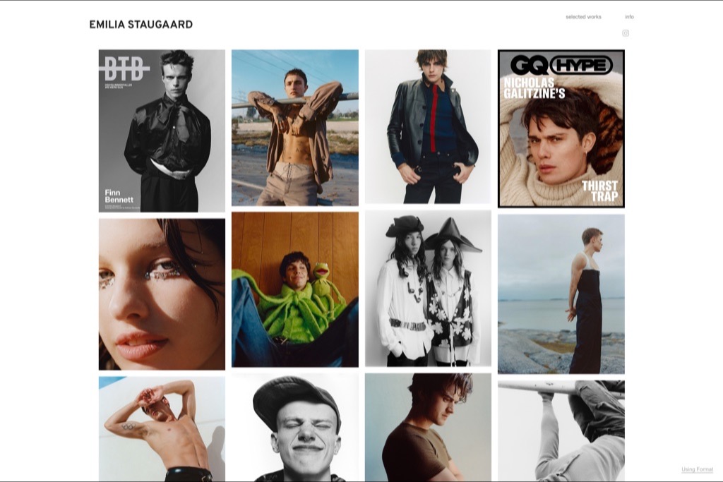
- Two-link top bar, dense four-column grid
- Palette sampled from the page
- #FFFFFF#EBEAEA#C9C9CA#783F22#231B1B
Two links in the top bar — selected works, info — and then a dense four-column grid that mixes finished magazine covers with the portraits behind them. Seeing a GQ Hype cover next to the loose frames from the same shoot is more persuasive than either on its own.
The grid is uniform and the images are small, which is a deliberate trade: you lose impact per frame and gain the impression of a photographer who works constantly. For editorial commissioning, volume of published work is the signal.
Why we chose it: Covers shown next to the outtakes that produced them.
8. Raul Romo
- Built with
- Format
- Layout
- Sidebar categories, single-image viewer
- Palette sampled from the page
- #FFFFFF#910B18#7D7C4C#C6BDA5#E8E7E7
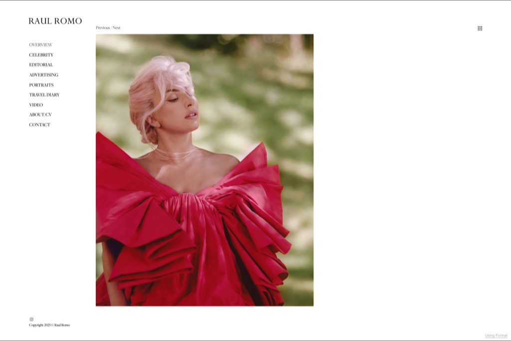
Romo uses a single-image viewer with Previous and Next controls rather than a grid, so you see one frame at a time at generous size. It is slower to browse and much better at holding attention — each image gets the room a magazine page would give it.
The sidebar splits Celebrity, Editorial, Advertising, Portraits, Travel Diary and Video. Keeping celebrity separate is a commercial decision: it is the category that books the other categories.
Why we chose it: One image at a time, when the images can carry it.
9. Katt Webster
- Built with
- Format
- Layout
- Left rail, two-column masonry
- Palette sampled from the page
- #FFFFFF#D3DAE0#656D8B#CF9E6F#1B110F
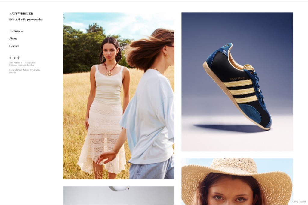
“Fashion & stills photographer” sits directly under the name, and the portfolio backs it up by alternating a lace dress in a summer field with a studio-lit Adidas trainer on gradient. Most photographers hide the product work; showing it beside the fashion is what makes the stills claim believable.
The layout is a quiet two-column masonry with a thin left rail for navigation, so the images set the rhythm rather than a rigid grid. It is a small site that does not pretend to be a large one.
Why we chose it: Fashion and product shown together, which is the actual offer.
10. Nikki Krecicki
- Built with
- Format
- Layout
- Top nav on a tinted ground, single centred image
- Palette sampled from the page
- #EDE0D8#CDC2C0#B1A6A5#97868C#452C25
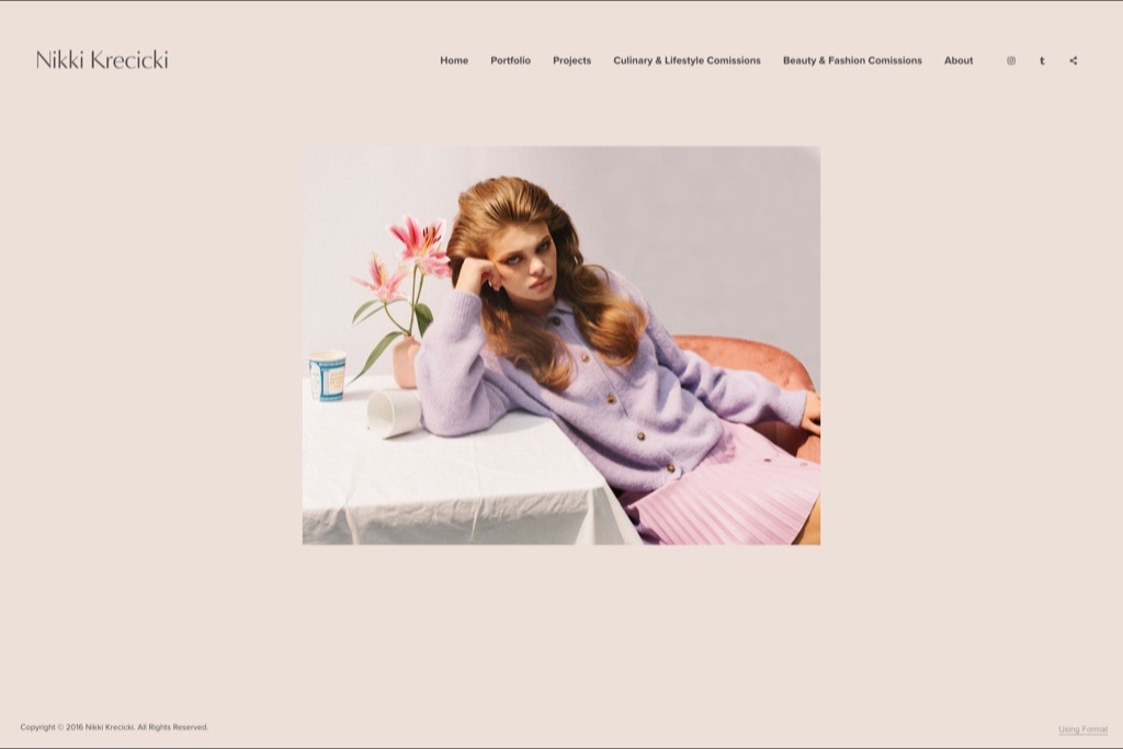
A warm blush background instead of the usual white, and a single centred image with a lot of air around it. The colour choice is doing real work — it flatters the pastel, slightly retro styling in the pictures instead of fighting it, which is rarer than it should be.
The nav names the commercial reality plainly: Culinary & Lifestyle Commissions and Beauty & Fashion Commissions as separate items. Anyone arriving with a budget knows in one glance whether she takes their kind of job.
Why we chose it: The background colour is chosen for the work, not for fashion.
11. Kevin Mason
- Built with
- Format
- Layout
- Heavy wordmark, one large image, two links
- Palette sampled from the page
- #FFFFFF#312211#967430#958C5E#4C5839
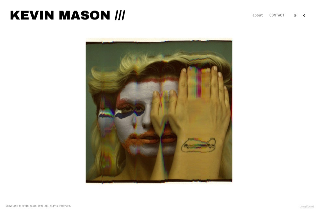
A heavy black wordmark with three slashes after it, then one large image and almost nothing else. The frame on the homepage is a distorted, scanner-warped portrait — a deliberately difficult first impression that filters for the clients who want that.
Only two links, about and contact. When the work is this specific, a large navigation would only dilute it. The site is essentially a single argument repeated.
Why we chose it: A homepage that filters clients instead of courting all of them.
12. Monet Lucki
- Built with
- Format
- Layout
- Side nav, paged single-image viewer with a counter
- Palette sampled from the page
- #FFFFFF#553B0E#F2F3C3#292713#ECEC77
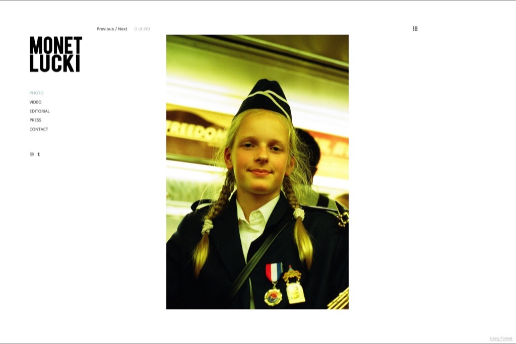
A stacked black wordmark in the corner, a slim category list, and a paged viewer showing one image with a counter — 1 of 200-odd. Publishing the count is a confident move: it tells you the archive is deep before you have seen any of it.
The categories separate Photo, Video, Editorial and Press. Keeping Press as its own item is worth copying — coverage is third-party proof and it does not belong buried in an about page.
Why we chose it: A visible image count doing the work of a paragraph about experience.
13. Anthony Deeying
- Built with
- Format
- Layout
- Narrow left rail, masonry grid
- Palette sampled from the page
- #FFFFFF#221510#B98B6B#705649#CDCED0
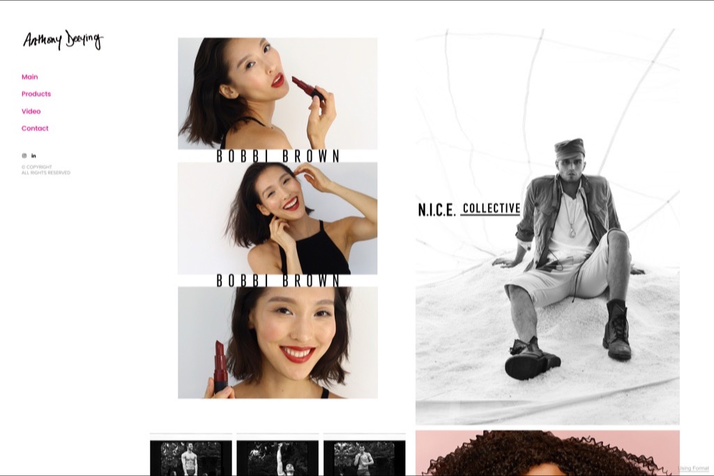
A handwritten signature as the logo, a narrow left rail with four links, and then a masonry grid that runs beauty campaign frames next to street-cast portraits. The Bobbi Brown work is placed first, which is the right instinct — the recognisable client goes at the top of the page.
The nav links are set in pink against plain white, the only colour on the page. It is a small amount of personality in a layout that otherwise gets out of the way.
Why we chose it: Recognisable client work placed first, everything else deferring to it.
14. Tim Melideo
- Built with
- Pixpa
- Layout
- Circular monogram, uniform portrait grid
- Palette sampled from the page
- #FFFFFF#040D05#9E5D32#D6D4CE#5C4028
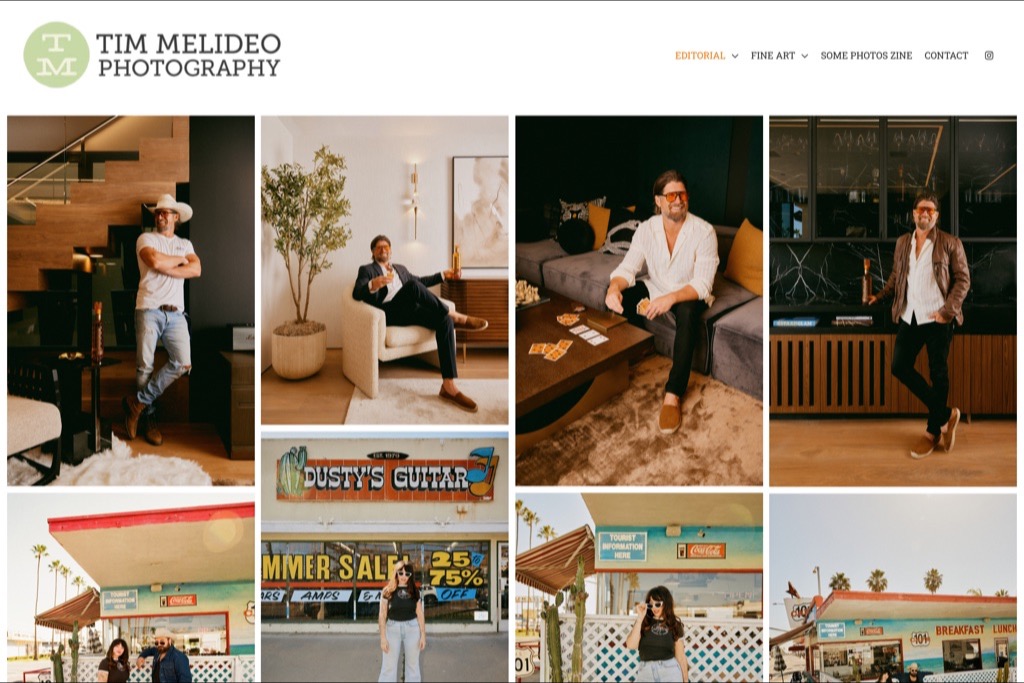
A circular monogram and a two-line wordmark give this more of a studio identity than most photographer sites attempt, and it suits work that sits between editorial fashion and Americana lifestyle — roadside signage, motel colour, portraits in interiors.
The nav carries a Some Photos Zine link alongside Editorial and Fine Art. A self-published zine is a credible way to show a point of view that commissioned work alone would not, and putting it in the main nav rather than a footer treats it as part of the practice.
Why we chose it: A self-published zine promoted to the main navigation.
15. Hanna Hillier
- Built with
- Format
- Layout
- Full-screen splash, single word entry
- Palette sampled from the page
- #895133#66381F#B18E7F#9C684B#C1A598
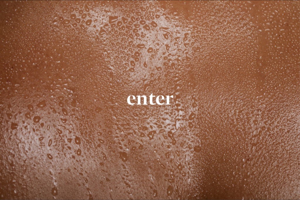
A full-screen abstract texture in warm brown with a single word — enter — set in a light serif. Splash pages are usually a mistake, costing a click and slowing the first meaningful paint for no benefit.
It is included here because it is the exception that shows the rule: it works only because the texture is itself a photograph, and it loads in one frame. If your splash page needs a video, a preloader or a logo animation, you are paying for the click and getting nothing back.
Why we chose it: The one splash page here that earns its click — and a warning about the rest.
16. Reiko Wakai
- Built with
- Wix
- Layout
- Wide category bar, colour-blocked two-row grid
- Palette sampled from the page
- #FFFFFF#BC1C27#E4E3E3#635A82#F7C8CD
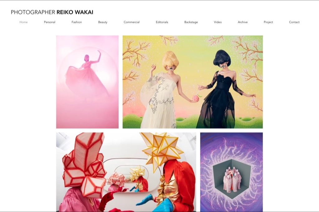
The navigation is the most explicit on this list — Personal, Fashion, Beauty, Commercial, Editorials, Backstage, Video, Archive, Project — and it is the right call for a photographer whose work is loud enough to need sorting. Backstage as its own category is unusual and smart: it is the material clients ask for and almost nobody publishes.
The imagery is heavily art-directed and saturated, so the site does something the white-ground Format portfolios cannot: the colour arrives in blocks, and the grid is built to hold it. Set against the rest of this list it is a useful reminder that restraint is a choice, not a rule.
Why we chose it: The only site here confident enough to let the work be loud.
17. Sharon Radisch
- Built with
- Wix
- Layout
- Offset wordmark, stacked text nav, asymmetric grid
- Palette sampled from the page
- #FFFFFF#40221E#CD9C81#BAC2C2#D9DDDF
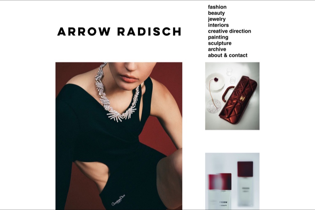
Trading as Arrow Radisch, the nav runs as a plain stacked list — fashion, beauty, jewelry, interiors, creative direction, painting, sculpture, archive — in lower case, left aligned, no styling at all. It reads like a contents page, and it covers a genuinely wide practice without looking scattered.
The work pairs a Chopard high-jewellery portrait against a Chanel clutch and a beauty product still life, which is exactly the range the nav promises. Listing creative direction alongside the photography categories is a quiet rate-card decision: it invites a bigger brief than a shoot.
Why we chose it: A nav that doubles as a contents page for a very wide practice.
18. Jakub Szymański
- Built with
- Wix
- Layout
- Bold wordmark, two-link nav, full-width three-column grid
- Palette sampled from the page
- #FFFFFF#06050A#233A4E#1A222E#D1D6DA
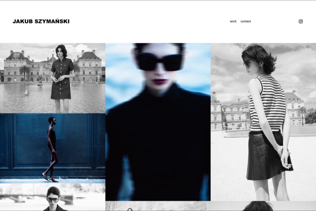
Two links — work, contact — and then a three-column grid that runs to the edges of the viewport. The edit alternates black-and-white street-cast fashion against one saturated blue beauty frame, and that single colour image is doing a lot of work by contrast.
It is the cleanest demonstration on this list that a Wix site need not look like a Wix site. Nothing here is a stock block: the type is set heavy and tight, the grid has no gutters, and the only chrome is the logo.
Why we chose it: Proof that the platform is invisible when the edit is this disciplined.
19. Will Bremridge
- Built with
- Squarespace
- Layout
- Centred serif wordmark, captioned project grid
- Palette sampled from the page
- #EBE8DF#8490A8#7EBACB#9B1F23#E3CDC0
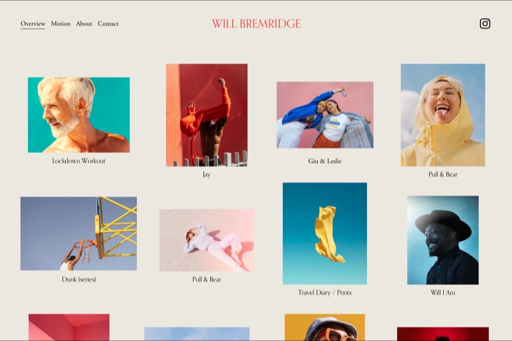
Bremridge captions every thumbnail with the project name — Pull & Bear, Lockdown Workout, Travel Diary, Will I Am — which turns a grid into an index. You can see the shape of the career before opening anything, and the two Pull & Bear entries tell a commissioning editor that the client came back.
The ground is a warm off-white rather than pure white, which suits an edit built on strong flat colour. It is a small decision that keeps a very saturated portfolio from feeling clinical.
Why we chose it: Captioned thumbnails turning a portfolio into a readable index.
20. Jessica Chou
- Built with
- Squarespace
- Layout
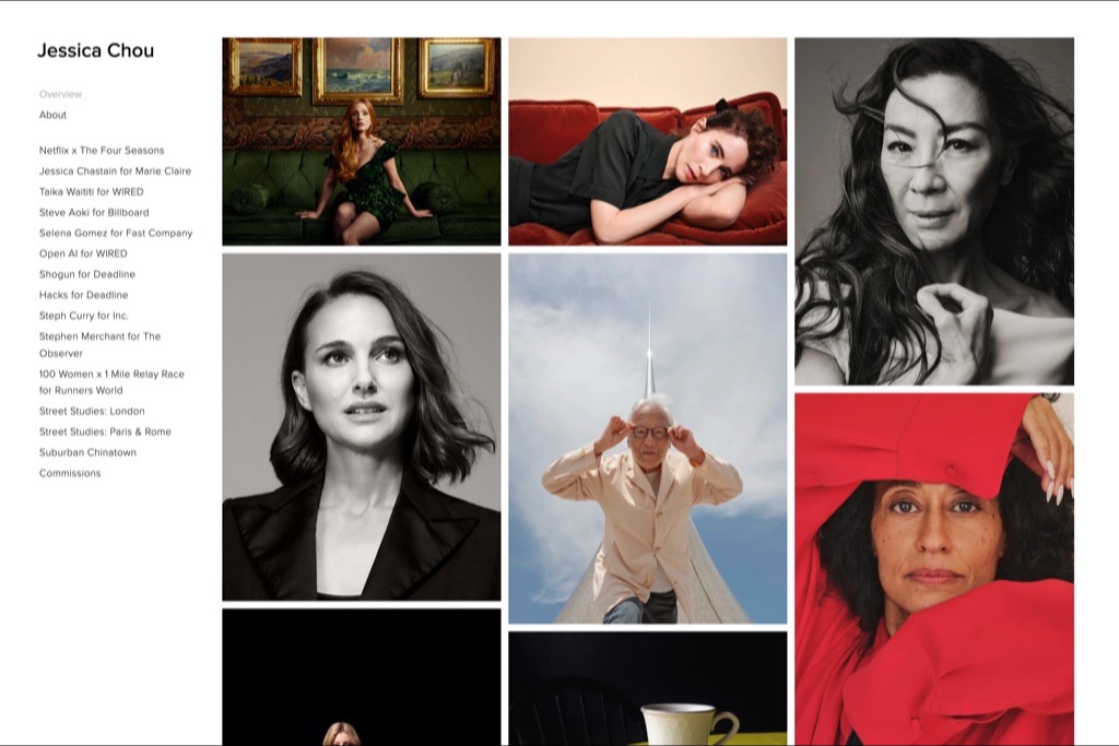
- Sidebar commission list, three-column portrait grid
- Palette sampled from the page
- #FFFFFF#CECCCD#010101#9E9E9D#D82B38
The sidebar is a list of named commissions rather than categories — Netflix x The Four Seasons, Jessica Chastain for Marie Claire, Taika Waititi for WIRED, Selena Gomez for Fast Company. Each one names the subject and the publication, which is far more specific than a client logo and far more useful to an editor deciding whether you can handle their talent.
The grid is celebrity portraiture rather than runway fashion, but it sits in the same commissioning world and shows the crossover clearly: the same art directors book both.
Why we chose it: Commissions listed as subject-plus-publication, not as logos.
What The Best Fashion Photography Websites Have In Common
Fifteen very different designs, and the same handful of decisions underneath them.
The work starts above the fold
Not one of these sites opens with a mission statement. The first thing on screen is a photograph, and the positioning copy — if it exists at all — is a single line under the name. In a genre judged on taste, the fastest way to demonstrate taste is to show it.
Categories are set by who is buying, not by subject
The strongest navigations here split advertising from editorial, or beauty from jewellery, or celebrity from everything else. Those are not aesthetic categories — they are different clients with different budgets. Organising by buyer means each one reaches their evidence in one click.
Client names are used carefully, or not at all
Nobody here has a logo wall. The ones with serious clients either leave the brand lockup inside the campaign image, or set the list as small running text in a sidebar. Both read as fact. A grid of logos reads as a pitch deck.
The grid is chosen to match the size of the archive
Photographers with a deep back catalogue use dense multi-column grids and small thumbnails, because volume is the argument. Photographers with a tight, distinctive edit use single-image viewers and a lot of white space, because each frame has to carry more. Choosing the wrong one makes a good portfolio look either thin or undifferentiated.
The palette comes from the photographs, not the design
We sampled the colours on every page in this list, and the pattern is almost comically consistent: a white or near-white ground, near-black text, and every other colour arriving from the images themselves. Only two sites tint the background at all — Nikki Krecicki’s warm blush and Hanna Hillier’s brown splash — and both do it to flatter a specific body of work.
The practical version: choose a background, a text colour, and nothing else. If you want a brand colour, put it in one place — Polly Hanrahan’s orange navigation, Anthony Deeying’s pink links — and leave the rest of the page out of the way. A photography site with a designed colour scheme is competing with its own pictures.
Contact is one click from anywhere
Every site here keeps a contact link in the primary navigation. None of them hide it behind an about page, and none of them use a contact form long enough to need scrolling. Fashion commissions usually start as a short email, and the site’s job is to not get in the way of it.
Free to download
Two of our five designs are free, under an MIT licence, for personal or client work. Each one is a finished site — open index.html and edit it, or rebuild it from the Astro source. The photographs are Unsplash placeholders; swap them for your own before you launch.
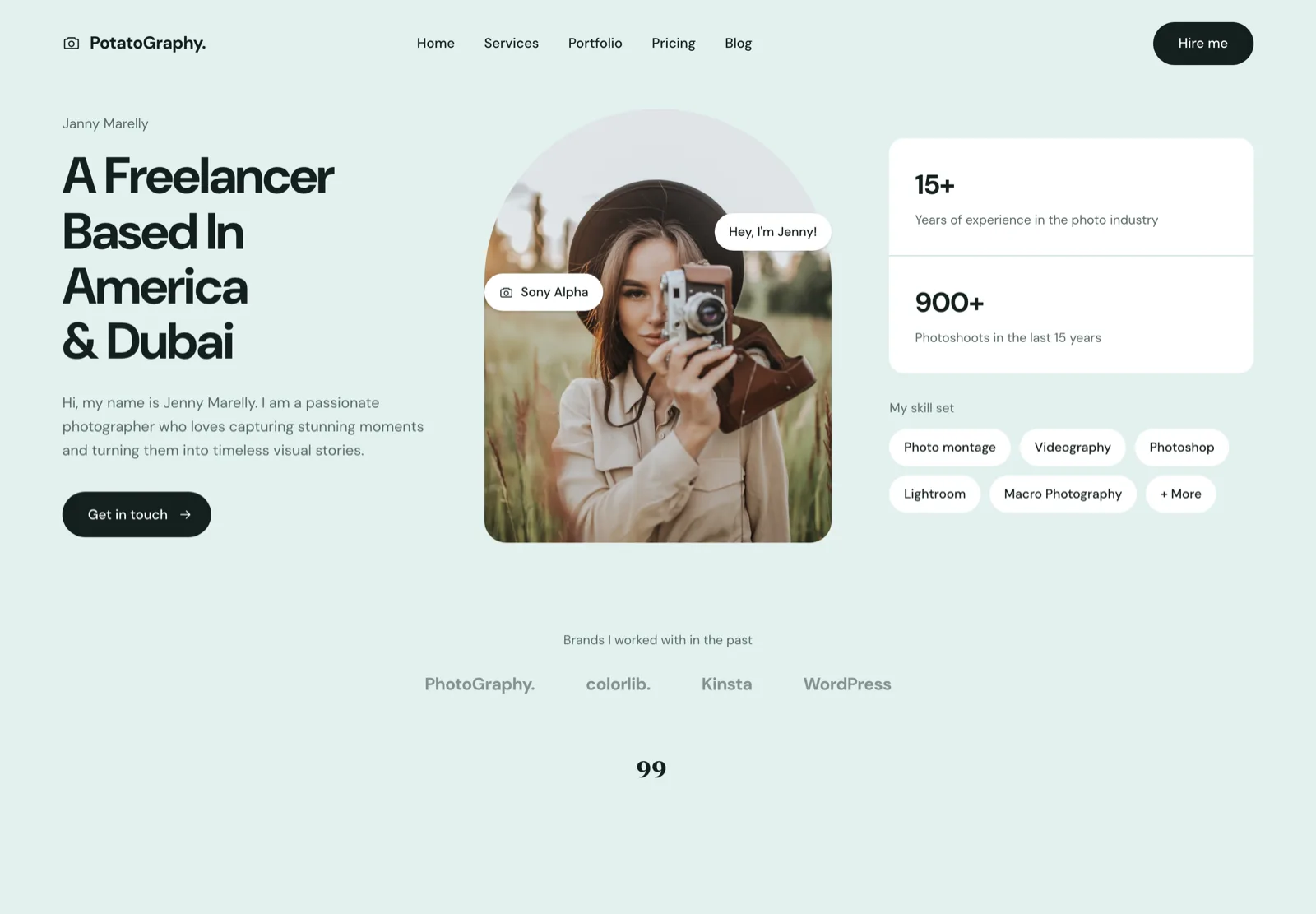
One page, one story, one call to action. The right shape when the whole site is the pitch — a hero, a skill set, a testimonial and a contact form, and nothing else to maintain.
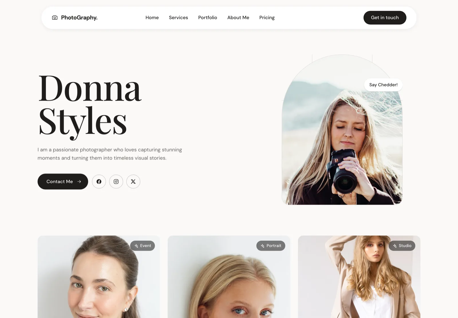
Built for the photographer whose booking depends on the client liking them. Portrait hero, an about-led structure, and contact details that follow you down the page.
The other three designs — wedding, fashion and agency — are available personalised to your brand and photographs, from $2,100. See website design for photographers, or open all five live demos.
Frequently asked questions
What should a fashion photographer’s website include?
A portfolio that opens fast, categories that match the kinds of commission you take, a short about page with a real photograph of you, and a contact link in the main navigation. Everything else is optional. The most common mistake is adding a services page full of copy when what an art director wants is twenty frames and an email address.
How many images should a fashion portfolio have?
Twenty to forty in total if you are showing one body of work, or fifteen to twenty per category if you split by client type. Depth matters more in editorial than in advertising: an editorial commissioner is looking for consistency across a lot of frames, while an advertising client mostly wants proof you have handled a campaign before.
Should I separate editorial and commercial work?
Yes, if you actively want both. They are different buyers with different budgets, and mixing them makes each look weaker — the commercial client wonders whether you are available, the editorial client wonders whether you are expensive. Several of the sites above split them at the top level of the navigation for exactly this reason.
Do fashion photographers need a blog?
Almost never. Blogging works for wedding and portrait photographers because their clients search locally and read before booking. Fashion commissions come from art directors, agents and repeat relationships, and none of them arrive through a blog post. Put that effort into the edit instead.
What is the best platform for a fashion photography portfolio?
Format and Squarespace cover most needs, and several sites on this list run on Format. If you want more control over the grid and the sequencing, a custom build is worth it — see our guide to the best photography website builders for the full comparison.
The same 47 sites were measured for above-the-fold structure — the numbers are in what a photography website homepage actually needs.