


Run a photography website through a mobile-friendly test and it will almost certainly pass. We know, because we ran 49 of them. Every single one has a viewport meta tag. Not one scrolls sideways. On the checks that made up “mobile-friendly” a decade ago, this field is perfect.
Then we loaded the same 49 sites on a simulated mid-range phone — a throttled processor, a normal 4G connection — and watched what a couple sitting on a sofa would actually get.
Only 18 of them loaded in under two and a half seconds.
The Test Everyone Passes And The One Nobody Takes
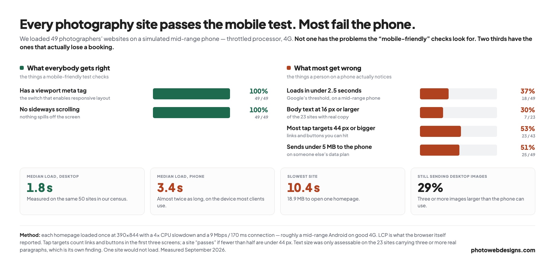
The gap between those two columns is the whole problem. “Mobile-friendly” became a solved box to tick around 2016, and the industry stopped there. The checks confirm your layout reflows. They say nothing about whether the page arrives before someone gives up on it.
Speed Is The Whole Story
On desktop, the median photography homepage in our 2026 census reached its largest element in 1.8 seconds. On a mid-range phone the same pages take 3.4 seconds — nearly double, and comfortably past the point where Google calls it a failure.
Fifteen of the 49 take longer than four seconds. The slowest takes 10.4 seconds and ships 18.9 MB to do it. That is not a website, it is a download.
The cause is not mysterious. The median site sends 4.9 MB to a phone, and half send more than five. Twenty-nine per cent are still serving at least three images larger than the screen can physically use — a desktop-sized photograph delivered to a 390-pixel-wide device, resized by the browser after paying for every byte.
Roughly two thirds of the field is using srcset, which is the mechanism that fixes this, so the tooling is not the obstacle. The remaining third are uploading one large file and hoping. We covered the export settings that fix it in how to speed up a slow photography website.
The Two Details That Make A Phone Feel Cheap
Text sized for a monitor
Of the 23 sites carrying three or more real paragraphs, 16 set body text below 16 px. On a desktop, 14 px reads as elegant restraint. Held at arm’s length on a phone it reads as squinting, and the reflex is to pinch-zoom — which on a full-bleed photography layout usually breaks something.
That only 23 of 49 sites had enough text to assess is its own finding, and the same one that runs through everything we measure: the median photography homepage carries 160 words.
Links you cannot hit
Apple and Google both put the minimum comfortable tap target at around 44 px. Across our sample, the median site has 45% of its links and buttons below that, and on 20 of 43 sites more than half are too small.
The usual culprit is a desktop navigation shrunk rather than redesigned: a row of 12-pixel uppercase links that works with a cursor and fails with a thumb. Forty-three per cent of the sample uses a hamburger menu, which sidesteps the problem for navigation but not for the small text links scattered through a footer or a gallery caption.
Why This Costs More For Photographers Than For Most
Two reasons, and they compound.
The first is when people browse. A couple looking for a wedding photographer does it in the evening, on a sofa, on a phone, with fifteen tabs open from Instagram. They are not evaluating you against a standard; they are comparing you against the other four tabs. A four-second load against a competitor’s one-second load is a decision that gets made without you.
The second is that photography sites are heavy because of the thing they are selling. A consultancy with 4.9 MB of homepage has a bug. A photographer with 4.9 MB has a portfolio. The weight is not accidental, which is exactly why the fix has to be deliberate: resize before upload, serve modern formats, and let the phone request a smaller file than the desktop gets.
What To Actually Check
Not a mobile-friendly test. Those all pass. Do this instead, on your own phone, on mobile data with wifi turned off:
- Time it. Count out loud from the moment you tap. If you get past three, you have the most common problem in this dataset.
- Read a paragraph at arm’s length. If you move the phone closer, your body text is too small.
- Tap your navigation with a thumb, not an index finger. Thumbs are wider and less accurate, and that is what people use one-handed.
- Check what you are sending. If your hero image is 2,500 px wide, a phone is paying for roughly six times the pixels it can display.
- Do it on 4G, not wifi. Every site in this study feels fine on a fast connection. That is why the problem survives.
If the answers are uncomfortable and you would rather not spend a weekend on it, that is what we do.
Method
Each homepage loaded once at 390×844 with a 4× CPU slowdown and a 9 Mbps / 170 ms connection — roughly a mid-range Android on good 4G, which is a deliberately ordinary device rather than a worst case. Largest Contentful Paint is what the browser itself reported. Tap targets count links and buttons in the first three screens, with a site passing if fewer than half fall under 44 px. Text size could only be assessed on the 23 sites carrying three or more real paragraphs. One site would not load and is excluded. The sample is the same 50 working photographers as our census, so the desktop and mobile figures are directly comparable. September 2026.
Frequently Asked Questions
Is my photography website mobile friendly?
Almost certainly yes, by the standard those tests use — all 49 sites we measured passed the viewport and horizontal-scroll checks. That is not the useful question. Only 37% loaded in under 2.5 seconds on a mid-range phone, which is the thing a visitor actually experiences.
How fast should a photography website load on mobile?
Under 2.5 seconds to the largest element, which is Google’s threshold. The median in our sample was 3.4 seconds and the slowest took 10.4 seconds. Desktop is not a useful proxy: the same pages averaged 1.8 seconds on a desktop connection.
Why is my photography website slow on phones but fine on desktop?
Usually image weight. The median site sends 4.9 MB to a phone, and 29% still serve at least three images larger than the screen can use. A desktop connection absorbs that; a phone on mobile data does not, and a throttled processor takes longer to decode the images as well.
What font size should a photography website use on mobile?
At least 16 px for body text. Of the sites in our sample with enough copy to assess, 16 of 23 set it smaller, which forces pinch-zooming on a layout that usually does not handle it well.
How big should buttons and links be on mobile?
About 44 px, which is the figure both Apple and Google use. In our sample the median site had 45% of its links and buttons below that, usually because a desktop navigation was shrunk rather than redesigned for thumbs.